| Image |
Comment |
| 11/03/2008 01:09:24 PM |
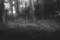
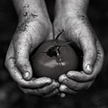
untitledby krnodilComment: And it begins! I agree with you in that it is lacking that zone plate glow, but it's still an awesome image. It could be a still from on old timey horror movie. |
 Photographer found comment helpful. Photographer found comment helpful. |
| 10/24/2008 12:14:33 PM |
|
| 10/24/2008 12:11:17 PM |
|
| Photographer found comment helpful. |
| 10/24/2008 12:11:02 PM |
|
| Photographer found comment helpful. |
| 10/24/2008 12:10:27 PM |
|
| Photographer found comment helpful. |
| 10/24/2008 12:09:16 PM |
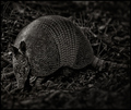
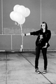
Aspireby MelethiaComment: This is really amazing. I love the single word yet play on words title. I love the rule of thirds, and everything is in just the right place for me. Great b/w too. My only 10! |
| Photographer found comment helpful. |
| 10/01/2008 04:58:35 PM |
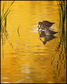
Rose et Noirby zackdezonComment: Ah! They really are pink! This is decent, but it doesn't compare to your B/W shot. Of course, I gave that one a 10 so that's pretty hard to beat. :) |
| Photographer found comment helpful. |
| 09/24/2008 01:58:16 PM |
|
| Photographer found comment helpful. |
| 09/24/2008 01:53:14 PM |
Six Pink Balloonsby zackdezonComment: That is so weird! The far right and bottom balloons actually do look pink to me. I had to pull it into photoshop to verify that they are truly gray. It's a cool shot, and I don't know how you could nail the challenge any better. A 10 from me! |
| Photographer found comment helpful. |
| 09/15/2008 05:17:30 PM |
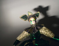
Inspired by Hurrellby jnenvirComment: **Critique Club**
My first impression of this image when it popped up was "looks pretty good". Had I voted this one, I probably would have gone along with the crowd and given it a 5. I'm kinda surprised you got so many 1,2, and 3 votes, but that's DPC for ya. :)
First, the likes. I like the lighting a lot and I think the pose works quite well. I think the tilt of the head is just perfect. If I were shooting this (note: these tips might not necessarily increase your score), I would have moved the doll to the left and toward the camera a bit to give the shadow more room and presence in the shot. I don't think it looks quite deliberate enough as it is. The shot feels pretty static as well with the face being almost perfectly centered.
Some things I think would improve the score: Get rid of that pesky sensor dust. Either clean the sensor or clone those bad boys out (which is legal in basic and advanced). I think it looks sloppy, and I know I (and probably others) vote down for it. For me, it's really all about attention to detail. Also, I agree with one of your comments that it could be a little sharper.
Overall, I like it. With a little tweaking, I think the score could have jumped a ways as well.
Please feel free to PM me if you have any questions or comments.
Thanks,
Nathan |
| Photographer found comment helpful. |
Home -
Challenges -
Community -
League -
Photos -
Cameras -
Lenses -
Learn -
Help -
Terms of Use -
Privacy -
Top ^
DPChallenge, and website content and design, Copyright © 2001-2026 Challenging Technologies, LLC.
All digital photo copyrights belong to the photographers and may not be used without permission.
Current Server Time: 06/11/2026 03:07:26 PM EDT.