|
|
|
Showing 101 - 110 of ~1053 |
| Image |
Comment |
| 04/23/2009 12:10:07 PM | |  Photographer found comment helpful. Photographer found comment helpful. |
| 04/23/2009 11:58:13 AM | I Try to Run, but My Feet Won't Moveby karmatComment: Awesome pinhole shot. I love the way the sun makes those trippy rainbows. Amazingly, the sensor dust spots actually seem to complement this shot! The shot itself doesn't really feel nightmarish to me, but it certainly has a surreal and dreamlike feel. So, close enough. :) | | Photographer found comment helpful. |
| 04/17/2009 04:38:52 PM | Dead Man's Rock, St. Luciaby aprudhommeComment: **Critique Club**
I think you're on the right track here, but you just missed it by that much. DPC voters love landscapes and seascapes, so that's a good start, but there are some technical issues with the image that knocked your score down a ways. Oh, and to get it out of the way, I would imagine most voters didn't really see it as a postcard. Text is a rarity around here, and I'm sure the voters were looking for it to be used.
So, the shot itself. I would prefer to see a wider angle. The rock being cut off on the right doesn't do it for me, and a nice wide angle with a big rock in the foreground always looks cool. The timing can make all the difference as well. A nice sunset hour, partly cloudy sky and a big wave crashing against the rock would do wonders for the scene. The editing looks fine to me except for the contrast, perhaps. That might be a little heavy. That ISO 1600 can't have helped as well.
Your score and placing are actually lower than I would have expected, so I'm guessing you got hit by the DNMC crowd pretty hard.
If you have any questions or comments please feel free to shoot me a PM.
Nathan | | Photographer found comment helpful. |
| 04/17/2009 04:26:03 PM | Just chillingby docjonnyComment: **Critique Club**
I think a few of your commenters hit the nail on the head. It's a good shot, but it doesn't really feel like a postcard. Darn those pesky challenge details! Meeting the challenge aside, I really think it's well done. Some of the white may be blown, but it looks fine to me. I think the puffy clouds complement the snow quite well, and I like the negative space at the top. I too think it could be a Coke add. In a different challenge this could score a lot higher. The only thing I don't like is the bit of snow behind the left foot. It ruins the illusion that he's sitting at the apex of a humongous mound of snow.
If you have any questions or comments please feel free to shoot me a PM.
Nathan Message edited by author 2009-04-21 10:24:33. | | Photographer found comment helpful. |
| 04/17/2009 04:13:43 PM | The Edge of the Earthby mgsmith53Comment: **Critique Club**
Well, you certainly created an interesting submission! I'm actually surprised that there aren't bigger spikes at the top and bottom ends of the voting breakdown. I would have expected more people to love it or hate it. I see that you were going for a humorous entry. To be honest, I didn't see that in voting. In retrospect, I don't think you went far enough. The border and text work well toward that end, but the image itself doesn't convey the humor that well to me. The main problem I have is that it's way too small (and I'm practically alone on this issue, so feel free to ignore me completely.) Something that's 576px on the long edge just can't compete with a 720px submission in my book. | | Photographer found comment helpful. |
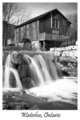
| 04/17/2009 04:02:10 PM | Old Millby bfurnerComment: **Critique Club**
First off, congrats on your new PB by quite a ways! This really is an excellent submission. It meets the challenge head on (it really looks like it could be a postcard) and it's a beautiful shot. Excellent use of border and text as well. In the image itself you combined several DPC friendly elements, and they paid off. You've got smooth water, great composition, a lovely landscape and a nice B/W conversion.
There are only a couple of things that I see that may have brought your score down a bit. First, the whole thing feels like it is leaning a bit to the right. That may or may not be true, but I would prefer a small rotation. Second, the white water in the foreground is totally blown out. The B/W helps that, but it's still a bit distracting. Finally, it could be sharper. You might want to check out this thread on Adamus sharpening. I bet it would work wonderfully on this image.
Overall, a great image, score, and placement. My recommended tweaks are pretty minor, but they may have improved your score a little. Great job!
If you have any questions or comments just shoot me a PM.
Nathan | | Photographer found comment helpful. |
| 04/10/2009 10:38:38 AM | by messerschmittComment: Truly inspiring. This one is my favorite of the series. | | Photographer found comment helpful. |
| 03/27/2009 05:02:06 PM | proposalby yiannis723Comment: What a bizarre image! Well, obviously it's horribly small, but the scene is quite fascinating. It almost looks like a still from an old 70s sitcom or something. | | Photographer found comment helpful. |
| 03/27/2009 04:51:32 PM | |
| 03/27/2009 04:48:07 PM | Flowers through the rainby PaulComment: Perfect application of the 1 second. I love the way the streaking rain looks like scratches on glass. | | Photographer found comment helpful. |
|
Showing 101 - 110 of ~1053 |
Home -
Challenges -
Community -
League -
Photos -
Cameras -
Lenses -
Learn -
Help -
Terms of Use -
Privacy -
Top ^
DPChallenge, and website content and design, Copyright © 2001-2026 Challenging Technologies, LLC.
All digital photo copyrights belong to the photographers and may not be used without permission.
Current Server Time: 06/09/2026 10:46:46 PM EDT.
|