| Image |
Comment |
| 01/14/2003 10:46:03 PM |
Snowing in Baltimoreby bawlmeroryulsComment: The post in the centre of the image is really distracting. It is almost the focal point of the picture, which I am pretty sure was not your intention. Taking a different angle for this shot would be much better. Just forget the boat, and shoot across the water. The boat in this instance does not really add to the picture. You chose a nice colour cast for this image though. jgillard5 |
| 01/14/2003 10:42:15 PM |
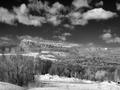
Mohonkby davisspragueComment: The sky has a bit of noise in it which could be removed by using a program such as neatimage. The contrast in your image needs improving. It is too hard to make out the trees against the landscape. Composition seems good to me though. I think this photo would be much more dramatic in colour. jgillard5 |
 Photographer found comment helpful. Photographer found comment helpful. |
| 01/14/2003 10:12:41 PM |
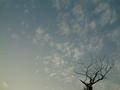
Tree in dusk, tree in Winterby ftsleeComment: I do not really think that this picture fits the challenge. Technically, it is sharp. The sky could be a bit more saturated colour wise. Maybe if you cropped out the top 1/2 of the photo, it would look a bit better. jgillard4 |
| 01/14/2003 09:19:09 PM |
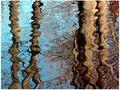
By the lakeby lionelmComment: This shot is not really a landscape shot. You will probably hear this alot. I think that if you included the shore as well as the water reflections, you would have gotten a much better score. Also, The image is a little busy. There is no real focus in it to draw the attention of the viewer. jgillard4 |
| Photographer found comment helpful. |
| 01/14/2003 09:17:36 PM |
Winter Wonderlandby rampantkComment: The reason that I gave this a lower score is because it is hard to make out what we are looking at. Some colour alteration via a photo editing program would have resulted in a much higher score. For suggestions just send me a message, and I can show you what I mean. jgillard4 |
| 01/14/2003 09:15:43 PM |
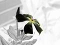
Flowers in the lanscapeby angelComment: A nice looking flower, though it could be sharper as it is the central piece of your image. A tighter cropping would have been more effective i think. jgillard5 |
| 01/14/2003 09:14:34 PM |
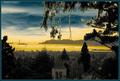
Golden Gateby GeneralEComment: The effect that you tried with altering the colors was inneffective. A more natural colouring would be in order. I liked the overhanging tree framing the shot. jgillard4 |
| Photographer found comment helpful. |
| 01/13/2003 11:12:22 PM |
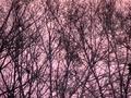
Dusky Pinkby ErastisComment: I voted this image low as it is too hard to make out what you are trying to show |
| 01/13/2003 08:47:03 AM |
|
| 01/13/2003 08:46:13 AM |
|
| Photographer found comment helpful. |
Home -
Challenges -
Community -
League -
Photos -
Cameras -
Lenses -
Learn -
Help -
Terms of Use -
Privacy -
Top ^
DPChallenge, and website content and design, Copyright © 2001-2026 Challenging Technologies, LLC.
All digital photo copyrights belong to the photographers and may not be used without permission.
Current Server Time: 07/16/2026 10:43:32 AM EDT.