| Image |
Comment |
| 01/26/2003 09:03:46 PM |
Slow Down For Wildfowlby vestanpanceComment: Nah.. Speed up for wildfowl ;) This picture will do well I think for three reasons. One, the colours are very nice. Two, it has a good composition. Three, it is very crisp. Oh, and four, people like little ducklings ;) jgillard9 |
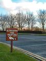
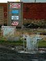
| 01/26/2003 09:02:28 PM |
No Crime Zoneby DianaComment: This shot looks a little washed out. Sorta like you are looking at a painting. Use of a sharpening utility would be welcomed to make the image more vivid. jgillard6 |
 Photographer found comment helpful. Photographer found comment helpful. |
| 01/26/2003 09:01:36 PM |
|
| Photographer found comment helpful. |
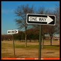
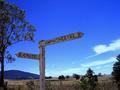
| 01/26/2003 09:01:16 PM |
...or another!by crabappl3Comment: I like it! ;) One sign is not enough to get the point across so they have to use two. jgillard7 |
| Photographer found comment helpful. |
| 01/26/2003 09:00:12 PM |
The Crossingby howzaComment: This image is a little dark. The problem with this image is that you oversharpened it wayyyy too much. The shot no longer looks natural. I recommend that you do a search for a tutorial on how to use an unsharp mask correctly! I like your composition though. jgillard4 |
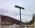
| 01/26/2003 08:53:55 PM |
Red Rock, Red Stopby YomiComment: I like your background, but I do not get the point of this sign being here? Im trying to determine what you want to tell me and I am not getting it. For your crisp colours and sharp focus I am giving you a 7 still though. jgillard7 |
| Photographer found comment helpful. |
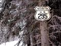
| 01/26/2003 08:51:35 PM |
Waiting aroundby decoteauComment: I think that you should use a better program for resizing your images. If you look closely at the letters you have zaggies. I hope that these are not jpeg artifacts. What I mean is that if the sign was a bit sharper, it would be more effective. I like the angle you shot it at though. jgillard6 |
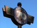
| 01/26/2003 08:50:04 PM |
Sign in Blueby PtmanComment: The sky does not look right. It is a little too blue. I like the sign though. jgillard6 |
| Photographer found comment helpful. |
| 01/26/2003 08:49:25 PM |
Look what I found in Canada,of all places.by camelotnorthComment: Are you sure that you did not hang that there? ;) I think that if you cropped the image so that the open space in the lower left corner was not there, the picture would be more uniform and stronger to the viewers eyes. jgillard6 |
| Photographer found comment helpful. |
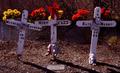
| 01/26/2003 08:48:31 PM |
Through a Kids Eyes.by vtruanComment: Simple and effective. I do not like the colouring of the roof of the fake house though. Still. Effective. jgillard7 |
| Photographer found comment helpful. |
Home -
Challenges -
Community -
League -
Photos -
Cameras -
Lenses -
Learn -
Help -
Terms of Use -
Privacy -
Top ^
DPChallenge, and website content and design, Copyright © 2001-2026 Challenging Technologies, LLC.
All digital photo copyrights belong to the photographers and may not be used without permission.
Current Server Time: 07/16/2026 02:27:26 PM EDT.