| Image |
Comment |
| 01/03/2007 10:49:30 PM |
|
| 01/03/2007 10:49:07 PM |
|
 Photographer found comment helpful. Photographer found comment helpful. |
| 01/03/2007 06:49:01 PM |
Editorby levyj413Comment: I thought this was actually quite fun. The lines are a little wavy, but that's not a big deal. Plus-the light is red, which is what an editor writes in. I like your crop and I think this should've scored higher. |
| Photographer found comment helpful. |
| 01/03/2007 06:46:43 PM |
|
| Photographer found comment helpful. |
| 01/03/2007 06:45:24 PM |
|
| Photographer found comment helpful. |
| 01/03/2007 06:43:30 PM |
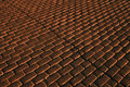
Broken patternby seeComment: well, it's definitely a pattern, but I think if you had added something simple, like a ball or an apple into the LL or UR corner, it would have made it more interesting. |
| Photographer found comment helpful. |
| 01/03/2007 06:41:34 PM |
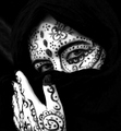
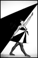
Pattern Adornesby WildcardComment: I think this might have done better if the lines were made in marker instead of paint. It would look sharper and cleaner and probably be a lot easier to do. There also seems to be a shadow on the thumb, which distracted me. The contrast is a little too high because the hand and cheek are blown out. That being said it's a good pattern and a nice pose! |
| Photographer found comment helpful. |
| 01/03/2007 06:38:06 PM |
op.!by silverfoxxComment: hehe, you crazy gal! You look a little uncomfortable, but it must have been hard to shoot. The only things that bpther me abot this is that the stckings are too dark; I think bare legs might have worked better. Also, your legs look a bit akward and short. I think if you had taken this from a lower perspective, it would have made you look taller. |
| Photographer found comment helpful. |
| 01/03/2007 06:34:01 PM |
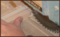
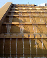
Patterns in water and shadowby mistComment: I love the pattern in this, but maybe you could have cropped out all of the sky and that angle on the left, which are somewhat distracting. Then the shadows of the water would stand out more, giving more emphasis on "pattern". Also the focus seems just a tad soft. |
| Photographer found comment helpful. |
| 01/03/2007 06:31:08 PM |
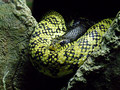
Dangerous Patternby KelliComment: I love the "pose" of the snake. Maybe you could've taken it from a straight-on perspective so you could have seen both of it's eyes. The detail is very nice. |
| Photographer found comment helpful. |
Home -
Challenges -
Community -
League -
Photos -
Cameras -
Lenses -
Learn -
Help -
Terms of Use -
Privacy -
Top ^
DPChallenge, and website content and design, Copyright © 2001-2026 Challenging Technologies, LLC.
All digital photo copyrights belong to the photographers and may not be used without permission.
Current Server Time: 07/17/2026 10:18:01 PM EDT.