|
|
| Image |
Comment |
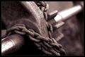
| 01/23/2004 06:07:51 PM | Restrained Movementby KonadorComment: Greetings from the Critique Club
Hi Ben,
got you again. Seems we are linked somehow.
Initial thoughts/My opinion
Great close-up, like the texture of the rusty iron. POV not the first thing that comes to my mind. Would make a great image to hang on the wall, maybe as triptych.
Content/Composition
The composition is just great: could be a textbook presentation for rule of third and also leading line. I also like that the back part of the axle adds due to its brightness a further element to the image and it is not only background. The shapes (gear wheel, chain and axle bearing) are simple and thus easy to understand and look at, although one does not know to what it belongs. But this is not important.
I like the texture of the metal very much.
Also I like the light: very gentle but still due to some soft shadows enough depth.
I would have composed the DOF a little different though: a little wider with everything sharp starting from the lower left up to the whole gear wheel leaving only the back part of the axle blurred. But this is really the only part where I see improvement.
Camera work -technically
Nothing to mention here: exposure, focus etc. just right.
Digital Processing - Technical
Very good selection of duo-tone, sharpening set right and the border works great to me: for such an image I feel a border is a must.
Fits the challenge
Actually I don't see a special POV in this image, to me it is more a close-up. However, that is really my personal view and I had this problem in one or another way with most submissions to this challenge.
Good luck for your upcoming submissions
|  Photographer found comment helpful. Photographer found comment helpful. |
| 01/23/2004 03:01:39 AM | Protest in Mexicaliby cimarron98Comment: To me this would fit better to photojournalism and for that topic it's well made: the protesters have interesting faces and look strong.
However, I don't know thing such political iamges would be shown in NG. | | Photographer found comment helpful. |
| 01/23/2004 02:59:33 AM | |
| 01/23/2004 02:57:32 AM | The Mask - Unveiling Man's Disguiseby Spanish_GreaseComment: I do like the strong contrast between the mask and the white background. Would have loved it to see some more details on the mask. Also the crop is too tight for my taste.
Like the strong colours. Good luck! | | Photographer found comment helpful. |
| 01/23/2004 02:55:36 AM | Ancient Egyptianby jaykeComment: Great subject with well ste light and delicate texture. Would have loved it if the background would be a little more visible. The colour of the background is great though. | | Photographer found comment helpful. |
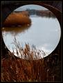
| 01/22/2004 05:34:55 PM | By the stone bridge in the swamps. by jjbeguinComment: Wonderfull perspective! When I first saw it, it took me quiet some time to relize how it was made and what it shows.
BTW: I acctually been to Gruissan the last two summers: love that place! |
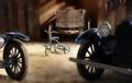
| 01/21/2004 12:18:23 PM | Right before my best buddy's head fell off for Makro IIIby Harz_JoergComment: Thanx for all the kind comments and votes!
I knew it wouldn't do very good because the story is to much a DPC-insider.
Acctually I wanted to make an image using the concave mirror from the point of view of a bug beeing photographed. However, I couldn't get a nice background (I would have liked to make a outdoor shot with the mirror).
So I decided to make a funny submission, and as with almost all my joke-images (beside the tacky image though) it did not do too well.
So I remembered the fly of Jackos Macro III image and wanted to make a story out of it. It should be the view from another fly (the buddy of the fly on the cactus) onto the scene right before the head was falling off.
Didn't realize that most people probably thought that the buddy of the cactus-fly is Jacko and not another fly :(
Anyway, it was a fun to set this up and you will for sure see other pictures from me with this mirror.
Jörg
BTW: here's a shot on the setup
 |
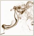
| 01/20/2004 11:59:16 AM | My Last Oneby Spanish_GreaseComment: Greetings from the Critique Club
Initial thoughts/My opinion
Great stuff, very well composed. Like the use of inverting the picture.
Content/Composition
Very well made! I especially like the ratio between the small cigarette and the large smoke and how you positioned the cigarette and the smoke along the diagonal.
Also, as it has been already mentioned by others, the use of negative space is great.
The only flaw I can think of is the darker portion of smoke at the lower right: elsewhere one has the feeling to see almost the whole smoke and only small portions have already faded out of the frame, but at the lower right the "thick" smoke is cut, so the viewer knows that there is more smoke around.
But this is really a minor issue.
Camera work -technically
Everything done as it should be: exposure and focus is right (judged it by inverting the image back).
Digital Processing - Technical
Inverting the image was a very good idea: it does not look unnatural, but gives it a final kick. That the inversion results directly in a sepia was a surprise to me. The border works very well too.
Fits the challenge
Of course it does and I hope you still keep your resolution (unless you didn't ever smoke at all). I tried to stop this year, but I failed.
Good luck for your upcoming submissions.
| | Photographer found comment helpful. |
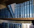
| 01/20/2004 11:42:33 AM | Woe be to him that reads but one bookby MrOlafssonComment: Greetings from the Critique Club
Initial thoughts/My opinion
Great resolution, nice looking books, too sad that a flash was used.
Content/Composition
The books themselves look nice due to their colour and nice texture. Taking just one out of the row is also a good choice. Showing a hand taking the books out might have actually been even better.
One compositional element that is important to such an image is to keep the image clean, i.e. showing only the things that are necessary and avoid anything else that does not belong there. In this image it's the lower row of books that is unnecessary. If it is cropped away the image gets much clearer, the book shelve serves way better as leading line and the more rectangular image looks much better.
In principle similar arguments can be used for the shelve itself: the wood disturbs a little too, especially at the very right. However, this could be better addressed using different light.
Camera work -technically
A major issue is the light: an important rule for indoor still-life photography is to avoid direct flashlight: it's simply too harsh, gives bad reflections that cannot be controlled by you and also strong shadows. Taking a simple desk lamp and moving it around the subject to see when the light and shadows look best is not only fun, but makes the whole atmosphere. Of course for doing so, a tripod or another good support for the camera is needed. Focus is set to the book that is taken out and that’s just right.
Digital Processing - Technical
The image could have been sharpened a bit. A well fitting border might be good here too.
Fits the challenge
Yes, very well, the intention gets through even without the title.
Good luck for your upcoming submissions
| | Photographer found comment helpful. |
| 01/20/2004 11:21:53 AM | new year's resolution ? mm..... be happy ! =)by diegohsComment: Greetings from the Critique Club
Initial thoughts/My opinion
What a wonderful smile of the girl! Like her pose too, makes the image dynamic. Don't like the fishermen at the left and the large amount of space at the right though.
Content/Composition
Even without the title, this image speaks of happiness: your niece looks just great and one can hear her laugh and giggle. Really greatly captured.
What could be improved here is the focal point of the image: its just the girl and everything else is un-important. The fishermen disturb, because they don't add to "happiness" but the viewer see them and so he/she wants to know what they are doing, thus he/she is taken away from the girl.
The nice river also does not add much here, mainly because the girl is not looking at it, she is just looking straight to the camera. If she would look along the river, than showing the river would have been a wise choice.
So here I would recommend a very tight crop, so tight that the branches held by the fishermen look like they are from some trees. Of course, such strong cropping only works if the image resolution permits this.
Camera work -technically
The girl is a little overexposed, especially at the pink shirt and the face. Otherwise exposure looks fine. Focus is set well too, that the image is somewhat soft is more a software problem.
Digital Processing - Technical
Could need some more sharpening. The border is nothing special here: I almost didn't notice it, because it's so thin.
Fits the challenge
Yes, including the title it does fit very well and one of the best resolutions actually!
Good luck for your upcoming submissions
|
Home -
Challenges -
Community -
League -
Photos -
Cameras -
Lenses -
Learn -
Help -
Terms of Use -
Privacy -
Top ^
DPChallenge, and website content and design, Copyright © 2001-2026 Challenging Technologies, LLC.
All digital photo copyrights belong to the photographers and may not be used without permission.
Current Server Time: 07/16/2026 12:02:44 AM EDT.
|