| Image |
Comment |
| 12/18/2002 09:15:02 AM |
|
| 12/18/2002 09:11:23 AM |
|
| 12/18/2002 09:08:54 AM |
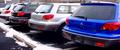
shiney new carsby shutterflyComment: The idea to show "shiney new cars" is great. But why didn't you choose the showroom. there you would have had better light and not the disturbing snow that makes the whole picture look not very shiny at all. |
| 12/18/2002 09:01:11 AM |
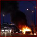
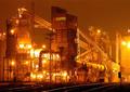
Commutingby goodtempoComment: I of course understand why you submitted this picture to DPC: this is a scene one (hopefully) does not see very often.And the way you captured with the bright flame, the black cloud in front of the dark blue sky is great. This would have been something for the photojournalism challenge.
And the title you choosed was the best you could do for this submission.
However, this great title (not used by anyone else) calls for a long row of cars and the backlight. That would have been great. |
 Photographer found comment helpful. Photographer found comment helpful. |
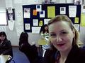
| 12/18/2002 08:54:22 AM |
Welcome to Second Period!by albright1Comment: It definitely fits to "occupation". I like the backgrounds color and brightness: very authentical. The composition could have been made better: two of the three students are at edges. But you probably didn't have the time and possibility to do a lot of testing for your shot.
That's probably also the reason why the light on your face is not set too great. |
| Photographer found comment helpful. |
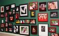
| 12/18/2002 08:48:32 AM |
What I do most of the timeby MarshaComment: I like the various colors and the gradient of the green. Also a wonderful collection of portraits you show to us.
Of course, without title nobody would think it has something to do with "occupation", but that's a problem of most submissions.
Sad that one sees the white wall in the lower left corner. |
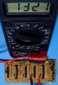
| 12/18/2002 08:40:15 AM |
Test Engineeringby paynekjComment: Nice view, good background and pretty sharp. Probably you could have made it more intersting if you would have worked with the light a little better and it would also have been nice if a few of the LEDs were on. |
| Photographer found comment helpful. |
| 12/18/2002 08:35:25 AM |
Sherwin-Williams Paint, Ops Mgrby falveyComment: I like this very much, although for itself the image is not recognized as "occupation".
Could also be a little sharper, but I guess you had a hard time getting it focused anyway. |
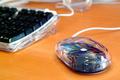
| 12/18/2002 08:29:11 AM |
Desktopby bstewartComment: Of all the keyboard-mouse images I like this most for it's color and use of DOF.
The reflection on the mouse turn out great colorwise. The thing in the upper part hower disturbs a little. |
| 12/16/2002 08:13:48 AM |
|
Home -
Challenges -
Community -
League -
Photos -
Cameras -
Lenses -
Learn -
Help -
Terms of Use -
Privacy -
Top ^
DPChallenge, and website content and design, Copyright © 2001-2026 Challenging Technologies, LLC.
All digital photo copyrights belong to the photographers and may not be used without permission.
Current Server Time: 07/16/2026 09:10:25 AM EDT.