DPChallenge: A Digital Photography Contest You are not logged in. (log in or register
 
Browse Settings
Currently viewing:
Registered UserHarz_Joerg

Show comments:

Per page:

Order:

Comments:


Comments Made by Harz_Joerg
Pages:   ... ...
Showing 311 - 320 of ~463
Image Comment
Artificial Heart
01/23/2003 06:33:57 AM
Artificial Heart
by nds

Comment:
You were realy lucky in finding one of the very few interesting signs of the challenge. Not only is it old, scratched and the tree is grown over it, its heard shape is wonderfull and you have a grat ese in seeing this. Most people would have passed by (including me).
However, somehow the cropping or size does not work well: on the thumbnail the "heart" is more obvious then on the enlarged picture. It's so big that the viewers eyes do not get the shape with one single view, his eyes have to move.
A square shaped cropping with a smaller sign might have been better.
Still, a very good picture with a wonderful idea. Good luck to you
Photographer found comment helpful.
Puppy's Nose
01/23/2003 06:20:53 AM
Puppy's Nose
by cassber

Comment:
I apreciat in your submission that it is very consequent: because it's quality is not good at all (focus, contrast, light etc.) I assume that it should be seen more as a joke, not intended to score high or address dog-lovers.
And as a joke -only be understood on this site- it's great. Acctually I missed a good dog nose in the last challenge.
I hope my interpreatation is correct. However, I will not vote it high.
Nailed
01/23/2003 06:14:14 AM
Nailed
by jmsetzler

Comment:
One of my few favourits this time: I like it's almost graphical style, the angle of view and the small number of colors. The texture is great too.
The blue sky is very important and seeing more of it might have been even better.
Also the nail is a little dark and thus hard to see on the first look.
Still a wonderfull road-sign picture living from color, composition and of course the topic. Good luck to you.
Highway 314
01/23/2003 06:07:27 AM
Highway 314
by vjoz

Comment:
I really like this picture! It's one of my very few favourits this time.
I like the color choice, the wonderfull composition (not many pictures of this challenge used special angles). It's one of the few pictures with space.
It could be a little darker though in the bright parts: the street reflection and the lamps are somewhat bright. I like the dark sky too.
So for me it is a winner and good luck to you.
Photographer found comment helpful.
Over all hilltops is peace - in all the treetops you feel - barely a breez; .... (Goethe)
01/20/2003 04:41:03 AM
Over all hilltops is peace - in all the treetops you feel - barely a breez; .... (Goethe)
by Harz_Joerg

Comment:
Thanx for all the wonderful and informative comments.
Reading the comments is as exciting as looking at the vote.

The outcome of my submission surprised my: I didn't though it would do so well. 6.28 in this wonderful challenge is great.

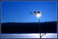
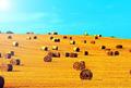
In my opinion my submission came short regarding the challenge-topic: the landscape was not the main object, it was more the weed. I also knew that some people might have problems realizing what they are looking at.
Therefore I added this long title to strengthen the intention.
Here is whole poem of Goethe for those who are interested:

SAMENESS
Over all hilltops
is peace
in all the treetops
you feel
barely a breeze;
The birds in the forest have
stopped their song
Wait, before long
you too will be still.
(Translated by Brigitte Dubiel)

I thought this poem fits well to the picture.

I submitted the picture simply because I liked it very much for its simplicity.
I had to crop it very tight, because in all directions there were other weeds disturbing the picture. I also sharpened it and strengthened the blue color.
One big problem while taking the picture was that I could not judge it right on the spot: the sun shined so bright, that even with my sun-shade I could not see my LCD-screen well enough to determine sharpness and exposure correctly. It was also very cold, windy and I had to go into the deep snow with my knees to make the shot.

Thanx again to all voters and commenter

Jörg

Sunset Lake
01/16/2003 06:27:18 AM
Sunset Lake
by LauraLee

Comment:
Why is it so small? The clouds are great with nice features I would like to see in more details. Also the color is great. You might have cropped the bottom portion a little more: the black area is not adding anything and thus unnecessary.
Photographer found comment helpful.
City Landscape
01/16/2003 06:24:03 AM
City Landscape
by kristie380

Comment:
I have to admit that I do not like this picture very much. While I don't mind submitting a view to a city in this landscape challenge (there are very good cityscapes in this challenge) I like to see a wide view to a scene with only a few different details. This picture has too many details, it would better fit to a challenge like traffic or so. My eyes can not find rest anywere.
Could be sharper and less noisy too.
What I like are the cars: the look like toy cars to me.
Road to Fogginess
01/16/2003 06:17:29 AM
Road to Fogginess
by kiwiness

Comment:
while I first rated your submission not so high, on the second look it apears to me as beeing very good. When I rushed through the pictures I didn't notice the nice texture of the road and how it's bended. Also the asymmetric framing by the trees on the left and the bush on the right is good: the small bush gives way to allow the viewer to get a view to the hill behind the fog. This hill could have been more visible if you would have increased the contrast though or reduce the brightness. Still very good and fitting to the challenge topic.
Photographer found comment helpful.
Hay, thats nice!
01/16/2003 05:59:18 AM
Hay, thats nice!
by Martin

Comment:
The composition is wonderfull and you have choosen a great topic. In my opinion it could have been improved by choosing a darker and deeper blue for the sky, but maybe this was not possible. Together with the yellow it looks a little artificial to me. Also the bright spot from the sun in the upper left corner does not add something in my opinion. Still a great picture for its topic and a 8 from me.
Photographer found comment helpful.
Windswept Tree
01/16/2003 05:49:14 AM
Windswept Tree
by lisae

Comment:
I like the texture of the sky (could be a little darker though to show the blue parts better) the tight cropping at the bottoom and top and of course the center topic of your picture, the tree. It might have been nice if there would have been more room to the left and right to strengthen the feeling of space though. Still very good and a 8 from me.
Photographer found comment helpful.
Pages:   ... ...
Showing 311 - 320 of ~463


Home - Challenges - Community - League - Photos - Cameras - Lenses - Learn - Help - Terms of Use - Privacy - Top ^
DPChallenge, and website content and design, Copyright © 2001-2025 Challenging Technologies, LLC.
All digital photo copyrights belong to the photographers and may not be used without permission.
Current Server Time: 09/16/2025 09:56:56 AM EDT.