| Image |
Comment |
| 02/06/2003 03:40:53 AM |
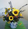
Floral Arrangementby jgillardComment: The flowers and the pot look very nice: the arrangment of the flowers, the color (although they could be more vivid) and sharpness. It's a little bright in some parts of the flower and the ligth is set a little flat (probably due to using a flash!?).
What really makes the picture look not too great is the table, the backgound and most important the two green boards. Taking them away and using a lower angle so the table would not be seen too much would have made the picture a lot better. |
 Photographer found comment helpful. Photographer found comment helpful. |
| 02/03/2003 09:19:21 AM |
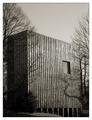
Where square people live.by Harz_JoergComment: Thanks for all the comments, especially the "what is it?"-comments.
Here's what it is:
It's the newly build archive of the "upper-mining-authorities" of northern Germany, located in Clausthal (Oberbergamt).
So it's a building containing all the files and books about mining dating back for maybe 400 to 500 years up to now.
Such a building does not need any windows, only at ground level there are some.
The architecture is extremely modern (the other side is even more interesting), because it sets a strong contrast to the main building that is more then 100 years old.
The window you see is actually some artistic addition to the building: on both side of the wall there is such a window and in the middle of the room there is nothing more then a table with a pile of books. Unfortunately I could not capture that well enough from below.
Thanx again for your interest. |
| 01/30/2003 07:24:58 AM |
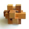
Puzzleby JamieWillmottComment: Great picture regarding light, color, texture of the wood and the focus.
What I like most is the gradual decrease of brighntess of the puzzle from the right to the left. Also the soft shadow of the puzzle on the background is great.
It is not too "square", it's more "geometry". However, it still fits the challenge IMO. |
| Photographer found comment helpful. |
| 01/30/2003 04:49:44 AM |
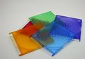
Plastic Rainbowby jgillardComment: Good choice of color in your submission. Somehow you had bad luck that the topic is choosen by other submitters. This usually leads to lower votes. The colors could be more vivid and the image itself a little brighter though. I like the arrangement of the disk covers and the simplicity of the picture: its a one-view-fully-captured-image. |
| Photographer found comment helpful. |
| 01/27/2003 05:20:40 AM |
"Honey, you missed the Stop-Sign!"..."No!"by Harz_JoergComment: Thanx to all the commenter and voters.
I have to admit that I was not very excited about the topic of this challenge. Therefore I thought: lets make a funny submission. Maybe this time my humor is understood. It seemed that it worked well enough.
Here is how I made the shot:
I took the spare-tire out of one of our cars and cleaned it. I also took a concrete-plate from the garden and cleaned it too. I did bend a nail, did cut it just below the bended part and glued the printout of a stop sign onto it. Arranged everything in my livingroom, sprayed the tire with water and made the shots. Not that the nail is not nailed into the cement, the sign is just laying there.
I needed the water, because otherwise the upper part would be only dark without contrast. Actually I wanted to roll the tire over the sign to make a picture similar to "Swish" (//www.dpchallenge.com/image.php?IMAGE_ID=6897), but the tire was simply too heavy. Setting the light was a problem too, so after some time I gave up and took the best I had for my submission, knowing that technically it could have been done better.
Jörg
|
| 01/27/2003 05:05:24 AM |
Over all hilltops is peace - in all the treetops you feel - barely a breez; .... (Goethe)by Harz_JoergComment: Thank you very much Natasha for your critique on my submission.
As I can see from your comment and from most of the others, I realized to achieve one think with this picture that is more important to me then a high rank: I was able to transfer to the viewer the intention I had in mind when submitting this picture.
That was stillness and peace. These were my thought when I first saw the picture on the computer (during shooting this was not my impression, it rather was "it so cooooooled!").
Thanx again.
Jörg
|
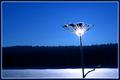
| 01/24/2003 05:10:26 AM |
Only in Boston can you be heading North AND South at the same time!by svitalComment: The topic of you submission is great. However, it looks a little too snapshoty. I assume it is actually a snapshot taken out of the car and you could not do much about the composition while taking it. So improvements could have been done only later on the computer. Rotating it to aling the sign horizontally or maybe almost diagonal, taking away as many colors as possible so only the green, blue and red is visible, change of the cropping, all this might have added something to the picture to make it more atractive to the viewers eyes. Still, because of the topic a good submission in my view. |
| Photographer found comment helpful. |
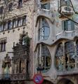
| 01/24/2003 04:52:18 AM |
Signs by Antoni Gaudiby bcncrazyComment: I like the architecture of Gaudi a lot: it's so different to anything else. Only Hunderwasser-buliding can reach him a little, although the styles is of course different.
To your picture: In my opinion you should have saved this treasure for a different challenge, where it fits better. In this building there are so many things that almost every challenge is suited. Hover, road-signs do not fit too well: the no-parking sign is in my view only disturbing and I would not call a building a road-sign.
For presenting the building itself, the composition should be changed: the tree-branches on the right side disturbe, on the left side not. A closer point of view, more of the Gaudi-building and the use of a different angle of view would have made the picture more interesting.
|
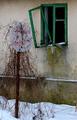
| 01/24/2003 04:41:41 AM |
Abandonedby miracComment: The topic of your picture is awesome and your composition with the green windows too. I thing it could have been improved by lowering the saturation of the colors yellow, blue and even red and strenghten the green. I tried it and in my opinion it looks better: the dirt below the the window will look not as dirty but rather like a patina. A frame might have been nice too.
Still a wonderfull picture. good luck to you. |
| Photographer found comment helpful. |
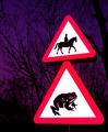
| 01/23/2003 06:41:06 AM |
Beware of the Giant Toadby KonadorComment: LOL, a wonderful combination of the two road signs. Even without reading the size mismatch is the first thing I noticed. I like the color and darkness of the background: it's more like a surface on which the main-objects rest. Like in a studio-shot with colored and textured background.
Because you probably used the flash, the sign appear a little flat, more like a graphic rather then a real life object. I can't say if this is good or bad.
Good luck to you.
|
| Photographer found comment helpful. |
Home -
Challenges -
Community -
League -
Photos -
Cameras -
Lenses -
Learn -
Help -
Terms of Use -
Privacy -
Top ^
DPChallenge, and website content and design, Copyright © 2001-2026 Challenging Technologies, LLC.
All digital photo copyrights belong to the photographers and may not be used without permission.
Current Server Time: 07/16/2026 10:10:44 PM EDT.