|
|
|
Showing 171 - 180 of ~463 |
| Image |
Comment |
| 01/02/2004 04:05:27 AM | Sony Unpluggedby rameviComment: Greetings from the Critique Club
Initial thoughts/My opinion
Nice composition, it has a 3D touch because of the narrow DOF, good colour choice, Woow-factor is missing.
Content/Composition
The content is of course something everybody knows and that's usually a good choice for macro-shots: to show something well known on an unusual length scale, allowing to see details otherwise unseen.
However, probably everybody has looked at earphones at this scale though.
So you tried to work via the arrangement and angle of view to make them appear more interesting. To me it worked at least in parts: crossing them works very well to me and especially that the focal plane is tilted relative to the surface was a great choice. This leads to the nicely focused surface texture on the lower right and the good focus on the Sony-symbols, and hence it's 3-dimensional. Like that very much!
The shadows are well placed and cropping and overall placement of the interesting parts is well made too. Also, it follows the rule of third very well.
A major compositional drawback is the glare on the Sony symbols: they are the focus, and hence they should be without any strong disturbances. Trying to move the reflections of the lamp somewhere else might have help (maybe not possible) or the use of a polarizer.
Camera work -technically
Beside the reflections noting worth mentioning. Good camera work. Especially it's sharp were it should be.
Digital Processing - Technical
Also well made, especially not over sharpened. Also your colour choice was good and the level adjusted well too. You might have tried to get rid of the reflections via the software, because that would have been allowed.
Fits the challenge
Of course it does
Keep up the good work and
Good luck for you further submissions
|  Photographer found comment helpful. Photographer found comment helpful. |
| 01/01/2004 06:43:40 AM | Flying logby qnjtComment: Great scenery and wonderfull clearity. Nice title too.
Have you ever tried to turn it upside down and then crop away the top: gives a very surreal result with everything flying in the clear reflection of the sky. | | Photographer found comment helpful. |
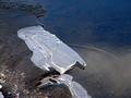
| 01/01/2004 05:45:23 AM | DSC02961an-edgecontrast.jpgby amsmythComment: Just saw your altered version and I like to comment on it.
Acctually now the water surface is too nerveous IMO.
One likes to see even more whats below the surface, but it's not possible. So darkening it more would be better IMO.
Here's my try on your image:

It's also strongly croped, leading to a nice effect I didn't notice before: the lines on the ice do lead to the bright spot at the tip.
It's of course a little narrow on the right side, but maybe the original file allows to move everything a little further to the left, to achiev some negative space effect. |
| 01/01/2004 04:30:50 AM | Made In Chinaby ScantyNebulaComment: Greetings from the Critique Club
Initial thoughts/My opinion
Great macro shot, which lives from the two colours, shape and use of a narrow DOF. Like it very much. Misses the often discussed "WooW-factor" though.
Content/Composition
I like what I look at, because it shows an everyday item in a clear presentation. Well suited for a macro challenge IMO. The pink and blue work very well for me, although pink isn't my favourite colour.
Maybe that's a point for understanding why it has been scored rather low by the voters: it is not a macro shot where one says: "Woow, didn't know that the world looks like that on small scale" or something like that. Hence, the has to speak by its higher then average technical quality (it does have it!) and has to address the voters mind by appealing shapes and colours. I could imagine that many voters just didn't like the colour pink!
Composition is very fine and well thought of: the diagonal foreground and the curved tape in the back result in a nice contrast with respect to shape. Also the use of a narrow DOF works very well. One thing that might have been interesting with respect to composition would have been to try to bend the tape in a way that one can see the transition from the straight foreground diagonal to the curved background. Not sure if it would work well, just a thought of mine.
Also to be able to see the details of the tape works well: gives the image texture on a small length scale.
Light is very well set.
Camera work -technically
No issue here: you know how to handle your camera and it shows. Especially exposure is right on the spot!
Digital Processing - Technical
Also nothing special to mention: sharpening is just right, the blue background is absolutely homogeneous without any noise. Just perfect.
Fits the challenge
Of course, it is a macro so it fits. Well selected title too.
Keep up the good work and
Good luck for you further submissions
| | Photographer found comment helpful. |
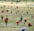
| 12/31/2003 09:00:56 PM | Grief has no boundaries....by TruegshtComment: Originally posted by Truegsht:
Sorry, that is my little rant on this. Why must there always be a focal point, a border? |
Maybe I can give you an answer to your question:
By the nature of photography, i.e. it's limited space on a paper or screen, it has boarders. So your submission has of course borders on all four sides. And because of that, especially when you want to show "no boundaries", you have to choose them very well, otherwise your intention does not get to the viewer.
The way you cropped/non-cropped the picture gave it a strong border: the cemetary ends for the viewer at the bush and trees at the very top.
Cropping it away would give them the feeling the cemetary goes on for ever.
Simillar issues are for the focal-point: if one views an image, the eye always walks arround to find something special. Nobody can avoid that. If there is nothing of interest the viewer looses interest.
In your image there are several foreground objects that are rather uninteresting or even disturbing (the blue flower at the very bottom).
So there would be two option to avoid this: have a focal point which is crisp and well defined and the surrounding gets less important.
Or, and that probably fits better here, have no focal point, but repating structures, which give symmetry and texture. The middle section of your image has this feature and its often seen on great images of military cemetaries.
Hope I could answer your question a little,
Jörg Message edited by author 2003-12-31 21:01:42. | | Photographer found comment helpful. |
| 12/31/2003 08:17:39 PM | | | Photographer found comment helpful. |
| 12/31/2003 02:18:52 PM | Where The Pacific Endsby ellamayComment: Greetings from the Critique Club
Initial thoughts/My opinion
Great colour, contrast and sharpness, but where is the end of the pacific or is it that small that one can see from one side to the other?!
Composition/Content
This image lives from the high contrast between the foreground, the silhouette of the city and the bright, nicely coloured sky and bay water. Even the very bright reflection on the left side works well: gives me the feeling That I need to close my eyes a little bit to see better. Although this does not work of course, I like such effects: they transfer the viewer into the scenery. Also the various soft textures of waves on the water adds the overall mood.
The composition is also well made: I like the absolutely horizontal line of the silhouette towards the water and also the line shown at the lower shore. It's too sad that it's broken by the right bench: a slightly different angle making both benches being at the same height relative to the shore line might have been better, because the image lives somehow from lines made by men and nature (by nature this I mean the trees).
Camera work -technically
Nothing to complain about, very well done: crisp and sharp, especially the silhouette, even the distant trees turn out very well and not fuzzy at all. Also well exposed: as already mentioned I like the overexposed portion, so that's OK with me.
Digital Processing - Technical
Also very well done. Maybe only sharpened a tad too much, which leads to some jaggies in the benches, but elsewhere sharpness is just right. Also you might have increased the contrast a little to lose all structures in the grass at the bottom.
Fits the challenge
Here is my problem with your submission and it's not the image itself (it shows some very well defined edges when taking the challenge subject literally). It's the title that lead for me to a totally different expectation: as mentioned above, I do not see any end of the pacific.
However, it's just a title! But this might explain to you how some of the voters have seen your otherwise great submission
Good luck for you further submissions
_______________________________________________
PS: As this is one of my first Critique Club critiques, it would be helpful to get some feedback if you like.
Forgotten: Happy New Year to you! Message edited by author 2003-12-31 14:41:02. |
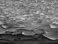
| 12/31/2003 01:01:28 PM | At the Lake's Edgeby vtruanComment: Greetings from the Critique Club
Initial thoughts/My opinion
Lots of edges and texture on various length-scales, starting by the frost/snow on the large ice plates via the small ice pieces up to the largest one. One feels the cold air at this winter lake.
However, a woow-factor is somehow missing.
Composition/Content
On the one hand the content is well chosen because a lot of sharp, well defined edges are shown. On the other hand, the composition is somewhat flat: it's more like a texture image with the third dimension missing.
Not sure if a tighter crop, a lower angle or both would have worked better, but that's were I see the major improvement possibilities.
While almost all shades of grey from black to white are included it appears also to be of rather low contrast. Maybe a more artistic approach with strong contrast could be a solution. However, that's not everybody's taste.
Also, B&W works of course well here, but a blue tint might have been as good.
Camera work -technically
No issue that I can see. The use of a wide DOF works well. Exposure is also OK
Digital Processing - Technical
Also nothing special to be mentioned. Especially sharpness shouldn't be increased, otherwise it would become to grainy
Fits the challenge
Yes, in the literal sense of "on the edge".
Good luck for you further submissions
As this is one of my first Critique Club critiques, it would be helpful to get some feedback if you like.
| | Photographer found comment helpful. |
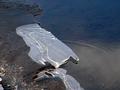
| 12/31/2003 07:16:26 AM | At the Water's Edgeby amsmythComment: Greetings from the Critique Club
Initial thoughts / My opinion
Fits well to the challenge, well selected place, only the composition could be improved to give it a wow effect
Composition/Content
The content you showed us is very well picked: the ice plate has some wonderful curves and reflections, especially the strong reflection at the lower tip is great. So your choice was excellent. The white spots on the ice are a little disturbing but were probably unavoidable.
The water in the lake appears a little undefined: it's not clear enough to see well what's under the surface but also not reflecting enough to be just a smooth, homogeneous background for the wonderful ice plate. The ripples, which probably originate from water drops of the nice tip are a strong element. Sad that they are so weak.
The image comes somewhat short in the composition/cropping: the shore that can be seen at the top and the lower left do disturb and lead the viewer's eyes away from the ice. Getting closer or cropping way tighter at the top, left and bottom would have been a considerable improvement. Also consider the use of rule of third here.
Camera work -technically
To me focus and exposure are set very good, maybe a polarizer (or if you used one a different angle) might have brought in some more contrast
Digital Processing - Technical
No particular issue here. Contrast enhancement might have been an improvement
Fits the challenge
It sure does as stated above.
Good luck for you further submissions
As this is one of my first Critique Club critiques, it would be helpful to get some feedback if you like.
| | Photographer found comment helpful. |
| 12/31/2003 05:02:41 AM | The inner Canyons are the deepestby Harz_JoergComment: Thanx for all the kind and informative comments.
As this is my first try on an emotional composition, I'm extremely happy with its outcome.
All critiques are well placed: of course it was staged. Fortunately I didn't have a suicide candidate at hand.
The rope was also something I was aware of that it might be a little too much.
I would have loved it to make it wider, but I could not, because the corridor of our cellar is very narrow and it's made even narrower by the two bars at both side. They once served as reinforcement of the cellar, because it was used as bomb-shelter during WWII.
Thanx once again to all voters and commenter,
Jörg
|
|
Showing 171 - 180 of ~463 |
Home -
Challenges -
Community -
League -
Photos -
Cameras -
Lenses -
Learn -
Help -
Terms of Use -
Privacy -
Top ^
DPChallenge, and website content and design, Copyright © 2001-2026 Challenging Technologies, LLC.
All digital photo copyrights belong to the photographers and may not be used without permission.
Current Server Time: 07/16/2026 07:38:55 PM EDT.
|