|
|
|
Showing 101 - 110 of ~463 |
| Image |
Comment |
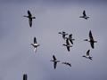
| 01/14/2004 06:12:49 PM | Ready, Aim....by vtruanComment: Greetings from the Critique Club
Initial thoughts/My opinion
To be honest, I do not like hunting, especially on birds, but that's my personal taste. The image is somewhat nervous and grainy and dark.
Content/Composition
I (as probably many) didn't get that there was a shotgun barrel at the lower left. Only by reading your comment I noticed it. Had the exactly same experience once with my "four" submission :(.
As mentioned above the image is somewhat nervous for the following reason: there are too many ducks to get them with a single view, but on the other hand the individual ducks are to large and detailed to see them just as a swarm of ducks. Hence the viewers eye walks around the image searching for something special, which can actually not be found.
Getting less close might have been better. Cropping out most of them and showing only the two left once would have given probably too many difficulties with the graininess (unless digitally taken away)
Camera work -technically
Focus seems a bit off, but I'm not really sure. Exposure is too much on the dark side, but you had probably problems getting enough light anyway as I can see from the camera settings.
Digital Processing - Technical
You could have made the image brighter digitally and of course the barrel more pronounced (though I'm actually not sure if the way you made is allowed, probably yes).
You could have sharpened the ducks more using "smart sharpening" and also blurred using the same inverted selection the noise away. I tried it on the image, works well.
Also some more colour saturation would have brought some more structure to the ducks.
Fits the challenge
Needs the title, but then it fits.
Good luck for your further submissions
|  Photographer found comment helpful. Photographer found comment helpful. |
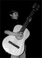
| 01/14/2004 05:09:57 PM | I Will Get Him Lessons!by OneSweetSinComment: Greetings from the Critique Club
Initial thoughts/My opinion
I like the play with size: what a huge guitar for the boy. Also like his expression, made me smile and think of our kids. It's way too dark for me and the title is less inspiring then the image itself.
Content/Composition
For this challenge image and title have to go more hand in hand then for other challenges, because a resolution can be a whole story. While getting your son some guitar lessons, a title like "This year I will become a star" would probably worked better. Such a title would draw the viewer into the image and think about the dreams of the boy and maybe the own dreams as a youngster. Your title made me and probably others "step" outside the image and thing about a parent who has duties and work to do. Often not so pleasant.
The composition itself is well made: placing the guitar along the diagonal is a good choice and the boy's placement follows the rule of third. Also that he wears a black shirt is fine: makes the hand and face stand out more. Black trousers might have been great.
The way you set the light is my main problem I do have with the image: it looks like it is an image taken with flash, judged by the strong reflection at the lower portion of the guitar. Thus the strongly reflecting guitar body is overexposed were as the rest is way to dark, even the face. Some softer light, probably from the side would have been much better.
I like the black background though and B&W was probably a good choice (depends a little on the colour of the guitar).
Camera work -technically
The focus seems to be a little soft, but not too much. Exposure: see above.
Digital Processing - Technical
Could need some more sharpening. Regarding a better balancing between the dark and bright parts there is actually not too much that can be done digitally without breaking the rules.
A border might have been nice.
Fits the challenge
Yes it does.
Good luck for your further submissions
| | Photographer found comment helpful. |
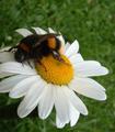
| 01/14/2004 07:28:42 AM | Beee-utifulby trainComment: While i do like the object itself, I have to say that you could have improved the image considerably by a different crop: right now the bee is leaving the image. Closer on it and more centered would not result this feeling. Also the bee is too dark. Good luck. |
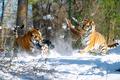
| 01/14/2004 07:23:56 AM | Winter Wonderlandby joshuamliComment: Great action and color! DOF is also used very well. Too sad that the bush disturbs at the lower left.
You should have been way closer: the two kitties look very friendly, don't they? Good luck. |
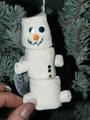
| 01/13/2004 06:53:48 AM | Snowmanby channeledComment: Greetings from the Critique Club
Initial thoughts/My opinion
The snowman is to me one of the tackiest items of the whole show, but the finger spoil the image. Also has some light issues.
Content/Composition
No question: as it has been commented by others the marshmallow snowman is reeeealy tacky but also cute. One sees that it has been handmade and that is nice. Arranging it in the tree was also a good idea, although the tree itself seems to be covered with snow-spray and thus the contrast to the snowman is not as high as it could be.
Main issue to me (as to others) are the fingers (probably needed to keep the snowman from rotation). They disturb so much, because they are as well focused as the snowman and thus attracts the viewers eyes as much. However, they are not important at all. Fixing the snowman from the back with a wooden stick or so would have been way better. Also the brown cookie in the back is not so well placed and thus disturbs.
Camera work -technically
Focus is just right and the narrow DOF works well to make a blurry background. The light is of course an issue: macro or closeup using flash rarely work and your image is a good example for this statement. Things turn out to look flat and cold, and the background gets usually way to dark (here it's the middle portion). Using a tripod or a solid support and a small desklamp to experiment with shadow and light is not only a fun thing to do, but one is always amazed how simple it is to set completely different moods by just moving the light around.
Digital Processing - Technical
You have might considered to change the tint of the image digitally to a warmer colour. Also a tacky border might have been good here.
Fits the challenge
Good luck for your further submissions
|
| 01/13/2004 06:34:26 AM | Beary Christmasby Dim7Comment: Greetings from the Critique Club
Initial thoughts/My opinion
Nice tacky decoration but the way it is presented is not very interesting.
Content/Composition
The content itself is great and for sure tacky, but presenting it in front of a white background was not a good idea, especially because the bear has a white, lower portion. Hanging it into the Christmas tree or in front of a dark-green paperboard might have been way better. Also the angle of view is to straight: a little from the side so one sees the third dimension would been good here. Of course not too much, because it is necessary to be able to read the text.
To the bear itself: I wonder what these lines and speckles are, but it was probably not possible to get them away.
Camera work -technically
Exposure is a little dark on the bear, probably because the automatic metering had problems with the large amounts of white. It seems to me that the flash was used (reflections in the eyes and harsh shadows). A softer light would have been better here. Focus is fine.
Digital Processing - Technical
You could have adjusted the overall tint towards a warmer colour instead of the bluish one. Also for this angle of view a slight rotation is need to make the bear levelled.
Fits the challenge
Yes, very tacky!
Good luck for your further submissions
|
| 01/13/2004 06:18:57 AM | Cellphones anyone?by oksamitComment: Hi,
I used the wrong comment box to place my CC-comment, but to get another image to comment on I have to fill out this comment box too.
Jörg |
| 01/13/2004 06:16:45 AM | Cellphones anyone?by oksamitComment: Greetings from the Critique Club
Initial thoughts/My opinion
That's tacky! Composition is a little flat with too much to see that is not necessary.
Content/Composition
I think that the content itself is well chosen: Santa with plenty of cellphones is tacky, already on the edge of tasteless. And I think the voters saw this too.
All the stuff on the desk and in the back do of course disturb a lot. Assuming that it wasn't your store where you took the picture and you were not allowed to rearrange things, the only thing that might have helped would have been a different angle of view. Probably more from below would have been better. But kneeing down in a store is not what everybody likes to do.
Composition with light was probably also not possible to get the back darker, am I right.
So I thing you did it as good as possible.
Camera work -technically
Focus is just right and using 2.2 as aperture was a wise choice to get the back as blurry as possible. Exposure is fine, maybe a little bright. A very gentle fill flash might have been interesting, but I do not believe that in this way you would have gotten the Santa well exposed in front of a darker background.
Digital Processing - Technical
Santa appears a little soft and cropping could have been improved: either a way stronger crop to focus more on his face and the phones, or a bit wider at the top and bottom to see the whole figure. A nice frame might have been great too.
Fits the challenge
Yes, for sure
Good luck for your further submissions
| | Photographer found comment helpful. |
| 01/12/2004 04:35:30 PM | time to get some reading doneby camelotnorthComment: Like the play of light and shadows and pose of this one. Also fits very well to the challenge.
It's just too bright and also could have been improved considerablly by moving the phone and other items away and place a cup of tea or glass of wine/whisky there. | | Photographer found comment helpful. |
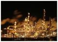
| 01/12/2004 04:30:11 PM | Nightshiftby geewhyComment: I personaly like to look at these bright shinning plants very much: can't take my eyes from them when I pass by.
This picture stands out for its brilliance, the lights come out almost like diamonds. I like the clouds in the back, they give a wonderfull background.
Acctually I was planning to make a simillar image too (not of such a great plant though) and the title would have been also "Nightshift".
Good luck to you. | | Photographer found comment helpful. |
|
Showing 101 - 110 of ~463 |
Home -
Challenges -
Community -
League -
Photos -
Cameras -
Lenses -
Learn -
Help -
Terms of Use -
Privacy -
Top ^
DPChallenge, and website content and design, Copyright © 2001-2026 Challenging Technologies, LLC.
All digital photo copyrights belong to the photographers and may not be used without permission.
Current Server Time: 07/16/2026 07:46:04 PM EDT.
|