| Image |
Comment |
| 05/20/2003 05:48:42 PM |
Pastel complimentsby ploogieaComment: Beatiful picture. I'm not entirely sure about the complementaries, they are quite subdued. But the picture is very nice. |
 Photographer found comment helpful. Photographer found comment helpful. |
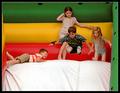
| 05/20/2003 05:45:52 PM |
Jack and Jillby crabappl3Comment: Beautiful. I love the various expressions on the children's faces. The red shows towards the orange on my monitor. ~7 |
| Photographer found comment helpful. |
| 05/20/2003 05:06:52 PM |
Mask paradeby AnastasiaComment: I had a notion to use masks for this challenge, masks and balance, something like that, but couldn't figure out HOW. This is beautiful! No nitpicks. I hope you do well with this entry! |
| Photographer found comment helpful. |
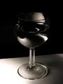
| 05/20/2003 11:04:44 AM |
Black and White glass and waterby christoComment: From the Critique Club,
Christophe, bonjour,
First impression: This is a good shot. Your choice of BW (sepia) is excellent. Meets the challenge with no problems.
The photo has an amazing depth to it, even (and especially) at the top, where the glass melts into the background. The glass looks so rounded and smooth. On my screen it is hard to distinguish that the glass is a bit over half full with liquid (wine?) and I find the two little "hooks" sticking out on either side somewhat disconcerting. The pattern created by the liquid is quite beautiful. I'm wondering if the picture would be more effective if it were just a little lighter.
Focus is very good.
I like the slanted horizon line, it works well in this photo.
Lighting is excellent. This was a hard subject to light properly, and you did it very well. Again, I'm wondering if just a bit lighter overall would improve it (something to try).
Overall, this is a very good shot, good to look at. Keep up the good work!
Ursula I Abresch |
| Photographer found comment helpful. |
| 05/19/2003 11:54:23 PM |
sweet & sourby Pep VentosaComment: I thought they were both sweet. Granny Smiths a bit less, of course ... Nice picture, love how the apple skin looks painted. Actually, the whole photo looks somewhat "painted". Very nice. |
| Photographer found comment helpful. |
| 05/19/2003 11:49:44 PM |
|
| Photographer found comment helpful. |
| 05/19/2003 11:48:35 PM |
Red and Yellow make Orangeby SonifoComment: Nice picture. The tulips are clear, and the colour is beautiful. The mattin is a bit heavy for my taste. A bit weak on "complementary" colour. Are the stems and green inner border it? |
| Photographer found comment helpful. |
| 05/19/2003 11:45:00 PM |
|
| Photographer found comment helpful. |
| 05/19/2003 11:44:00 PM |
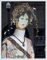
Vintage Ladyby giseleComment: I like this picture, even though I am having a bit of a hard time figuring out the complementary colours. The face looks transparent (I know, it's a reflection, it just looks that way). Good job! ~7 |
| 05/19/2003 11:41:44 PM |
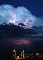
Evening Colorsby rll07Comment: Beautiful sunset! The blue of the sky is amazing. I like the tree silhoutted at the right hand side. The thin blue line (frame) is a good touch. ~9 |
Home -
Challenges -
Community -
League -
Photos -
Cameras -
Lenses -
Learn -
Help -
Terms of Use -
Privacy -
Top ^
DPChallenge, and website content and design, Copyright © 2001-2026 Challenging Technologies, LLC.
All digital photo copyrights belong to the photographers and may not be used without permission.
Current Server Time: 07/17/2026 11:40:49 AM EDT.