|
|
|
Showing 5581 - 5590 of ~6008 |
| Image |
Comment |
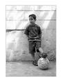
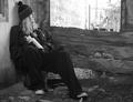
| 08/18/2003 06:50:24 AM | Dream a Little Dreamby lmhrComment: Beautiful picture, well done. I think I recognize the little boy from another picture - might this be Cristobal? ~10 |  Photographer found comment helpful. Photographer found comment helpful. |
| 08/18/2003 06:41:40 AM | | | Photographer found comment helpful. |
| 08/17/2003 09:42:10 PM | Cats and Dogsby patriciabrown2001Comment: FROM THE CRITIQUE CLUB
Hello, Patricia,
First of all, I'm not sure how well I'll be able to write about your picture, because I've never seen the movie from your title. My biggest concern as far as meeting the challenge would be that the picture doesn't necessarily bring to mind the movie, even for those who have seen it.
This is a good picture of your dog. I like your composition, and I like the way the dog is looking at you. I like it that there is no extra border.
Light and colours are very good. Focus is just a tad on the soft side (the eyes look a bit soft - always try to focus on the eyes, which I find rather hard using a digital camera, because on a little screen like the digital cameras have it's hard to see if the eyes are perfectly in focus or not).
Is that a bug on the beagle's nose? I think the picture would be improved just a little if that were not there (I know, I'm being picky). Also, I think your background is quite beatiful, appropriately blurry, and the branch by the dog's paw is well placed, but there is a 2x4 or fencepost (or something like that) sticking out right next to the dog but in the background - I think (and again, this is just my opinion) that the picture would be better if that were not in it. Details, details, I know.
To sum up, this is a nice picture of your dog. It's pleasing to look at, but it could be improved with a tad sharper focus and with attention to a couple details. It meets the challenge, but not "head on" or in a "hit you in the face" manner, and thus probably went somewhat unnoticed.
Hope this helps a little. Keep up the good work!
Ursula (uabresch)
Comments, complaints, questions ... feel free to contact me. | | Photographer found comment helpful. |
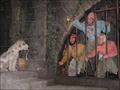
| 08/16/2003 08:00:41 PM | Pirates of the Caribbean: The Curse of the Black Pearlby bryskydComment: FROM THE CRITIQUE CLUB
Hello, Bryan,
I'm so glad I got this picture! I loved Pirates of the Caribbean (I've seen it three times). I've never been to Disneyland, and, if my kids wouldn't have told me, I wouldn't have known that it was based on Disney characters.
I think this was a good entry to the "Movies" challenge. It certainly couldn't be anything but that movie!
Your photo is good technically, although the light could be just a tad better. Your crop is very good. There really is not much wrong with the picture (except maybe the light a bit).
So you ask, why didn't it get a higher score? My guess is that the whole scene somehow looks too unreal, or "plastic", which takes away from the impact of the photo. Somehow the emotion gets lost with the fake figures. It's weird how that happens, but that's what I think happened here. Like my little girl tells me, "Why couldn't he get Johnny Depp to pose for him?"
Anyway, I like your entry, it is very appropriate to the challenge, and well done. Take care,
Ursula (uabresch)
Comments, questions, complaints ... feel free to contact me. |
| 08/16/2003 07:51:02 PM | Bell, Book, And Candleby joannadivaComment: FROM THE CRITIQUE CLUB
Hello, Joanna,
I wasn't around for the voting on the "Movies" challenge, and I haven't taken the time to look over the entries, so, this is the first time I see your photo. Also, I don't know the movie this picture is based on. But, on first impression I like your picture! As a matter of fact, I think I might like to look up the movie (I like older movies - this is an older movie, right?)
Your composition is excellent. Everything looks like it should be where it is, and even though it looks set up, it also looks very natural. That is very interesting.
Light and colours are very good. The pure black background is excellent. The only place where it could possibly be improved is on the right side of your face, especially the shadow from the cat.
Focus is a bit off - and that is probably the main reason you didn't get a better score. It looks like you focused in front of the cat, more or less where the bell is, but everything in front and in back is somewhat out of focus. I don't know what f stop you used (or if your camera allows you to adjust f stops), but using a higher f stop (f8 or so) will give you better depth of field.
Anyway, I like your entry very much. I love the smile on the girl's face (is that you?), and the fact that the cat seems fascinated with the candle. Good work!
~Ursula (uabresch)
Comments, complaints, questions ... feel free to contact me.
| | Photographer found comment helpful. |
| 08/15/2003 09:58:31 PM | broken windowby ramoneComment: Very nice! I like how the hole in the glass looks like a person, and how you can see the painted face on the wall through the hole. Very good! ~10 | | Photographer found comment helpful. |
| 08/15/2003 09:57:19 PM | The Last Strawby arnitComment: Beautiful!!! Excellent silhouette picture. The colours and the blur of the background are just right. ~10 |
| 08/15/2003 09:56:39 PM | A Brush with Decayby moodvilleComment: Great title, wonderful closeup! Not everyone can make something like this look so beautiful. ~10 | | Photographer found comment helpful. |
| 08/15/2003 09:55:55 PM | | | Photographer found comment helpful. |
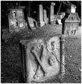
| 08/15/2003 09:54:53 PM | Sadness ......by agwrightComment: What strange gravestones! Are they gravestones? Good entry for the challenge, b/w is very appropiate and well done. | | Photographer found comment helpful. |
|
Showing 5581 - 5590 of ~6008 |
Home -
Challenges -
Community -
League -
Photos -
Cameras -
Lenses -
Learn -
Help -
Terms of Use -
Privacy -
Top ^
DPChallenge, and website content and design, Copyright © 2001-2026 Challenging Technologies, LLC.
All digital photo copyrights belong to the photographers and may not be used without permission.
Current Server Time: 07/19/2026 09:53:16 AM EDT.
|