|
|
|
Showing 4221 - 4230 of ~6008 |
| Image |
Comment |
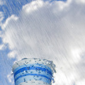
| 06/09/2006 05:12:32 PM | (Words are) Flowing Out Like Endless Rain Into a Paper Cup - "Across the Universe"by LoreneComment: Hello from the Critique Club:
I am so glad I got this image to write about, I love it! It's always easier to comment on something you like. The only problem is that I think the image is pretty much just right the way it is. Hmmmm.
Anyway.
For the technicals:
Focus is right on - the cup, drops, and "rain" are all nicely in focus, while the sky is soft in the distance.
Exposure - F8 & 1/250 sec seem to have worked just right here. If you would have wanted to get a more streaky background (traces of water coming down) then you'd have to use a lower shutter speed (1/60 or so), but then the drops in the air would not have been as clear. There is a series of flower images made in front of a sprinkler, at 1/30 to 1/60 shutter speed, backlit (that is, sun, shower, flower in that order) that look absolutely beautiful - maybe you've seen some of them.
Lighting - seems just right to me also.
Composition - Just something that comes to mind, there are few square images that win at DPChallenge (I don't know why). I like your composition quite well. Maybe it would be worth experimenting with placing the cup at the bottom right, so that it looks like more of the rain is actually flowing into the cup (right now, there is a big area to the right where the rain isn't going anywhere so to say). The slightly blurry area at the bottom right might also have thrown off some viewers. But I like the cut as it is.
Meeting the challenge - this is probably the area where your image suffered most. The lyrics read "flowing out", yet the image has a feel of "flowing into". The image does not convey the idea of rain very much - that might have hurt. You did really well though, a top 20 finish at DPC with your 4th entry is quite an achievement.
I am looking forward to your future creations. Congratulations again on an excellent entry.
~Ursula
--------------------------
If you have comments/questions/complaints, feel free to contact me. |  Photographer found comment helpful. Photographer found comment helpful. |
| 06/09/2006 11:29:26 AM | Sparklingby Dax-Comment: Wow, Bea, this is just perfect! I missed it before somehow. You're so good! | | Photographer found comment helpful. |
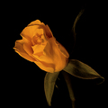
| 06/09/2006 12:37:31 AM | Yellow Roseby tonyvComment: Tony, hello from the Critique Club:
First of all, congratulations on a good finish with this image. You scored higher than your prediction :)
First impression: It's a beautiful rose. The stem in the background is rather distracting (as the images load top to bottom, you get to see the stem first, before seeing the rose).
Focus: Right on. No problems here.
Exposure: Again, seems just right for this image.
Lighting: Looks to be quite good, although the rose does not look yellow, but orange, and that might be due to the desk lamp light (incandescent?). A different white balance might work better in this situation. Your contrast masking probably changed the whole thing a fair bit.
Composition: Quite good again, the stem in back is not needed IMO, and the bottom leaf looks to be cut off ever so slightly. Hard to tell if not cutting it off would change the image much or not. The flower looks rather leathery, not delicate at all. The orange on black with hints of green is beautiful.
Overall: A solid, well done entry, with a good score.
Hope this helps!
~Ursula | | Photographer found comment helpful. |
| 06/09/2006 12:23:01 AM | Fountains at my workby HedsIcComment: Hello from the Critique Club.
I am having a difficult time writing a critique for this image, because I know that you will be upset if I also say that it looks like multiple light sources, not just one. But here it goes.
Focus is OK, the building, trees and fountain are clear and sharp, the grass, sidewalk and flowers less so but within acceptable clarity.
Exposure: It is difficult to get a good exposure when you have such a contrast between the very light building and the dark surroundings, especially the very dark sky. IMO the lights look blown out, whereas the sky could be lighter. I am not sure how you could achieve this in this situation, except for making a couple identical exposures (one for the sky/other dark portions, the other for the building and other light portions) and merging them in post-processing. Using more than one image would not be legal for the challenges though. Sometimes you can get the two layers (two exposures) from one RAW image.
Composition: Essentially OK. The centred building makes for a rather static image. The colours look rather brown on my screen, and I don't know if this was intentional or not.
Overall: This image was probably not the best choice for this challenge - it really does look like multiple lights (the V shaped shadows would seem to indicate that there is more than one light source). Outside of that, the image is not really captivating enough to sway voters to give you a high score in spite of the perception of DNMC.
Hope this helps.
~Ursula |
| 06/08/2006 08:33:42 PM | | | Photographer found comment helpful. |
| 06/08/2006 08:32:28 PM | Converseby ChilibeanComment: Beautiful! Now who says centred pictures don't work. Very interesting in B/W. | | Photographer found comment helpful. |
| 06/08/2006 02:58:43 PM | New Nokiaby errasmusComment: Hello from the Critique Club:
First of all, welcome to DPChallenge. I hope you enjoy it here.
First impression: Interesting image, the blue light is quite beautiful.
As for it being a match for the challenge, it is, but it is somewhat difficult to realize that it is just one light (from the cell phone) - it almost looks like two lights, one the blue shining on the strap, the other the yellow/green coming from the cellphone itself.
Exposure looks to be quite good.
Focus is a bit problematic in this image, the only thing in focus is the part of the strap with "Nokia" on it. You used F 3.6, it probably would have been better to use your smaller F stop (higher number) and a tripod (or other firm surface), because you'll need a longer exposure for the smaller aperture. IMO, the selective focus you get while using a large aperture (small F stop number) can be very beautiful, but you have to be careful with it - in general the out of focus parts need to look as if they are intentionally out of focus, not just blurry. I hope that makes sense to you.
Lighting is good, yet, as mentioned above, it looks as if it were two light sources, not one.
Composition is also OK, although the phone and strap are right down the vertical middle of the photo, and it might be worth trying a slightly different angle.
Overall: A solid image, with beautiful blue colour.
Again, welcome to DPChallenge - I'm looking forward to seeing more of your photography.
---------------
If you have any questions/comments/complaints, feel free to contact me. Take care,
~Ursula | | Photographer found comment helpful. |
| 06/08/2006 12:57:47 PM | Rainbow Shotby steffyldComment: Stephanie,
hello from the CC:
First impression: Interesting image, the colours shining through the glasses are beautiful.
It is a good match for the challenge.
Exposure looks to be right on.
Focus IMO is a bit off, it seems to be on the back glasses, and in this case I think that either all glasses should be in focus, or the front glasses should be in focus fading to the back. Whether to have it all in focus or use selective focus is a personal choice, mind you, but in this case I find the selective focus slightly distracting.
Lighting is good, it is stronger in back (on the back glasses), and the effect of the darker glasses towards the front/lighter to the back is quite beautiful. The staggered shadows created on the backdrop add good drama.
Composition is very good. If anything, it might be worth trying to eliminate (crop?) some of the dark space at the bottom. That area is not doing much in the picture, and it might be a stronger image if the bottom were higher up.
Overall: A well done, solid image, with quite a bit of visual appeal, and only your second entry and you're at almost 6.4 already! Congratulations. That's excellent. I'm looking forward to seeing more of your photography.
---------------
If you have any questions/comments/complaints, feel free to contact me. Take care,
~Ursula | | Photographer found comment helpful. |
| 06/08/2006 12:37:46 PM | Ultra Violet Pansyby MQuinnComment: Hello from the CC:
First impression: This is an "in your face" shot, both because of the vivid colours on black background, and because you pretty much filled the frame with the pansy. I think that a lot of viewers might have thought, "Weird!", when first being presented with this image.
It is a good match for the challenge.
Exposure looks to be right on.
Focus is quite good, except for a couple water drop (middle left side). IMO, if you're going to have stuff out of focus, it HAS to look like it is out of focus on purpose (especially for DPC voters), and even then most people will mind :)
Lighting is good, but it looks a bit stronger on the left, that is, the right side looks to be more in shadow. It is not slanted enough to create shadow textures, yet it is not right on either. I am not sure exactly what to think of it, but IMO, in this case, it would have aided the image to have even lighting.
Composition is good, I see nothing wrong with it. Centred does work some times. This image, even though it is centred, doesn't give the feeling of centred, I think mainly because of the horizontal colour striping (I like that). The pansy looks rather static (which I guess it is). The droplets look a bit like gel rather than water.
Artistic: This is a well done, solid image, but from an artistic point of view it seems to be lacking that little extra pizzaz that would make it a beautiful image for beauty's sake, or a message/story that would speak to the viewer (or maybe both).
Overall Right about 6.0 is a good score. As above, this is a well done solid entry. The colours in particular are lovely.
---------------
If you have any questions/comments/complaints, feel free to contact me. Take care,
~Ursula
| | Photographer found comment helpful. |
| 06/07/2006 09:59:57 PM | | | Photographer found comment helpful. |
|
Showing 4221 - 4230 of ~6008 |
Home -
Challenges -
Community -
League -
Photos -
Cameras -
Lenses -
Learn -
Help -
Terms of Use -
Privacy -
Top ^
DPChallenge, and website content and design, Copyright © 2001-2026 Challenging Technologies, LLC.
All digital photo copyrights belong to the photographers and may not be used without permission.
Current Server Time: 07/27/2026 06:05:46 PM EDT.
|