| Image |
Comment |
| 04/19/2011 12:08:21 PM |
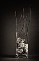
Creationby jmritzComment: I wondered what sort of inspiration that one word could have brought. Really funny! :)
During discussions in the Jury group, I referred to this one as "Walmart" at least once, so I guess my mind was stuck there, except I never remembered that prior thread. |
 Photographer found comment helpful. Photographer found comment helpful. |
| 04/19/2011 11:40:53 AM |
|
| Photographer found comment helpful. |
| 04/19/2011 11:38:52 AM |
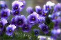
Spring is in the airby docjonnyComment: I like the photo, but I am having trouble liking the processing, especially because of the loss of detail and the posterization (e.g., at right, the out of focus pansies). The pansies certaily burst with colour though. May I ask, why the strong processing? Why the posterization? It looks like a beautiful photo that could stand without that processing (just my opinion). |
| Photographer found comment helpful. |
| 04/18/2011 12:49:23 PM |
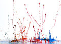
musical colorsby curtpetguyComment: Hehe, speaker and paint! I was thinking about trying something like this, just for the fun of it. Haven't had time to try it. I like the cheerfulness of your picture. It bursts with colour! :) |
| Photographer found comment helpful. |
| 04/18/2011 12:02:01 PM |
Stopby tvsometimeComment: My opinion, but I would have worked at not having shadows on a stop sign, and second, I think there's a bit too much space at right and not enough at bottom an left. Even just lining up the right side close to the sign, as you have it at bottom now, might work better. Not sure though. ~6 |
| Photographer found comment helpful. |
| 04/18/2011 12:00:52 PM |
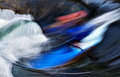
blur of colorby leonedavisComment: Beautiful, but I think that the drop is (1) just a bit too small to command enough attention, and (2) it needs to show sharpness better to work. I like the purple/yellow colour scheme. More than "burst of colour" this is "compo on colour". ~7 |
| Photographer found comment helpful. |
| 04/18/2011 12:02:38 AM |
Fulcrumby Bear_MusicComment: Wow, nice! I like this one. Congratulations on the high placement! |
| Photographer found comment helpful. |
| 04/15/2011 12:29:08 AM |
|
| Photographer found comment helpful. |
| 04/15/2011 12:28:35 AM |
|
| Photographer found comment helpful. |
| 04/15/2011 12:28:00 AM |
K-2by tomeComment: Many congratulations on your high placement. Beautiful image! |
| Photographer found comment helpful. |
Home -
Challenges -
Community -
League -
Photos -
Cameras -
Lenses -
Learn -
Help -
Terms of Use -
Privacy -
Top ^
DPChallenge, and website content and design, Copyright © 2001-2026 Challenging Technologies, LLC.
All digital photo copyrights belong to the photographers and may not be used without permission.
Current Server Time: 07/18/2026 04:20:39 PM EDT.