| Image |
Comment |
| 12/02/2006 12:58:34 PM |
"Star"by ThaiComment: Beautiful composition. Your score with this image will probably suffer because the background is not white, but a pinkish tone. ~7 |
 Photographer found comment helpful. Photographer found comment helpful. |
| 12/02/2006 12:57:33 PM |
My Daughter's Passion IIby LN13Comment: Very nice. It's good to see a disorganized grouping of pencils :) When first looking at this I thought, but it would be nice if the pencils were all sharp and maybe turned the same way (no lettering). Then I thought, no, this is much more natural. Technically excellent (the whites and the soft colours and hinted shadows). ~8 |
| Photographer found comment helpful. |
| 12/02/2006 12:55:55 PM |
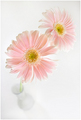
On a rising arcby arpitaComment: Beautifully done. It's so interesting what all can be done with closeup and perspective (don't know what to call it), but the flowers look HUGE in relation to the vase, yet the was has to be bigger than the flowers (at least lenghtwise for the vase, across for the flowers). Hmmmm. Love the pinks and orange/yellows, so soft. One of my favourites. ~10 |
| Photographer found comment helpful. |
| 12/02/2006 12:46:33 PM |
Wild Flowerby debreezeComment: I like the concept and the general composition of this image, and it meets the challenge well. It's beautiful actually. What bothers me is that it looks like it's just floating there, no grounding. ~8 |
| Photographer found comment helpful. |
| 12/01/2006 02:05:00 PM |
6by LeeDComment: I like this one! It's so soft and beautiful. Thanks for the advice! |
| Photographer found comment helpful. |
| 12/01/2006 01:51:47 PM |
7by LeeDComment: Beautiful! |
| Photographer found comment helpful. |
| 12/01/2006 01:12:17 PM |
|
| Photographer found comment helpful. |
| 12/01/2006 01:11:48 PM |
Mississippi Afternoonby StrikeslipComment: Nice candid, but at least to my eyes the processing is just too much here. There is simply way too much to look at this way, and nothing stands out, everything is that bright middle. It's probably a matter of taste. ~5 |
| Photographer found comment helpful. |
| 12/01/2006 01:09:51 PM |
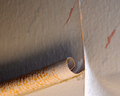
Old Saltby RolandBComment: Ahhh - I like this one :) It's just right. The rain streaks on the windows, the pipe, the lunch bag, even the wide ring on the finger. ~10 |
| Photographer found comment helpful. |
| 12/01/2006 01:02:30 PM |
|
| Photographer found comment helpful. |
Home -
Challenges -
Community -
League -
Photos -
Cameras -
Lenses -
Learn -
Help -
Terms of Use -
Privacy -
Top ^
DPChallenge, and website content and design, Copyright © 2001-2026 Challenging Technologies, LLC.
All digital photo copyrights belong to the photographers and may not be used without permission.
Current Server Time: 05/05/2026 12:51:41 PM EDT.