| Image |
Comment |
| 05/03/2007 10:43:23 PM |
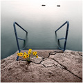
La Patience Éternelleby yankoComment: I like the concept quite a bit. I think that maybe, just maybe, if you went a touch closer and didn't include the two rocks (are they rocks) or logs at the top, it might work better. They draw too much attention away from the places that need attention in this image. ~7 |
 Photographer found comment helpful. Photographer found comment helpful. |
| 05/03/2007 10:30:17 PM |
Surreal Landscapeby ShamanComment: I think the picture is a good image, but I really don't think the treatment works here. The large area of desaturated, leaden sky, combined with a very bright oversharpened yet slightly blurred front, just don't do it for me. ~3 |
| Photographer found comment helpful. |
| 05/03/2007 10:26:44 PM |
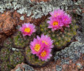
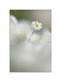
Blooming Cacti amongst the Lichenby hahn23Comment: Beautiful wildflowers in their natural surrounding - I like it! Well done. My one comment (trying to be helpful) is that the image probably looks too "text-bookish" to do well at DPC. ~8 |
| Photographer found comment helpful. |
| 05/03/2007 10:25:05 PM |
Looking Outby Renee_JordanComment: Nice, simple image of a beautiful horse. I think the image might benefit from a slightly higher dynamic range (work on curves?) ~7 |
| 05/03/2007 10:24:13 PM |
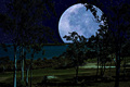
Moon Struckby BrianRComment: There are quite a number of images in the challenge that are digital manipulations. Some of them work well. This one doesn't work all that well. It looks overdone. IMHO, when the effect itself becomes the only real attention getter in an image, it ceases to be effective. ~3 |
| Photographer found comment helpful. |
| 05/03/2007 10:20:21 PM |
|
| Photographer found comment helpful. |
| 05/03/2007 10:19:45 PM |
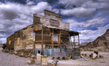
Mercantileby LanceWComment: It's a beautiful picture, but I think you went just a touch too heavy on the tone-mapping (or whatever was used here to give it this effect). IMHO, when the effect itself becomes more prominent than the image, it is not all that effective anymore. But that's just my opinion. ~6 |
| Photographer found comment helpful. |
| 05/03/2007 10:15:34 PM |
|
| Photographer found comment helpful. |
| 05/03/2007 10:12:00 PM |
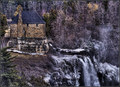
Frosted Fallsby StrikeslipComment: What a place! What a beautiful picture of this place. The stark, almost monochromatic colour scheme in the trees/falls beautifully set off the brighter golden tones of the stones in the building. Very good composition. ~9 |
| Photographer found comment helpful. |
| 05/03/2007 09:17:26 PM |
The Music Livesby RolandBComment: Looks like a genuine Venetian mask. The mask is beautiful. I like the blue eyes behind it. I'm not as sure about the totally black background, because it makes the whole thing sort of look like it's just floating there, and I think I'd like a bit of context. Not sure though .... Those eyes are unreal BTW. ~7 |
| Photographer found comment helpful. |
Home -
Challenges -
Community -
League -
Photos -
Cameras -
Lenses -
Learn -
Help -
Terms of Use -
Privacy -
Top ^
DPChallenge, and website content and design, Copyright © 2001-2026 Challenging Technologies, LLC.
All digital photo copyrights belong to the photographers and may not be used without permission.
Current Server Time: 05/05/2026 06:09:51 PM EDT.