|
|
|
Showing 2261 - 2270 of ~6015 |
| Image |
Comment |
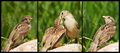
| 05/07/2007 12:27:16 PM | A Taste of Springtimeby LoreneComment: Greetings from the Critique Club
Challenge: Definitely meets the challenge
Strong points: It tells a beautiful story, it is well presented, the centre panel is the main focus, the birdies have almost human-like expressions. Beautiful colours.
Possible weaknesses: The cut-off tails. It looks smallish somehow. The rock (branch?) is a bit overexposed.
Technicals: Your high shutter speed is a good choice for capturing speedy birds. I think you could have maybe gone just a touch faster, to get a slightly darker image (so that the rock/branch would have a bit more detail). The backgrounds are a bit messy, and you could maybe work on diffusing them slightly better.
Presentation: The centre panel is the main focus area, and you did great in telling your story this way. I wonder if you could have made that centre panel even more prominent somehow. The subdued framing is great for this, it separates the images without dominating the whole of the image.
Overall: A good entry and a strong finish. Keep up the good work!
~Ursula
|  Photographer found comment helpful. Photographer found comment helpful. |
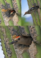
| 05/07/2007 12:18:50 PM | Coming out of the Nestby AzCKellyComment: Greetings from the Critique Club
Strong points: Beautiful images of this woodpecker. Each of them individual would be a good shot by itself. Beautiful colours. Good detail and sharpness.
Possible weaknesses: The presentation. The images lined up without any borders/divisions make for a good series, but make the whole thing look a bit bland. The storyline is weak.
Technicals: Great colours, great detail and sharpness. Amazing you got this sharp at F5.6! Love the bokeh at the left in the top right image. The processing seems adequate for each individual image, although they might benefit from a tad more definition (shadow/highlights or curves or so).
Overall: A beautiful series of images, I almost think they would be better by themselves than arranged in a series.
I hope this helps. If I can be of further help, please let me know.
~Ursula | | Photographer found comment helpful. |
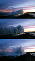
| 05/07/2007 12:13:34 PM | Wavesby MCCullenComment: Greetings from the Critique Club
Strong points: A very good idea, telling the story of getting closer to a wave, how it hits the wall, grows, and falls over it. The wave itself is great, as is the sky. I also like the light reflected on the retaining wall, very beautiful.
Possible weaknesses: The presentation doesn't get the story across well enough. The light in the pictures changes. The third picture (bottom) looks softish.
Technicals: You say you took 3 images in burst mode. I'm assuming the "getting closer" is achieved with cropping then. It is hard to make good images in this situation, I think. The light in the sky, even though it is evening (or early morning?), is quite powerful compared to the light on the face of the wave. The images "look" like they have different light. It must be because of the crop.
I wonder if you could have maybe processed each individual image so that the light would look the same, possibly getting a bit more definition on the water itself (curves, shadow/highligh, I might even try tone-mapping here).
Presentation: The 3 images stacked without any divisions or borders between/around them make for a clean, but somewhat bland presentation. The vertical arrangement might be difficult to read - we are used to move eyes more in a horizontal fashion for stories. If would be impossible to put 3 wide images next to each other here, but you could try putting 3 slices next to each other, and see what happens.
Overall: A beautiful series of pictures, and a good score to show for it. I personally think that any of the 3, especially the top 2, might make a pretty good picture all by themselves.
I hope this helps. If I can be of further help, please contact me.
~Ursula |
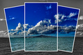
| 05/07/2007 12:01:26 PM | Snapshotsby NuzzerComment: Greetings from the Critique Club
Challenge: Meets the challenge description.
Strong points: The 3 overlapping windows combined with colour on B/W give this scene a lot more interest than it might have had all on its own. The sky is beautiful. The little sailboats draw you in.
Possible weak points: Very strict interpreters of "triptych" had a problem with this. The image looks a bit overprocessed. It is a rather centred composition, even though the horizon line is not at centre.
Technicals: The exposure/shutter speed combo you used looks to be right on. Your presentation is excellent. The processing looks (to my eyes) just a bit too strong (oversaturation in the coloured areas, too much contrast at the expense of detail).
Overall: A beautiful entry for Triptych, and you got an excellent score to go with it. Congratulations!
~Ursula | | Photographer found comment helpful. |
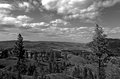
| 05/05/2007 07:49:14 PM | Day 5 - The Valleyby ArtysteComment: Same sky we have in the Kootenays today. The weather looks good for the next 2 weeks or so. Our hills are bigger :) | | Photographer found comment helpful. |
| 05/05/2007 06:06:46 PM | Amandaby MadukesComment: Just my opinion, but just one bright blue eye doesn't work. ~4 | | Photographer found comment helpful. |
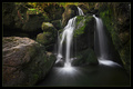
| 05/05/2007 06:06:06 PM | Lodore Fallsby ImagineerComment: Good image (DrAchoo?). The falls are beautiful, especially at the place where they hit the water, the way they go out in rays. I personally do not much care for the huge rock in front at the left. For one, it looks like some sort of animal looking on. You probably couldn't avoid it, but IMO it really doesn't do much for the image. ~8 | | Photographer found comment helpful. |
| 05/05/2007 05:29:42 PM | Ducky Does the Dishes!by Buckeye_FanComment: Greetings from the Critique Club
This is a fun image, one that brings a big smile to the viewer when you first look at it.
In my view, the image is well exposed, and the colours are nice. It meets the challenge (there are bubbles in it), but it doesn't "sell" the idea of bubbles.
The weakness is in the composition. First, there's too much information, too much stuff. Less is more in many cases. Second, what information you present needs to be presented cleanly (beautifully). Even with cropping, the background would still look a bit messy.
In other words, I think what would have really helped this image is to set it up a lot more carefully. Go closer, have a hint of dishes in the back, a ducky floating on bubbles in front, a hint of the edge of the sink, and you might have yourself a good image.
I hope this helps. If I can be of further help, please let me know.
~Ursula | | Photographer found comment helpful. |
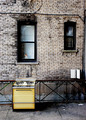
| 05/05/2007 05:24:38 PM | .....too hot in the kitchenby Car54Comment: Greetings from the Critique Club
This is a beautiful example of "found" photography. On a personal level, I'm glad to see it's a gas stove, not electric - I'm very partial to cooking on gas stoves :)
Strong points of the image: The composition is good, the stove stands out even with all the business of bricks and windows and lines in back of it. The colours are harmonious, and pleasing (although I've always wondered why anyone would use either "mustard" or "avocado" for appliace colours).
It meets the challenge, that is, it follows the ROTs.
I'm wondering about the post-processing. You do not say anything about it in your notes, but it looks either tone-mapped or edited with S/H in some way. Whatever you did, it works here.
My own favourite detail of the whole image is little dancing figurine in the window behind the stove. It gives the image a joyous quality, sort of like, "The range is outside, but I'm still dancin'!"
Something that might improve the image (hard to tell if it would, but it's worth trying) is to take it more right on, that is, not so much at an angle, so that both the sidewalk and bricks to not go smaller towards the right.
I hope this helps. If I can be of further help, please let me know.
~Ursula |
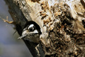
| 05/05/2007 05:15:01 PM | Under Constructionby abroken1Comment: Greetings from the Critique Club
This is one of those beautiful images that gets lost in the middle, where nobody comments because they don't find anything really wrong with it, but also because it's not a spectacular shot, one that would get people to at least say, "WOW!".
In other words, this is a very good image, but it is not a wow image.
As your one commenter points out, the details are very good on the focal plane. The out of focus part behind the little bird is beautiful, the hint of a little branch and the blurred colours of leaves/sky. The out of focus part in the foreground (on the trunk) is not as interesting. Unfortunately for you, it is this not so interesting part that dominates the image when you first look at it. There's too much of it.
From a technical POV, your exposure seems right on, and your processing is right for the image.
The image also meets the challenge, that is, it follows the ROTs.
Overall, a beautiful image with a decent score, lost in the middle.
I hope this helps. If I can be of further help, please let me know.
~Ursula |
|
Showing 2261 - 2270 of ~6015 |
Home -
Challenges -
Community -
League -
Photos -
Cameras -
Lenses -
Learn -
Help -
Terms of Use -
Privacy -
Top ^
DPChallenge, and website content and design, Copyright © 2001-2026 Challenging Technologies, LLC.
All digital photo copyrights belong to the photographers and may not be used without permission.
Current Server Time: 05/04/2026 11:31:07 AM EDT.
|