| Image |
Comment |
| 10/03/2008 02:11:00 AM |
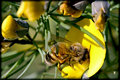
Honey beeby GregoryBComment: The bee is quite beautiful, especially the the back wing. The colours are also very pleasing in this image. Sharpness is alright, except that it seems to be a bit behind the bee (or at the bee's backside) - it might work better to have the whole bee sharp, or at least have a bit more sharpness towards the front side. The composition is rather busy. The bee almost gets lost in so much stuff here. I personally really don't much care for the grainy sort of border, to me it takes away from the image, but that is a matter of personal taste I suppose.
|
 Photographer found comment helpful. Photographer found comment helpful. |
| 10/02/2008 05:44:14 PM |
Oct 02.jpgby Mr_PantsComment: Beautiful study! Quite well done. I personally do not care for the vignette in this case (I do like using vignettes though) because to me it looks too much like an out of focus frame rather than a vignette to draw the eye into the picture. The tones are quite beautiful though, and I like the out/in/out focus. |
| Photographer found comment helpful. |
| 10/02/2008 05:41:15 PM |
_DSC0190.jpgby sulamkComment: It is a beautiful subject, and the colours are rich without being overwhelming.
The image could use better sharpness and a tidier composition. You probably couldn't do this without scaring off the subject, but moving the brownish branches out of the way might have helped. Sometimes you can set up at a place, and then wait for the bugs to stop by and then you can shoot them. :) |
| Photographer found comment helpful. |
| 10/01/2008 10:22:12 PM |
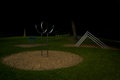
Playgroundby zeuszenComment: That is one geometric playground! Good for kids and adults. |
| Photographer found comment helpful. |
| 10/01/2008 10:21:27 PM |
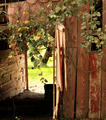
Invitation to a Brighter Dayby bergiekatComment: Not entirely sure, but I think that it has to do with the colourspace assigned to the image. I've had the same problem from time to time, and I can't quite remember at the moment what I read about it - if I find it, I'll post it.
Otherwise -- I like how this makes you want to walk into the picture. You know, I think the colours look quite good as they are, especially on the wood parts. |
| Photographer found comment helpful. |
| 10/01/2008 10:17:30 PM |
|
| Photographer found comment helpful. |
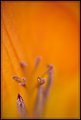
| 10/01/2008 01:02:26 PM |
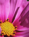
Oct 01.jpgby Mr_PantsComment: Beautiful, warm colour, I like it that it fills the entire frame.
Good use of narrow focus (shallow DOF), although, in my opinion, it would work better if there were only one area of interest in focus - here you have 3,almost 4 if you include the slightly in focus petal area towards middle top left, and my eye doesn't know where to go.
The composition, again IMO, too much blank space without purpose. Blank space needs to have a purpose in an image - here it just seems to be there. And the placement of the in focus areas is a bit odd.
The border, IMO, is way too heavy for a delicate image such as this one.
But I do like the colour filling the entire frame, and I love the use of shallow DOF!
|
| Photographer found comment helpful. |
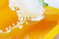
| 10/01/2008 12:55:17 PM |
Yellow pepperby hajekaComment: I like the diagonal provided by the line of pepper seeds. I think it is interesting that you used a yellow pepper, going by memory, most pepper inside shots I've seen are either red or green peppers. It is good to see variation :)
What doesn't work so much for me in this picture is:
(1) the lighting, it is too bright and a bit harsh;
(2) the composition is untidy, the diagonal is good, but you could have gotten closer and made it into a much more abstract macro, or further away and provided more context. As it is, the cut doesn't make much sense, and the 2 triangular background areas at top and bottom right take away from the impact of the image.
You might want to take time with peppers, put a cut pepper in a place with good light and walk around it with your camera and try shots from all sorts of angles. Try using a polarizer to cut down on glare (pepper flesh is very reflective). Try closer up and further away shots. Try to make a story with the images :)
I hope this helps. |
| Photographer found comment helpful. |
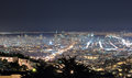
| 09/29/2008 03:13:29 PM |
1412by jdannelsComment: Beautiful image, Joe. I like how it looks so light, both in actual light, but also how the city feels light in the distance. The fog coming in adds a great touch. I'm not quite so sure about the shrubbery silhouette right in the middle in front (if anything, I'm imagining it ore to the left side), but I suppose there was little you could do about its placement. :) |
| Photographer found comment helpful. |
| 09/26/2008 01:03:02 AM |
|
| Photographer found comment helpful. |
Home -
Challenges -
Community -
League -
Photos -
Cameras -
Lenses -
Learn -
Help -
Terms of Use -
Privacy -
Top ^
DPChallenge, and website content and design, Copyright © 2001-2026 Challenging Technologies, LLC.
All digital photo copyrights belong to the photographers and may not be used without permission.
Current Server Time: 07/25/2026 12:12:46 PM EDT.