| Image |
Comment |
| 09/12/2006 11:36:17 AM |
|
| 09/12/2006 11:34:54 AM |
|
| 09/12/2006 11:32:48 AM |
Heir To The Throneby QartComment: the black border creates a strange effect. since it is extending the darkness, it makes him look like the top half of his head is gone, or covered. but that's a small matter. another small matter is the creases on his shirt. regardless of the cause, it makes the shirt look new which makes it seem like a "dramatization." It works against the illusion you're creating. Everything else is fine, though. You've got a moody, noirish shot with a protagonist we want to know more about(for our own safety, perhaps). |
| 09/12/2006 11:25:05 AM |
|
| 09/11/2006 01:31:30 PM |
Sarahby stare_at_the_sunComment: you have what seems like an unintentionally funny effect, with those pipes in the background spitting water on your subject. |
 Photographer found comment helpful. Photographer found comment helpful. |
| 09/11/2006 01:24:04 PM |
DNMC This!by MichaelCComment: you get an automatic 7 for making me laugh, but this is also a nicely composed shot with exciting shadows and a great sense of "flatness" |
| Photographer found comment helpful. |
| 09/11/2006 11:24:12 AM |
Colouring the Cloudsby BeeCeeComment: sorry, I skipped voting this challenge, otherwise I'd have given this a high score. a visually thrilling photo (that actually scored pretty well without me)!! |
| Photographer found comment helpful. |
| 09/11/2006 10:35:12 AM |
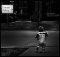
One, Two, Manyby CutterComment: I find the composition compelling, and love the figure of the walking toddler from behind... but could it be that there was a little too much burning? the darkness seems so unnatural. it's great that you highlight the two important compositional elements, sign and baby, but to my esthetic you went just a step too far. But then again, I'm a sucker for subtlety. |
| Photographer found comment helpful. |
| 09/11/2006 10:23:35 AM |
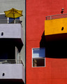
Saltburn Pierby FalcComment: very cool composition. oddly flat considering how much perspective is involved here (I mean that as a good thing!). I gave it a 7. Message edited by author 2006-09-11 10:24:05. |
| 09/11/2006 10:22:43 AM |
Sweet Babyby L1Comment: nice use of DOF to point our attention to the pastel elements: the eyes and nose. It also somehow conveys the almost desperate neediness of a kitten. I gave this a 7, and I want to know your secret for getting a 6 out of DPC with such a creative picture. |
| Photographer found comment helpful. |
Home -
Challenges -
Community -
League -
Photos -
Cameras -
Lenses -
Learn -
Help -
Terms of Use -
Privacy -
Top ^
DPChallenge, and website content and design, Copyright © 2001-2026 Challenging Technologies, LLC.
All digital photo copyrights belong to the photographers and may not be used without permission.
Current Server Time: 05/08/2026 11:10:07 AM EDT.