|
|
|
Showing 31991 - 32000 of ~37821 |
| Image |
Comment |
| 02/20/2007 06:41:22 PM | |  Photographer found comment helpful. Photographer found comment helpful. |
| 02/20/2007 05:57:16 PM | | | Photographer found comment helpful. |
| 02/20/2007 05:56:06 PM | | | Photographer found comment helpful. |
| 02/19/2007 11:55:53 PM | | | Photographer found comment helpful. |
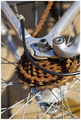
| 02/19/2007 11:34:39 PM | Years of Neglectby splidgeComment: First Rule of Critique Club: Do Not Talk About Critique Club!
Second Rule of Critique Club: Do NOT Talk About Critique Club!
Third Rule of Critique Club: When a photo scores less than six, there must be something wrong with it.
Hmmm... let's see.... it meets the challenge. Rust is bad. Anybody who's ever had to deal with rust knows that it destroys expensive things, and once it starts you can't stop it.
Let's see... a beautiful abstract composition. Lots of energy! Mostly straight lines, but with one elegant curve, plus the implied curve of the wheel we cannot see, and the rusted gears. A lot of strong diagonals and lines radiating from the center.
Wait! I know! No subject!
Fifth Rule of Critique Club: One subject at a time. I know what you're thinking, you DO have one subject. But where does it begin, where does it end? Gear and spokes and cable all compete for the title, as does the implied wheel. Composition trumps subject in this photo. We are given a feast of abstract energy instead of a straightforward (yawn) depiction of a something-or-other.
Fourth Rule of Critique Club: Only two guys to a photo. That's right. Only two. The photographer and the viewer. You and me. Ultimately, you are creating an experience for a single person, whoever is looking at the picture at a particular moment. The score is an average, but there is no average experience for your photo. Some will get it and some won't. That's the way it is for all photos. I got a kick out of your photo.
Sixth Rule of Critique Club: No shirt, no shoes. Okay, I only gave it a 6. I liked the energy but it didn't give me the thrill I needed to give it a 7. 7 and above means I would put it on my wall if I had space for it. Unfortunately, I can't tell you what would make this a 7 for me. It could be done any number of ways, perhaps by giving it a certain mood with the lighting. But the joys of this photo are subtle. I like it more the more I look at it. It really does get to the heart of photography: the joy of seeing.
Okay, there are two more rules but I'm out of gas.
| | Photographer found comment helpful. |
| 02/19/2007 08:42:56 PM | by boysetsfireComment: this is so hilarious. it is perfect.
p.s. you are now on that level of people who take too damn many good pictures so I avoid faving your pics now, or else I'll use up my quota. Message edited by author 2007-02-19 20:43:58. | | Photographer found comment helpful. |
| 02/19/2007 07:50:20 PM | | | Photographer found comment helpful. |
| 02/19/2007 01:36:11 PM | Reading the Good Bookby doug61853Comment: Greetings from the Critique Club!
Scoring is just a measure of how well you pleased DPC voters, and nothing else. I would say this scored over 5 because it clearly met the challenge. The reason it didn't score higher is because for a set-up shot like this, the DPC voter expects a Studio Shot, whereas this is more like a candid, with natural light (with blown highlights) and a soft focus (but not out of focus, imho). Ironically (though it's an irony that is now second nature to me), those are the very things I like about this photo. The natural light is much more attractive and interesting than studio light, and the shadows create strong diagonal shapes that add interest to the picture. I also think that it is the "candid" genre that caused you to put the book "upside down". In a candid shot, we're always looking at someone else, and when you look at someone else's book, it is always upside down! In a studio shot, everything belongs to the viewer. That is why most studio shots are dull. There is no tension between viewer and object. | | Photographer found comment helpful. |
| 02/19/2007 11:27:26 AM | Thumbs Up Is Goodby sumskater41Comment: Welcome from the Critique Club!
As your other commentors have mentioned, your hand is in good focus, well lit and overall you've done a good job of showing us your hand. The next question is, why do we want to look at your hand? This is a variation on the question we ask of any photograph: why do we want to look at this photo? So let's look at some reasons:
1. Meeting the challenge. The hand is in a symbolic thumbs-up gesture, thus meeting the challenge. This plus the "good technicals" on the hand gave you a 5+ score. Meeting the challenge will not guarantee you a good score, however. Viewers are still looking for a good photograph, probably one that would be worth looking at even without the challenge (though there are exceptions).
2. Interaction with the background. As with so many photos, you have a foreground subject with a background behind it. One interesting thing here is that the person in the background is the same person whose hand we're looking at. Even more interesting, it's the face that is blurry background material. We're used to faces being the subject. One trouble I might have is that this is not a very original idea.  rscorp rscorp has done it several times, but not everyone is concerned about originality. But, as other commentors have noticed, you have other items in the background as well, and they are a bit distracting. The usual solution offered by DPC is to remove the background, or at least make it as blank as possible. I'm not crazy about this approach. I think it's usually a cop out, unless you're making catalog photos or stock photos. Much more interesting and challenging is to have a background that enhances your image instead of distracts from it. For example, I don't mind seeing a door. It's a little glimpse of setting, so I can start thinking about the character of this person, where he lives, what his life is like. If, for example, you replaced that poster with an eye chart, I might think you're an eye doctor. Well, you're kind of young to be a doctor. Maybe a patient? Maybe an eyeglass salesman? The single most important thing I've learned from taking pictures is to be aware of the background. I am still no good at getting the right background for the right subject. I think it's a lifetime process.
3. Symbolic value. This is a strongly symbolic image. Most if not all images, however, have some sort of symbolic value. A symbol itself doesn't have much impact. A thumbs-up by itself doesn't have much impact. However, if it is the surgeon who was operating on Mom, then his thumbs-up suddenly has a LOT of impact. Your job as a photographer of a symbol is to connect the general symbol to some kind of specific meaning. I gave an example above of how you can do that with the background. You can also fight the meaning of the symbol. For example, you could have someone crying while holding his thumb up. That would probably be a bad idea for this particular challenge, but it would make for a more interesting photo in general. |
| 02/18/2007 10:52:55 PM | grape mirageby cheleComment: I like the areas of frostiness. A very pretty picture. 7 | | Photographer found comment helpful. |
|
Showing 31991 - 32000 of ~37821 |
Home -
Challenges -
Community -
League -
Photos -
Cameras -
Lenses -
Learn -
Help -
Terms of Use -
Privacy -
Top ^
DPChallenge, and website content and design, Copyright © 2001-2026 Challenging Technologies, LLC.
All digital photo copyrights belong to the photographers and may not be used without permission.
Current Server Time: 06/20/2026 03:17:34 AM EDT.
|