| Image |
Comment |
| 03/20/2007 06:35:37 PM |
|
 Photographer found comment helpful. Photographer found comment helpful. |
| 03/20/2007 06:34:47 PM |
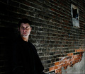
Silkby bubeltrubelComment: some strange smearing going on in the face here. Otherwise it's a captivating portrait. 7 |
| Photographer found comment helpful. |
| 03/20/2007 06:33:28 PM |
|
| Photographer found comment helpful. |
| 03/20/2007 06:31:14 PM |
|
| Photographer found comment helpful. |
| 03/20/2007 06:30:34 PM |
|
| Photographer found comment helpful. |
| 03/20/2007 06:29:50 PM |
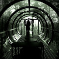
it's whats inside....by boysetsfireComment: OOB = 5
anti-DPC = 5
total = 10
not really, it's the layers I like. hell, it might even be a statement on anti-Semitism. 10 |
| Photographer found comment helpful. |
| 03/19/2007 11:31:52 PM |
One Rainy Day by shalrathComment: This is really beautiful. One of the few ribbon winners that would have gotten a high vote from me (I didn't vote this challenge). |
| Photographer found comment helpful. |
| 03/19/2007 07:12:38 PM |
|
| Photographer found comment helpful. |
| 03/19/2007 07:12:00 PM |
|
| Photographer found comment helpful. |
| 03/19/2007 07:11:20 PM |
|
| Photographer found comment helpful. |
Home -
Challenges -
Community -
League -
Photos -
Cameras -
Lenses -
Learn -
Help -
Terms of Use -
Privacy -
Top ^
DPChallenge, and website content and design, Copyright © 2001-2026 Challenging Technologies, LLC.
All digital photo copyrights belong to the photographers and may not be used without permission.
Current Server Time: 06/22/2026 01:29:21 PM EDT.