| Image |
Comment |
| 05/15/2007 06:44:38 PM |
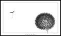
Wish in the windby TannyComment: I don't see any wind affecting the seed head, but I do like the inversion. It makes your dandelion seem furry! And I liked the blurred seed. It almost seems as if the seed leapt from the flower of its own volition instead of waiting for the wind!
Also nicely unexpected is the motion from right to left instead of left to right, although that only works in certain cultures. |
 Photographer found comment helpful. Photographer found comment helpful. |
| 05/15/2007 04:16:23 PM |
Belly Bellyby muckpondComment: For all their bright clothing, they blend into the background a little bit. This might look much better at poster size. As it is, I feel I'm missing too much detail. I did give it a 6, though, because I thought it was an interesting subject and I liked the lighting. |
| Photographer found comment helpful. |
| 05/15/2007 04:13:46 PM |
Gone Fishingby TannyComment: It feels a little off-balance to me because the top half is all feathery and the bottom half is all mechanical. |
| Photographer found comment helpful. |
| 05/15/2007 04:10:37 PM |
Peeping Overby JedusiComment: I like the flower. The missing petals give it personality and poignance. The composition is too conventional for my taste, though, and is quite static. This needs some energy. |
| Photographer found comment helpful. |
| 05/15/2007 04:07:57 PM |
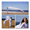
Playing With The Windby WildcardComment: the top picture is impressive just because you have this huge piece of fabric flowing out so far, but the two on the bottom are much more graceful, where the woman seems to be one with the fabric. the woman on top seems a little stiff.
In general, I think the two bottom pictures are good photos in themselves. The triptych doesn't do much for me. And the drop shadows make it even worse: they keep the photos too separate. The illusion is that they're floating above the mat. What purpose does that serve? |
| Photographer found comment helpful. |
| 05/15/2007 04:03:38 PM |
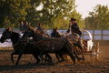
Around the Top Barrelby CitadelComment: great action capture, particularly the dirt flying up! I don't think it's too tight at all. the only thing that distracts me are the audience-people. I wonder how this would look in b/w with the audience people burned almost to oblivion. |
| Photographer found comment helpful. |
| 05/15/2007 04:01:54 PM |
Stormy Shoresby tryals15Comment: I love the silkiness of it. You've clearly captured some wave action here, but it seems like it's utterly still. I like how the big projection in the background and the blown-out sky remove all context from this. really, really lovely. |
| Photographer found comment helpful. |
| 05/15/2007 12:29:48 PM |
Maestro1.jpgby AlmilanComment: Originally posted by Almilan:
Cropped too much, maybe?
Edit: Have posted a different version of this  |
I love the lady on the bench! What a great counterpoint! Why don't you just crop off the top of this one? I think that would look great. |
| Photographer found comment helpful. |
| 05/15/2007 12:28:15 PM |
Maestro1.jpgby AlmilanComment: I like this. Yes, it's a tight crop but it makes him look like an exciting blotch taking over your photo. His pose is perfect. The OOF background kind of blends into him, though he is clearly demarcated by color. This "blending" keeps the centered composition from being too dull. |
| Photographer found comment helpful. |
| 05/15/2007 12:25:06 PM |
|
| Photographer found comment helpful. |
Home -
Challenges -
Community -
League -
Photos -
Cameras -
Lenses -
Learn -
Help -
Terms of Use -
Privacy -
Top ^
DPChallenge, and website content and design, Copyright © 2001-2026 Challenging Technologies, LLC.
All digital photo copyrights belong to the photographers and may not be used without permission.
Current Server Time: 07/17/2026 05:16:07 PM EDT.