| Image |
Comment |
| 06/01/2007 12:53:02 PM |
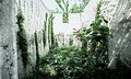
tone mappingby krnodilComment: What a ridiculous use of tonemapping. You've made half the picture look blown out and overexposed. You've utterly abused this technique in order to make a picture of a concrete garbage bin into a frightening fantasyland where winter and summer battle for control of a harsh world. Ice blinds me and bugs bite me at the same time. The planet threatens to crack open.
I have seen hundreds of reverent but utterly pointless tonemappings, only to discover you wielding this dangerous power for an actual purpose. You have dared to betray mundane reality and foist your own interpretation on it. Be warned, you have ventured into the realm of the artist. It is a realm where emotions run high and discontent is always right around the corner.
Are you sure you don't want to take studio shots of jewelry and puppies? |
 Photographer found comment helpful. Photographer found comment helpful. |
| 06/01/2007 10:10:10 AM |
The Picture of Dorian Grayby bdennyComment: Originally posted by purpleflutterby13:
(heh, except why is the portrait so damn happy? I always imagined it as falling apart from all that sin and debauchery :p ) |
Yeah, I noticed the same thing. It's probably because, you know, most people smile in portaits! |
| Photographer found comment helpful. |
| 06/01/2007 09:10:36 AM |
|
| Photographer found comment helpful. |
| 05/31/2007 07:55:39 PM |
|
| Photographer found comment helpful. |
| 05/31/2007 06:03:55 PM |
The Picture of Dorian Grayby bdennyComment: Dr. Confuser has missed the point. The only reason this scored poorly is because apparently most DPC voters are culturally illiterate. |
| Photographer found comment helpful. |
| 05/31/2007 10:41:33 AM |
|
| Photographer found comment helpful. |
| 05/31/2007 09:04:31 AM |
Poppy2.jpgby eamurdockComment: The OOF is perfect. That's the best part of this. It's the OOF that makes the colors so beautiful. Colors are just colors after all, waiting to see what we do with them. My only suggestion is a more interesting composition, but I'm perverse that way. The composition actually works very well, it just seems "familiar". |
| Photographer found comment helpful. |
| 05/31/2007 09:01:41 AM |
Peacefulby jjusaComment: there's something cloudy about this, and I don't just mean the clouds. It lacks the sharply saturated look so prevalent in DPC landscapes... thank God. I like the way what's in the water battles with the reflections on the water. Landscapes tend to bore me but this is very pleasant to look at. I actually enjoy just sitting and looking at it. The title is apt, not because it's a sedate scene but because the act of looking is itself peaceful. |
| Photographer found comment helpful. |
| 05/31/2007 08:56:46 AM |
24by mia67Comment: I would call this "formalism." You have neglected the sentimental attachments the viewer might associate with children in order to focus on the purely visual composition and a photographic version of brushstrokes. Some of the most profound art comes from the integration of form with content, but there is something very exciting about the "neglectfulness" of almost pure formalism. Content, sometimes referred to as reality, dissolves before your very eyes. Glass in particular seems to be the main protagonist of this dissolution. Notice how the foreground girl reaches right into it, unafraid. Oops there I go with the content again... I guess we all have to wake up sometime. |
| 05/30/2007 10:16:44 PM |
|
| Photographer found comment helpful. |
Home -
Challenges -
Community -
League -
Photos -
Cameras -
Lenses -
Learn -
Help -
Terms of Use -
Privacy -
Top ^
DPChallenge, and website content and design, Copyright © 2001-2026 Challenging Technologies, LLC.
All digital photo copyrights belong to the photographers and may not be used without permission.
Current Server Time: 07/23/2026 11:11:47 AM EDT.