| Image |
Comment |
| 06/03/2007 11:25:04 PM |
|
 Photographer found comment helpful. Photographer found comment helpful. |
| 06/03/2007 11:24:52 PM |
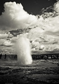
Geysirby karinnComment: perfect. ecstatic. Posthumous Red Ribbon. |
| Photographer found comment helpful. |
| 06/03/2007 11:24:31 PM |
vol de nuitby silverfoxxComment: spectacular. the best I've seen so far. I didn't vote enough for them to count, but you get the Posthumous Blue Ribbon, which is just as real as a DPC blue ribbon... hahahaha |
| Photographer found comment helpful. |
| 06/03/2007 11:20:49 PM |
|
| Photographer found comment helpful. |
| 06/03/2007 11:19:46 PM |
|
| Photographer found comment helpful. |
| 06/03/2007 11:19:32 PM |
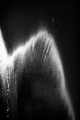
Rain Waterby TCGuruComment: Nice rain capture! Most rain shots are too sharp, and lose the dynamic sense of the rain. |
| Photographer found comment helpful. |
| 06/03/2007 11:18:57 PM |
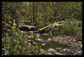
AquaTerraby jjusaComment: I like the busy-ness. creates a sense of mystery, a sense of wanting to know where the river goes. |
| Photographer found comment helpful. |
| 06/03/2007 11:18:25 PM |
|
| Photographer found comment helpful. |
| 06/03/2007 11:17:12 PM |
|
| Photographer found comment helpful. |
| 06/03/2007 11:16:36 PM |
|
Home -
Challenges -
Community -
League -
Photos -
Cameras -
Lenses -
Learn -
Help -
Terms of Use -
Privacy -
Top ^
DPChallenge, and website content and design, Copyright © 2001-2026 Challenging Technologies, LLC.
All digital photo copyrights belong to the photographers and may not be used without permission.
Current Server Time: 07/22/2026 10:44:28 AM EDT.