| Image |
Comment |
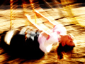
| 02/13/2006 03:07:25 PM |
DIZZYby wavelengthComment: Tell the truth, was this a motion panning shot that didn't work out? ;-)
I don't hate it but it was not sufficiently abstract for me - thought you might have improved it by chopping off her head (no offense to the subject ;-) |
 Photographer found comment helpful. Photographer found comment helpful. |
| 02/13/2006 02:09:38 AM |
|
| Photographer found comment helpful. |
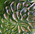
| 02/13/2006 01:46:45 AM |
RGBby Spork99Comment: Gutsy submission. Guessed what it was, got a kick out of it, grossed out that it's been dq'd. Sure hope that's a boo-boo. |
| Photographer found comment helpful. |
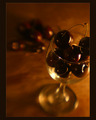
| 02/11/2006 05:17:08 PM |
cherriesby noseprintsComment: This is really gorgeous. I love your focus but I do have the slightest urge to up the magenta in the cherries, keeping it dark though. On the border, that light inner rim made it work for me. Very sexy photo! (p.s. great username) |
| Photographer found comment helpful. |
| 02/10/2006 12:34:55 AM |
|
| Photographer found comment helpful. |
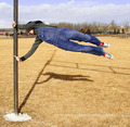
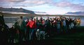
| 02/09/2006 03:39:32 PM |
Solidarityby GunnsiComment: This is a fascinating shot. It looks so realistic and yet it also has some qualities of a painting. Although a good catch as it is (and what a backdrop), seeing it makes me wish I could pose a similar shot.... where the colorfully-clothed people are all looking straight ahead and not at the camera, and only the b/w dog, perhaps sitting on a third of the composition, would be looking right at the camera. Keeping that gorgeous backdrop! Maybe I'm just making it cliche? Anyway, thanks for posting this, I enjoyed thinking about it. |
| Photographer found comment helpful. |
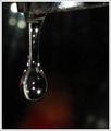
| 02/08/2006 12:28:47 PM |
Leaving soon - The longest dropby GunnsiComment: This is really beautiful, grain or no. You have a good eye to have found this capture, and getting the lights in the drop must have been no small task. They are so pretty that they almost look fake. |
| Photographer found comment helpful. |
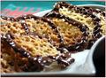
| 02/08/2006 12:19:36 PM |
Nut dreamsby GunnsiComment: My favorite kind of cookie! For the photo, I'd echo some of what you've already heard - focus all the cookies, reduce harshness of lighting, consider different-colored backdrop. None of that keeps me from wanting to eat them! |
| Photographer found comment helpful. |
| 02/08/2006 03:34:26 AM |
|
| Photographer found comment helpful. |
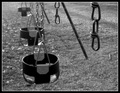
| 02/08/2006 03:07:48 AM |
Disconnectedby kteachComment: Interesting subject. Good composition and metal shine. The stark black and white in your frame makes the image look a little washed out though. |
| Photographer found comment helpful. |
Home -
Challenges -
Community -
League -
Photos -
Cameras -
Lenses -
Learn -
Help -
Terms of Use -
Privacy -
Top ^
DPChallenge, and website content and design, Copyright © 2001-2026 Challenging Technologies, LLC.
All digital photo copyrights belong to the photographers and may not be used without permission.
Current Server Time: 06/10/2026 06:49:12 PM EDT.