| Image |
Comment |
| 08/16/2007 08:23:23 AM |
|
 Photographer found comment helpful. Photographer found comment helpful. |
| 08/16/2007 08:21:39 AM |
|
| Photographer found comment helpful. |
| 08/16/2007 08:20:34 AM |
|
| 08/16/2007 08:19:34 AM |
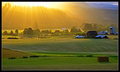
Nature's Paletteby SJCarterComment: a tad oversaturated, colors look offf, especially the purple hills. nice landscape, though |
| Photographer found comment helpful. |
| 08/16/2007 08:18:19 AM |
|
| Photographer found comment helpful. |
| 08/16/2007 08:17:25 AM |
|
| 08/16/2007 08:16:12 AM |
|
| Photographer found comment helpful. |
| 08/16/2007 08:15:46 AM |
|
| Photographer found comment helpful. |
| 08/16/2007 08:14:25 AM |
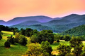
Summer Morningby riversongComment: perfectly meeting the challenge. nice sky, good composition. trees are a tad too dark. |
| Photographer found comment helpful. |
| 08/16/2007 06:19:17 AM |
August is an Alphabetic Monthby bassboneComment: very, very nice shots (except for C and U, the rotating/flipping is too obvious), but the arrangement doesn't work for me. the gaps between the pics are irregular, they don't even keep the baseline - looks like the height of the pictures differs. i had placed them in a way, that there is a equal amount of space between the edge of the poster and the pics, except for the bottom, where title and © should stand. the typeface works fine for the headline, not for the signature. color of typeface is way off, better go for white. some pics could be croped a little closer, especially the O and the I.
Hope that helps (and trust me, I'm a CD)! |
| Photographer found comment helpful. |
Home -
Challenges -
Community -
League -
Photos -
Cameras -
Lenses -
Learn -
Help -
Terms of Use -
Privacy -
Top ^
DPChallenge, and website content and design, Copyright © 2001-2026 Challenging Technologies, LLC.
All digital photo copyrights belong to the photographers and may not be used without permission.
Current Server Time: 05/08/2026 04:23:38 PM EDT.