| Image |
Comment |
| 09/03/2007 09:25:40 AM |
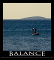
Balanceby aliquiComment: great capture, just could be a little sharper. Border is a tad too bold, something strange happening at the corners. "Balance" is too close to the picture, also wish you had chosen a less cliché typeface and layout. |
 Photographer found comment helpful. Photographer found comment helpful. |
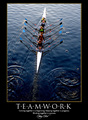
| 09/03/2007 09:23:02 AM |
t e a m w o r k by hotpastaComment: not the most original idea, but very well executed; great colors and sharpness, beautiful gradient created through the light from top to bottom. Good layout, border color is too muddy, choice of typeface for "Henry Ford" is questionable. |
| Photographer found comment helpful. |
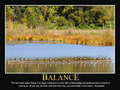
| 09/03/2007 08:30:17 AM |
BALANCEby gocComment: good shot, colors just a bit too dull. absolutely shouts "balance"!. the stretched typeface is rather distracting, the bottom line shouldn't be wider than the image. |
| Photographer found comment helpful. |
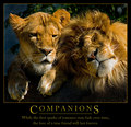
| 09/03/2007 08:17:29 AM |
Companions by eqsiteComment: excellent shot (hmm, who has been to the zoo lately...?). orange of outline goes well with the image, but not with the yellow of the text. not sure how or what this should motivate, though |
| Photographer found comment helpful. |
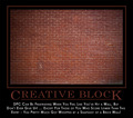
| 09/03/2007 07:15:26 AM |
Creative Blockby smurfguyComment: aah, i love that irony - and it will hopefully give you a great score. BTW, did you notice the face in the wall above the "A"? |
| Photographer found comment helpful. |
| 09/03/2007 07:10:18 AM |
|
| Photographer found comment helpful. |
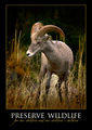
| 09/03/2007 07:07:15 AM |
PRESERVE WILDLIFEby ursulaComment: good shot that suffers a bit from post-processing (reddish cas tin the shadows). very well designed poster, good choice of fonts and colors, especially like how the subline lays above the headline. |
| Photographer found comment helpful. |
| 09/03/2007 07:02:22 AM |
Goalsby parma182Comment: great shot and very good translation of the message. text layout is very cliché with the underlining and larger first and last letter, doesn't work with short words IMO. |
| 09/03/2007 06:59:31 AM |
|
| Photographer found comment helpful. |
| 09/03/2007 06:56:37 AM |
|
Home -
Challenges -
Community -
League -
Photos -
Cameras -
Lenses -
Learn -
Help -
Terms of Use -
Privacy -
Top ^
DPChallenge, and website content and design, Copyright © 2001-2026 Challenging Technologies, LLC.
All digital photo copyrights belong to the photographers and may not be used without permission.
Current Server Time: 05/09/2026 02:13:20 AM EDT.