| Image |
Comment |
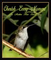
| 09/04/2007 05:35:04 AM |
Cherish Every Momentby RefocusedComment: very good shot, unfortunately spoiled by the added design elements: border color doesn't match (had left it away, anyway), font color would be OK, if the text was not placed within the image. typeface is really not my taste, blanks are much too wide. usage of capital letters in each word doesn't make sense to me. |
 Photographer found comment helpful. Photographer found comment helpful. |
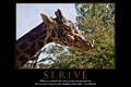
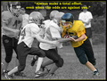
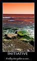
| 09/04/2007 05:30:47 AM |
STRIVEby pipersdComment: nice shot, good classic layout. border at left and right could be less bold. |
| Photographer found comment helpful. |
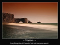
| 09/04/2007 05:29:19 AM |
Visionby StructorComment: beautiful image, but that's why this doesn't work best for me: the beauty is obvious, not hidden. typeface works well for the subline, the headline needs more impact. |
| Photographer found comment helpful. |
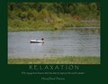
| 09/04/2007 05:27:30 AM |
Relaxationby L1Comment: well composed shot, might need a boost in contrast and sharpness. image and text go very well together, nice color scheme. Wish you had used a less worn out typeface, a bigger font size for the headline and a smaller one for the author. |
| Photographer found comment helpful. |
| 09/04/2007 05:24:23 AM |
|
| Photographer found comment helpful. |
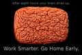
| 09/04/2007 05:22:13 AM |
Work Smarter. Go Home Early.by pixelpigComment: Creative take on the challenge! good, clean shot. Layout misses the impact of the picture, had reduced the size of the sponge and placed both lines below the picture. |
| Photographer found comment helpful. |
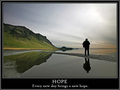
| 09/04/2007 05:19:10 AM |
Hopeby BrinComment: good shot, but to me doesn't show hope. looks rather like an evening than a dawn - a higher saturation had probably helped. typeface is a bit boring and so cannot convey a positive feeling, too. outer white border is unnecessary IMO. |
| Photographer found comment helpful. |
| 09/04/2007 05:14:53 AM |
|
| Photographer found comment helpful. |
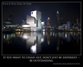
| 09/04/2007 05:07:18 AM |
If You Want to Stand Out....by ErikVComment: Very good shot, the longer I look, the more I like it - can't really find something to nitpick. Layout is OK, but neither different nor outstanding and anticipates the message. 10 for image, 6 for overall work, bumping you up to 8. |
| Photographer found comment helpful. |
| 09/04/2007 04:56:08 AM |
Grab Lifeby LanndonKaneComment: nice shot with harmonic, warm colors. I had preferred a deeper DOF, though. Headline is to close to the image and not exactly centered, typeface is OK (interesting, the original fonts name is "Lithos", from the greek word for "stone"). Typeface for subline is a bit blah, lacks of impact. |
| Photographer found comment helpful. |
Home -
Challenges -
Community -
League -
Photos -
Cameras -
Lenses -
Learn -
Help -
Terms of Use -
Privacy -
Top ^
DPChallenge, and website content and design, Copyright © 2001-2026 Challenging Technologies, LLC.
All digital photo copyrights belong to the photographers and may not be used without permission.
Current Server Time: 05/09/2026 02:58:38 AM EDT.