| Image |
Comment |
| 10/02/2007 03:58:48 AM |
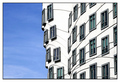
The Dancing Buildingby elemessComment: looks a bit like the Gehry-Buildings at the Düsseldorf Media Harbour (if you don't know them, have a look at my portfolio), but those don't have the curved lines. I would be interested in the location.
well composed shot of high graphic quality, good color and contrast. black frame is irregular (bolder at right and bottom). the powerline in foreground distracts a bit. |
 Photographer found comment helpful. Photographer found comment helpful. |
| 10/02/2007 03:54:31 AM |
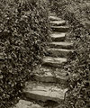
Stone Pathby ElaineComment: light is a bit flat, a push in contrast might have produced a more mysterious atmosphere. |
| Photographer found comment helpful. |
| 10/02/2007 03:52:00 AM |
Old Truckby drake217Comment: crop is much too tight. would have been a much more interesting shot if at least the whole garage sign and the headlight were included. |
| 10/02/2007 03:50:56 AM |
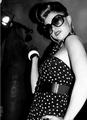
vintage style ladyby takinou42Comment: interesting outfit, but overall look is of a snapshot. at least you could have cropped off the person in the background and avoided the white line at left. |
| 10/02/2007 03:49:14 AM |
|
| Photographer found comment helpful. |
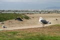
| 10/02/2007 03:48:34 AM |
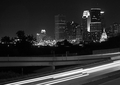
Seagullby oboyComment: well composed shot, overall a bit dull |
| Photographer found comment helpful. |
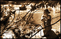
| 10/02/2007 03:48:06 AM |
untitledby APComment: well composed, moody portrait. toning works well. good detail in her face, interesting DOF. light was a bit harsh and blew the lights. might be worth a try to crop right of the left rower for more balance and better focus on the girl. |
| Photographer found comment helpful. |
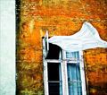
| 10/02/2007 03:44:50 AM |
The Nylon Curtainby gsalComment: very interesting capture, though it would IMO have been better to include the whole window in the shot. I like the contrast between the heavily textured wall and the soft, bright curtain. nice complimentary contrast, too. |
| Photographer found comment helpful. |
| 10/02/2007 03:42:02 AM |
Beaconingby posthumousComment: contrast is too high and the kid is just too small and too far at right side to make for an interesting subject |
| Photographer found comment helpful. |
| 10/02/2007 03:40:20 AM |
self-sufficientby ButterflyGirlComment: good capture, but had cropped off some at the bottom, where the surface is out of focus. that would also help for a more balanced composition. lights are unfortunately blown. |
| Photographer found comment helpful. |
Home -
Challenges -
Community -
League -
Photos -
Cameras -
Lenses -
Learn -
Help -
Terms of Use -
Privacy -
Top ^
DPChallenge, and website content and design, Copyright © 2001-2026 Challenging Technologies, LLC.
All digital photo copyrights belong to the photographers and may not be used without permission.
Current Server Time: 05/09/2026 10:47:36 AM EDT.