| Image |
Comment |
| 11/22/2007 07:01:35 AM |
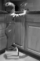
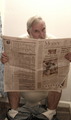
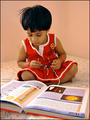
Smart Cookieby kellybrucewayneComment: Technicals: 0.5/2 - flat lighting, lights are blown, focus is rather on the furniture than on the kid; slight blur around his right hand
Composition: 0/2 - uninteresting POV; tight crop. distracting background objects; slight tilt; too much perspective distorsion; awkward pose, might have been better if he had a hand in the dispenser
Challenge Relation: 2/2
Originality/Creativity: 2/2 - unusual take on the challenge
Overall Impact: 0.5/2
5 |
| 11/22/2007 06:54:36 AM |
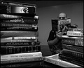
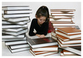
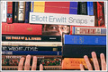
Engulfedby RulerZigzagComment: Technicals: 1/2 - good focus; noise in midtones; shadows are too dark
Composition: 1.5/2 - angles of the books lead to the reader, good distribution of light; background objects distract; soft border makes no sense to me
Challenge Relation: 1.5/2 - choice of book scould be much smarter
Originality/Creativity: 1/2 - the first idea that comes to mind
Overall Impact: 1/2
6 |
 Photographer found comment helpful. Photographer found comment helpful. |
| 11/22/2007 06:48:55 AM |
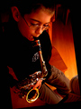
Sax Playerby zoomzoomComment: Technicals: 0.5/2 - underexposed; no clear focus point
Composition: 1/2 - interesting POV, tilt of the image inside the frame doesn't add anything; background objects distract
Challenge Relation: 0.5/2 - okay, he seems to be studying
Originality/Creativity: 1/2
Overall Impact: 1/2
4 |
| Photographer found comment helpful. |
| 11/22/2007 06:43:46 AM |
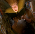
Knowledge is Power by glodaComment: Technicals: 1/2 - good focus, exposure and interesting lighting; too much motion blur in lower part of image
Composition: 1/2 - angle adds drama; crop at top is too tight,
Challenge Relation: 1.5/2 - he looks as if it was his first book
Originality/Creativity: 1.5/2 - unusual lighting
Overall Impact: 1/2
6 |
| Photographer found comment helpful. |
| 11/22/2007 06:37:27 AM |
Book Smarts: A Scholar's Studyby THEOLDGEEZERComment: Technicals: 0.5/2 - flat lighting, reddish cast from wrong white balance, lack of contrast, slight overexposure
Composition: 0.5/2 - tilted, badly cropped, uninteresting POV, shower curtain distracts
Challenge Relation: 1/2
Originality/Creativity: 1.5/2 - unusual location
Overall Impact: 1/2
5 (challenge relation and originality overweighted) |
| Photographer found comment helpful. |
| 11/22/2007 06:31:45 AM |
Study to Stay Aheadby SonifoComment: Technicals: 1.5/2 - sharp; good stock material. a tad too dark: greyish background, no drawing in her shirt
Composition: 1/2 - too centered; black books at left, brown books at right, all the books lying in similar directions, no titles readable
Challenge Relation: 2/2
Originality/Creativity: 0.5/2 - first idea that comes to mind, no added extras
Overall Impact: 1/2
6 |
| Photographer found comment helpful. |
| 11/22/2007 06:26:49 AM |
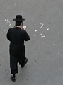
On the roadby OdedComment: Technicals: 1.5/2 - very good exposure, every wrinkle in his clothes is visible; slight halos from sharpening; flat light
Composition: 1/2 - not the most exciting POV, too much empty space
Challenge Relation: 1/2 - person reads a book while walking - not very smart :-P
Originality/Creativity: 1.5/2 -lucky shot
Overall Impact: 1/2
6 |
| Photographer found comment helpful. |
| 11/22/2007 06:15:19 AM |
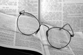
Read, Learn, Progressby banmornComment: Technicals: 1.5/2 - good focus and DOF, light is a bit flat, text in front looks oversharp
Composition: 1/2 - too centered; tilt of the book adds drama, but otherwise makes little sense, dark corner distracts
Challenge Relation: 1.5/2 - topic implies a person to be in the image, the hint is not enough IMO
Originality/Creativity: 1/2
Overall Impact: 1/2
6 |
| Photographer found comment helpful. |
| 11/22/2007 06:04:00 AM |
on the way..by bnileshComment: Technicals: 1.5/2 - overall reddish cast - wrong white balance; good focus and exposure
Composition: 2/2 - centered works well; I like how the book is cropped; different angles of girl, book and walls add tension; girls pose looks natural
Challenge Relation: 2/2
Originality/Creativity: 0.5/2
Overall Impact: 1/2
7 |
| Photographer found comment helpful. |
| 11/22/2007 05:58:05 AM |
Book Wormby PhotonurdComment: Technicals: 1/2 - skin tone is too reddish, oversaturated
Composition: 0.5/2 - hard to believe those are the hands of the guy behind the books - distance between hands and face is too long, hands do not show the weight of the books; hands are cropped brutally.black border doesn't add anything
Challenge Relation: 2/2
Originality/Creativity: 1.5/2 - person between lots of books is the first idea that comes to mind, but you added an extra with the pose
Overall Impact: 1/2
6 |
| Photographer found comment helpful. |
Home -
Challenges -
Community -
League -
Photos -
Cameras -
Lenses -
Learn -
Help -
Terms of Use -
Privacy -
Top ^
DPChallenge, and website content and design, Copyright © 2001-2026 Challenging Technologies, LLC.
All digital photo copyrights belong to the photographers and may not be used without permission.
Current Server Time: 05/09/2026 10:14:16 AM EDT.