| Image |
Comment |
| 11/27/2007 03:31:53 AM |
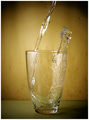
Touch Downby TechoComment: Had preferred this for the challenge, it has the best sharpness and a very calm feel to it. Other voters might have disagreed, though. |
 Photographer found comment helpful. Photographer found comment helpful. |
| 11/26/2007 05:53:20 AM |
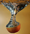
L O O Pby h2Comment: Originally posted by bassbone:
- almost like there are some dust bunnies on your sensor |
no dust bunnies, dried water drops on background and lens from lots of tries :( |
| 11/26/2007 03:02:30 AM |
high flierby suemackComment: Congrats on your top 10 finish, had liked to see this on the front page, though |
| Photographer found comment helpful. |
| 11/26/2007 03:00:44 AM |
Triumph! by AnnComment: Stunning shot, congrats on another well deserved blue! |
| Photographer found comment helpful. |
| 11/26/2007 02:53:22 AM |
Splash! by IreneMComment: Congrats Irene, well done! I'm a fool I didn't follow my first idea... |
| Photographer found comment helpful. |
| 11/26/2007 02:52:15 AM |
|
| Photographer found comment helpful. |
| 11/23/2007 09:37:59 AM |
Elementsby smichenerComment: Technicals: 0/2 - is that taken with a phone?
Composition: 1/2 - good POV; slightly tilted; flat lighting; crop through his head is not so good
Challenge Relation: 1.5/2
Originality/Creativity: 1/2
Overall Impact: 0.5/2
4 |
| 11/23/2007 09:34:00 AM |
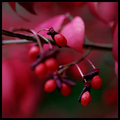
Poisonousby skewsmeComment: Technicals: 1.5/2 - a tad too dark; DOF is too shallow
Composition: 1/2 - focus point is too close to the edge, brightest area (=most attracting to the eye) is OOF; little compositional effort visible
Challenge Relation: 0/2
Originality/Creativity: 0/2
Overall Impact: 0/2
2 (challenge relation overweighted) |
| 11/23/2007 09:28:04 AM |
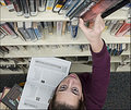
He Knew Too Muchby BoriegaComment: Technicals: 2/2
Composition: 1/2 - crop is loose at top, tight at bottom; higher POV would have been better (difficult, I can imagine)
Challenge Relation: 2/2
Originality/Creativity: 2/2 - outstanding idea!
Overall Impact: 1/2
8 - one of my top picks in this challenge |
| Photographer found comment helpful. |
| 11/23/2007 09:27:39 AM |
Getting your priorities rightby JudiComment: Technicals: 1.5/2 - brighter areas and spot in the background; slightly oversharpened
Composition: 1.5/2 - a tad too centered, but that's balanced by the tilt; very good lighting; objects in bottom left corner are slightly distracting; glasses are overdone
Challenge Relation: 2/2
Originality/Creativity: 2/2 - good idea to anticipate the first idea that comes to mind!
Overall Impact: 2/2
9 - top pick |
| Photographer found comment helpful. |
Home -
Challenges -
Community -
League -
Photos -
Cameras -
Lenses -
Learn -
Help -
Terms of Use -
Privacy -
Top ^
DPChallenge, and website content and design, Copyright © 2001-2026 Challenging Technologies, LLC.
All digital photo copyrights belong to the photographers and may not be used without permission.
Current Server Time: 05/09/2026 08:16:22 AM EDT.