| Image |
Comment |
| 01/27/2008 12:26:38 AM |
On a lighter noteby rchandrurComment: I feel that this is cool shot but do think that a tighter crop with less black dead space could have made more of an impact. |
 Photographer found comment helpful. Photographer found comment helpful. |
| 01/27/2008 12:24:18 AM |
I've Been Framedby heavyjComment: I like the tone and the setup but do feel the hands are a bright and draw attention away from the face. |
| Photographer found comment helpful. |
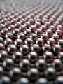
| 01/27/2008 12:22:16 AM |
The Chain ballby gauravComment: Cool set up but I feel the shot suffers from noise and a lack of sharpness and DOF. |
| Photographer found comment helpful. |
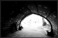
| 01/27/2008 12:21:20 AM |
Art Intimating Natureby raishComment: I feel the shot could be a bit sharper and the border adds distraction in an already busy picture. |
| Photographer found comment helpful. |
| 01/27/2008 12:19:31 AM |
|
| Photographer found comment helpful. |
| 01/27/2008 12:17:56 AM |
|
| Photographer found comment helpful. |
| 01/27/2008 12:15:58 AM |
Churchby lapopComment: Looks like a beautiful scene though I feel the wires that were used as the frame are more of a distraction than an element that helps the photo. |
| Photographer found comment helpful. |
| 01/27/2008 12:14:39 AM |
Moonlightby rema15Comment: The compsotion seems to be a bit stange for this type of shot and I feel that centering this might have helped. The color if the vignette is a bit to close to the color of the mouse and there is no real contrast, maybe a different color could have meade teh mouse pop. |
| Photographer found comment helpful. |
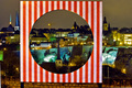
| 01/27/2008 12:11:48 AM |
The 3 churchesby MiepComment: I feel the color is a bit stange or off balance and the stripped frame is a bit odd. |
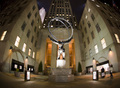
| 01/27/2008 12:10:55 AM |
Monument .by mb2006Comment: Love the fisheye for this shot, really makes the building look like it is trying to wrap around the staute. nicely done. |
| Photographer found comment helpful. |
Home -
Challenges -
Community -
League -
Photos -
Cameras -
Lenses -
Learn -
Help -
Terms of Use -
Privacy -
Top ^
DPChallenge, and website content and design, Copyright © 2001-2026 Challenging Technologies, LLC.
All digital photo copyrights belong to the photographers and may not be used without permission.
Current Server Time: 05/14/2026 12:06:29 AM EDT.