| Image |
Comment |
| 10/07/2006 03:10:50 AM |
The Lynx effectby Ecce_SignumComment: Lovely position of the animals in the frame, great poses and I like your title :o) This list of places to revisit is growing ;o) |
 Photographer found comment helpful. Photographer found comment helpful. |
| 10/07/2006 03:09:13 AM |
Nice Hair!by Ecce_SignumComment: Lovely sharp image with nice colours and the crop has worked well here :o) |
| Photographer found comment helpful. |
| 10/07/2006 03:08:04 AM |
Picture 044a.jpgby Ecce_SignumComment: I like this, nice sharp image. I may have been tempted to crop a little tighter around the face though. |
| Photographer found comment helpful. |
| 10/07/2006 02:36:58 AM |
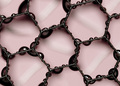
Close Callby EssAreDubyaComment: Greetings from the Critique Club!
Composition:
I like the position of the in focus piece of glass in the frame and the choice of colours are good but the rest of the image looks very busy. As one of your commenters mentions the blue at the bottom center ir also very distracting.
Technicals:
I think the focus on the small squares of glass is good but the different colours and shapes in the rest of the shot become distracting due to their out of focus look. The lighting looks fairly good on the in focus glass.
My personal thought:
The challenge description said the subject should not easily be identificable at first glance. The thing I struggle with with this shot is had I not read your description I would still not know what I was looking at and I think maybe voters were looking to at least be able to make out the subject after one or two glances.
If you've got any questions about this critique, please feel free to contact me via the PM system.
- Natalya :o) |
| 10/06/2006 02:15:09 PM |
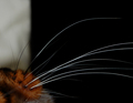
These are a few of my favourite thingsby SiggavComment: Greetings from the Critique Club!
Composition:
The position of the kitty and his whiskers leading from the bottom left corner is good, I would like to have seen all the whiskers in the frame and possibly a little more negative space to the right of them. I agree with your commenters that the white in the background on the left is quite distracting and may have lost you a viewer points with the voters.
Technicals:
Love the sharpness in the whiskers. Nice use of depth of field and focus, a little brighter lighting on the kitty may have helped but other than that I think this a 'technically' pretty good.
My personal thought:
I am really surprised this didn't score higher! The only other reason I can think of is its possibly easily recognisable at first glance which may have given you a few less points.
Look forward to seeing more images of your lovely 'model'! :o)
If you've got any questions about this critique, please feel free to contact me via the PM system.
- Natalya :o) |
| Photographer found comment helpful. |
| 10/06/2006 01:36:43 PM |
macrooo.jpgby haakkyComment: Ah it all makes sense now!!! I think the crop you choose worked really well :o) Great idea!! |
| 10/05/2006 03:47:09 PM |
¤¤¤by haakkyComment: Greetings from the Critique Club!
Firstly Håkon congratulations on your 2nd highest scoring image (so far!) :o)
Composition:
First impression, I thought I was looking at some kind of jewellrey with dark beads on it!! I really like the placement of the wire in the frame and the drops of water add an extra something to the image :o) I find the light lines on the background work well with the dark lines of the wire and the slight angle across the frame is nice.
Technicals:
The image has an overall softness that I find a little distracting, I'd like to have seen the wire much sharper. I do think the noise actually adds to this shot and the detail is good :o)
If you've got any questions about this critique, please feel free to contact me via the PM system.
- Natalya :o) |
| Photographer found comment helpful. |
| 10/05/2006 03:02:43 PM |
Bright Sunshiny Dayby TuckersmomComment: Like your use of the sunlight here, the placement and angle of the flower in the frame is really nice and you have captured some good detail :o) |
| Photographer found comment helpful. |
| 10/05/2006 03:01:39 PM |
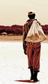
Bottle Collectorby TuckersmomComment: I agree with your comments below I think the processing works really well with your subject here to create a real feel for the character of the 'Bottlemon' and his surroundings. Love the placement of the man in the frame and the effect that he is walking away from the viewer and towards the water/land in the distance. Nicely done :o) |
| Photographer found comment helpful. |
| 10/05/2006 02:51:00 PM |
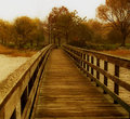
River Dockby TuckersmomComment: Great use of the bridge to lead the viewer into the image. I agree you have really made something of this, the colours are lovely and the shot has a nice overall autumn feel to it :o) |
| Photographer found comment helpful. |
Home -
Challenges -
Community -
League -
Photos -
Cameras -
Lenses -
Learn -
Help -
Terms of Use -
Privacy -
Top ^
DPChallenge, and website content and design, Copyright © 2001-2026 Challenging Technologies, LLC.
All digital photo copyrights belong to the photographers and may not be used without permission.
Current Server Time: 05/09/2026 02:53:24 PM EDT.