| Image |
Comment |
| 10/13/2006 04:08:46 PM |
Day 1 LEAFby magenmarieComment: I like your choice of background and the lighting and colours are good. I would like to see a greater DOF as there is not quite enough of the leaf in focus for my tastes :o) |
 Photographer found comment helpful. Photographer found comment helpful. |
| 10/13/2006 04:05:05 PM |
PuRRRRRpleby magenmarieComment: Really cool choice of subject and I like the DOF but the overall image needs to be a little sharper IMHO |
| Photographer found comment helpful. |
| 10/13/2006 03:58:51 PM |
Day-1.jpgby magenmarieComment: You are excellent as this self portrait stuff! I really like your pose,position in the frame, choice of background and editing on this shot. They all come together nicely here to create a pleasing to the eye image :o) |
| Photographer found comment helpful. |
| 10/13/2006 03:56:45 PM |
Day-4.jpgby magenmarieComment: Well this one really made me chuckle!! What a great idea, good use of negative space and the thumb is lit nicely :o) I have to agree some calibration maybe needed on your husbands computer as the background is not completely black but excellent attempt :o) |
| Photographer found comment helpful. |
| 10/12/2006 04:07:12 PM |
Poseidon's Tridentby ndsComment: Greetings from the Critique Club Matthes!
Composition:
I am really impressed with how well composed this image is considering you were underwater! I like the trees leading from the left of the image and the position of Susi between them is very good.
Technicals:
Great lighting but a little lighter near the bottom may have helped and I would like to have seen a little bit more detail in the trees but not sure how easy that would have been to do! There does appear to be a little noise on the divers wet suit which I think one of your commenters pointed out.
My personal thought:
Overall I think this is an excellent underwater image and for a free study you scored pretty good :o)Anythings that could be suggested to change may not have been very easy for you to do due to the location!
If you've got any questions about this critique, please feel free to contact me via the PM system.
- Natalya :o) |
| Photographer found comment helpful. |
| 10/12/2006 03:49:14 PM |
Shepherds Delightby KHoltComment: Greetings from the Critique Club Keith!
Composition:
A wonderful, dramatic sky with great colour and detail in the cloud formations! I think this would have looked better if the house and hills were in silhouette against that great sky. That would have enabled you to lose the distracting elements such as people and cars by the house.
Technicals:
I have to agree with your first comment on this image, what happened in your editing?? I was pleased for you that you managed to score 5.3, for me your editing alone would have warranted a low vote (sorry). The sky colour does look natural, its the rest of the image I am struggling with.
My personal thought:
I am big on getting it right in camera (sorry again), and as suggested above with such a lovely sky the other elements would have looked nice silhouetted in my opinion. Oh and I suppose the biggest thing.....finish what you started before submitting :o)
If you've got any questions about this critique, please feel free to contact me via the PM system.
- Natalya :o)
|
| Photographer found comment helpful. |
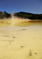
| 10/08/2006 02:21:26 AM |
Geothermal Paletteby rinacComment: The colours are lovely Rina and I like the angle as it helps lead the viewer along the water into the shot :o) |
| Photographer found comment helpful. |
| 10/08/2006 02:19:42 AM |
|
| Photographer found comment helpful. |
| 10/08/2006 02:18:37 AM |
Intensityby msdoubletroubleComment: I like the effect on the background, nice composition and those stripes are mesmirizing! :o) |
| Photographer found comment helpful. |
| 10/08/2006 02:16:21 AM |
Thinking of Homeby karmatComment: Good study, composition is nice and I like your choice of Sepia. Just a shame about the sky imho :o) |
| Photographer found comment helpful. |
Home -
Challenges -
Community -
League -
Photos -
Cameras -
Lenses -
Learn -
Help -
Terms of Use -
Privacy -
Top ^
DPChallenge, and website content and design, Copyright © 2001-2026 Challenging Technologies, LLC.
All digital photo copyrights belong to the photographers and may not be used without permission.
Current Server Time: 05/09/2026 02:53:24 PM EDT.