| Image |
Comment |
| 11/25/2002 07:55:00 PM |
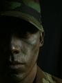
Little Boys & Big Dreamsby RackatComment: My only criticism to an otherwise top-rate photo is its overexposure. The area behind the silhouette is just too bright. Nonetheless, a great capture! |
| 11/26/2002 08:27:00 PM |
|
| 11/25/2002 07:59:00 PM |
King of Beersby biohazardixComment: I think this misses the theme a bit. Sure there are advertisments in journals, magazines and newspapers but the photo should be representative of what you'd find in the actual articles/cover of the magazine/newspaper. |
| 11/26/2002 08:22:00 PM |
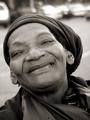
Living On Faith by ShiiizzzamComment: Picturewise there's really not much to improve on 'cause I really like it... The expression captured is great, tonal range is also very good. As a stanadlone shot, I probably would have cropped closer to the head to remove the top bright areas. If this is supposed to depict a homeless person though, some part of his environment should be included in the shot, because if it weren't for the title or filename, no one would know. Good shot though! |
| 11/25/2002 08:06:00 PM |
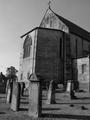
Story of a churchby joshuazhangComment: A levels adjustment or similar photo correction would give the picture more punch. Good composition. |
| 11/26/2002 08:15:00 PM |
Colorado Drought 2002by vtruanComment: Very good shot, looks like it would appear in Natural Geographic almost, reminds me of a photographer who takes lots of aerial views of the earth and then makes these famous exhibitions in major cities, don't remember his name but this pcture reminds me of his style... Is it a photojournalism picture? I don't know anymore. I think there's a grey area and when a picture's in a grey area it shouldn't influence the score, so that will be my philosophy.. Good work! |
 Photographer found comment helpful. Photographer found comment helpful. |
| 11/20/2002 06:10:00 PM |
Modern Day Rainbowby indigo997Comment: I don't know how you got a CD to reflect those colors, but its really nice. Having the candle and CD immersed in blackness really makes the subject stands out. Only thing I can think of that would impprove the shot would be the removal of whatever is behind the CD, (by changing shooting angle, etc.) |
| 11/19/2002 10:35:00 PM |
1891by SSonnentagComment: What I really like about the photo is the sepia tone that conveys the typewriter's antiquity, and the lighting (except perhaps the really dark shadows in certain spots). I think though, that it has lost something compositionally by being shot straight on instead of trying out other viewpoints. Perhaps getting in closer and making it slightly more abstract? |
| 11/19/2002 10:43:00 PM |
|
| 11/18/2002 10:15:00 PM |
Basic Technologyby JEMComment: Highlights are washed out and lots of shadows too. The light was a tad too harsh. |
| Photographer found comment helpful. |
Home -
Challenges -
Community -
League -
Photos -
Cameras -
Lenses -
Learn -
Help -
Terms of Use -
Privacy -
Top ^
DPChallenge, and website content and design, Copyright © 2001-2026 Challenging Technologies, LLC.
All digital photo copyrights belong to the photographers and may not be used without permission.
Current Server Time: 07/16/2026 10:10:20 AM EDT.