| Image |
Comment |
| 07/21/2008 06:06:56 PM |
Cartesia Reighby wickee_oneComment: I like the softness of the photo and the feeling and mood that it creates through out. I do wish it was just a little bit sharper however as my eye does have a slight issue finding a place to start to peruse the image.
I like the effect of the lighting to give the very dream like state, excellent control and very nice through out the frame. When I first looked at it, i thought that she really was sleeping as children normally have a wrinkled face when pretending, but is a very nicely composed with the positioning and angle that you took the photo from.
The processing and and crop of this shot are beautiful. I feel you should have scored higher than the score recieved for this shot. |
 Photographer found comment helpful. Photographer found comment helpful. |
| 07/21/2008 07:49:57 AM |
Day-6.jpgby joynimComment: I think the use of the overlay works very well in the photo to convey the magical effect that you were going after. Certtainly holds your attention in the frame and makes you want to look more into what is going on in it. The positioning of the girl amongst the grass is a very nice, typical sleep position you see photographed often. nice job composing the frame as to have some verticals and diagonals created by the grass without having the grass as a distraction away from your image.
The processing is real nice on your shot, I like the muted pink dress amongst the desaturated grass, It draws your attention right to the subject. Great job merging the overlay into the photo, you kept it very nice and clean.
In my opinion, The only thing that I would say would be missing to take this from a daydreaming shot to a pixie shot would be a set of pixie wings for you subject. I think if you had that it would be perfect. |
| Photographer found comment helpful. |
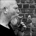
| 07/21/2008 07:40:39 AM |
Forty years of Camelsby timfythetooComment: I think the processing on this image is fantastic, the detail and clarity are great. I like how you can see each of the whiskers in the beard and mustache. The conversion to B&W and the contrasting of colors and textures really make you want to explore the photo more and more.
The angling of the hand gives a good amount of depth to the photo and the horizontals in the brick wall make a great background to shoot this on. I really like the positioning of your dad in the shot the composition and negative space on the unused side makes this feel really balanced in the frame. Looks like you may have done a bit of burning on the hand, on the wrist and perhaps the inner palm? May be just me, but I may have like to see it a bit lighter. |
| Photographer found comment helpful. |
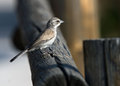
| 07/21/2008 07:27:30 AM |
Sparrowby Frankie_LvComment: Being straight from the camera, and being a 30d, I will make most of my comments based on this. Your DOF was dead on, you have thrown both the foreground and background out of focus, making the sparrow in the attention. IMO, you will need to crop this so the post in the forground doesnt compete for attention, as well as burning the lighter colored wood in the background.
The sparrows feathers are nice and detailed, I really like that you have all of the sparrow in the frame. If it is possible, you my want to tune the whites just a tad on the bird especially under the chin, not blown out but definately higher key than avg white. I do like the fence post that creats the diagonal into the photo. It really gives a good amount of depth to it. |
| Photographer found comment helpful. |
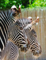
| 07/18/2008 07:29:50 PM |
zebras.jpgby YomiComment: There is a great feeling of texture from the stipes of the zebra that creates a real interest in the photo.I like the positioning of both of the zebras eyes in the photo their positioning really makes for an interesting composition. I like the detail in the single hairs that you can also see not only on the mane of the zebra, but also on the chin. Your choice of DOF keeps the interest where the it should be instead of searching for more in the background. |
| Photographer found comment helpful. |
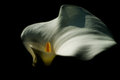
| 07/18/2008 07:15:46 PM |
Calla3.jpgby signal2noiseComment: I Really enjoy the lighting on this shot. Was it done from above? I really like that the pollen stem is so nicely lit and has the yellow glow within the pocket it creates. The tones and textures of the Calla Lilly are beautiful, i like the sharpness and detail within the petal. I also like the shadowing on the petal toward the right of the flower. I think that the off centered the pollen stem to gives a more interesting framing and compsition. |
| Photographer found comment helpful. |
| 07/18/2008 06:28:39 PM |
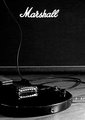
Only a Marshall Will Doby arron_christensenComment: First off, I really like the overall feel to this, seems like I would be seeing this in an advertisement or some place similar to that. I really am enjoying your composition, the bridge placed on the lower left 3rd and it being polished chrome (grey in B&W) really grabs your attention. Then with the guitar strings running off in a diagonal and the guitar being in the diagonal it makes it exceptionally strong. This has some great detail thoughout and I love the sharpness of the writing on the speaker as well. Very nicely done, may want to think about considering it when we do music II challenge. |
| Photographer found comment helpful. |
| 07/18/2008 06:22:14 PM |
Tulipsby rmezzoComment: I like the colors and tones of the tulips, the center pulp is very nicely focused and the doF has been chosen to make it so the whole flower interior is in focus and nicely detailed. The lighting (IMO) is just a bit bright, not overexposed but making you loose a bit of detail on the rim of the foreground tulip and a bit more on the one in the rear. Your composition of this makes its very nice, not the average centered tulip shot. The contrasts of the reds to the greens draw your interest and the DOF brings your eye to exactly what you intend them to see which is the inside of the tulip in the foreground. The only thing I may reccommend you try is a bit of a burn on the blacks inside the foreground tulip to help them pop a bit more. |
| Photographer found comment helpful. |
| 07/18/2008 11:52:52 AM |
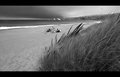
IMGP0311-Goat-Beach.jpgby EstimatedEyesComment: I like the positioning of the camera to add the foreground interest of the sea grass in the foreground. The detail in the grass in the foreground helps me to want ot explore the photo futher. There are alot of pleasing textures to it, from the sands to the grass to the waves crashing onto the shore. I like the depth caused by the shorline where the waves break.
I do not really care for the sticks and people hanging out in the center of the frame, but that is just my opinion, i was thinking if they were your subject, then the composition you chose was good. Because if you had tried to move them to a point along the rule of third lines it wouldnt allow the sand to come up to the foreground.
HTH
Rich |
| Photographer found comment helpful. |
| 07/18/2008 07:40:32 AM |
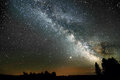
Summer Milky Way with Jupiterby strangeghostComment: I am going to state first that I am not any way a astrophotographer, but I think you did a great job with this photo. I love the lens choice you used for this as it gives so much of the beautiful sky. Excellent light control as well, the exposure is evenly lit, especially with so many elements within that radiate light.
I really like how you have some elements of the ground to relate to as we look into the heavens. The sharp trees give a feeling of a nice clear night, and a couple people outside just stargazing or camping.
I also like the glow of the clouds at the horizon area. It gives the feel of either the sun still setting or the sun begining to rise. It just really adds interest at that point and outlines the trees really well. |
| Photographer found comment helpful. |
Home -
Challenges -
Community -
League -
Photos -
Cameras -
Lenses -
Learn -
Help -
Terms of Use -
Privacy -
Top ^
DPChallenge, and website content and design, Copyright © 2001-2026 Challenging Technologies, LLC.
All digital photo copyrights belong to the photographers and may not be used without permission.
Current Server Time: 06/22/2026 08:58:25 AM EDT.