| Image |
Comment |
| 05/03/2007 09:23:05 PM |
Embraceby SeanachaiComment: Absolutely love the story this one tells. Something that a mom would be proud to display on her wall. The dandelion stem she's holding onto is a nice touch too. You can just see the child bringing it to her as if it was the best thing in the world! Lovely! |
 Photographer found comment helpful. Photographer found comment helpful. |
| 05/03/2007 09:23:00 PM |
Day Flows to Dusk, then Into the Nightby The_DentistComment: I love how the shots are seemlessly put together and the light flows. I also like how the trees to the left are fuller, and the ones to the right are more bare... almost as if it is a change in season as it goes across the shot too. My only little nitpick is that the shot feels tilted down to the right. Overall, great idea and well excecuted. |
| Photographer found comment helpful. |
| 05/02/2007 06:10:04 AM |
Lord & Lady of Bluebell Woodsby alpharichComment: I like this idea.. very natural feel to it, and I like the variation in the dof with the middle shot. I think this might have been better for me if the two end shots had been more symmetrcal. Perhaps cropping closer on the left one to make the statue the same size as in the right shot. Nice! |
| Photographer found comment helpful. |
| 05/02/2007 06:05:24 AM |
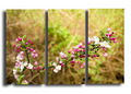
Destainedby BugzeyeComment: I like this idea... the framing is nice, and I like that it wasn't cut in even thirds. It appears as though there are some desaturated spots on the flower and stem in the top two sections... perhaps from adjusting colors and not sections of the photo? Nicely done though! :) |
| Photographer found comment helpful. |
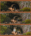
| 05/02/2007 06:01:20 AM |
Chipmuck's homeby ladpupmoeComment: Cute series of shots that work well together. The whole presentation could have been enhanced by a bit of editing... perhaps a contrast or levels adjustment. The top photo looks a bit crisper with more color compared to the other two. |
| Photographer found comment helpful. |
| 05/01/2007 09:25:32 PM |
Nice Shotby remboComment: Nice set of shots to show the action, but the editing is too obvious for my tastes. You can the halo around her body and the racquet where you've edited, perhaps where you tried to add a blur to the background or tried to make the ground/wall even up a bit? Just needs a bit more editing to clean it up and make it even better! Still, a fun shot! :) |
| Photographer found comment helpful. |
| 05/01/2007 09:07:48 PM |
In the Gardenby jerseyjimComment: I like how the photos pop off of the white background, but the 3rd one is placed higher, which is confusing. Nice diagonal line that goes through the 3 frames. |
| 03/25/2007 09:12:05 PM |
by melissa111083Comment: Neat collection of footprints... so simple, yet lots to look at. Nicely done! |
| Photographer found comment helpful. |
| 03/21/2007 07:43:27 PM |
Jacquesby BrielleComment: I thought this one was yours when I peeked through them, but I didn't get to vote in this challenge! Fantastic job and congrats on the top 10! :) |
| Photographer found comment helpful. |
| 03/18/2007 12:17:39 AM |
Circles of the Essenceby UbersteinyComment: Time to find a new friend to model for you... your model has a very unique look so she is easily recognizable, and you keep using the same basic idea of painting shapes on her face. A nicely done shot, just a little redundant for me. |
Home -
Challenges -
Community -
League -
Photos -
Cameras -
Lenses -
Learn -
Help -
Terms of Use -
Privacy -
Top ^
DPChallenge, and website content and design, Copyright © 2001-2026 Challenging Technologies, LLC.
All digital photo copyrights belong to the photographers and may not be used without permission.
Current Server Time: 07/28/2026 02:39:55 AM EDT.