| Image |
Comment |
| 05/09/2004 10:23:37 PM |
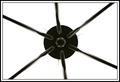
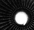
Looking up at the Lightby mariomelComment: Why take a simple monochromatic graphic design and add that border to detract from its elegant simplicity? It detracts horribly! |
| 05/09/2004 10:21:41 PM |
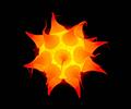
Solarby TallblokeComment: Looks exactly like a kidney stone enlarged and colored intensely! (It HURTS to look at that!) 8 |
 Photographer found comment helpful. Photographer found comment helpful. |
| 05/09/2004 10:20:35 PM |
|
| Photographer found comment helpful. |
| 05/09/2004 10:20:03 PM |
|
| Photographer found comment helpful. |
| 05/09/2004 10:19:31 PM |
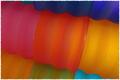
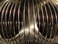
Tumblersby spydrComment: Strong graphic image, intense colors, then that mickey mouse border weakens it. (It's probably cute for family pix, but it doesn't say ART to me. The image IS Art; the border is not. IMNHO) |
| Photographer found comment helpful. |
| 05/09/2004 10:16:21 PM |
|
| 05/09/2004 10:15:43 PM |
|
| Photographer found comment helpful. |
| 05/09/2004 10:11:53 PM |
|
| Photographer found comment helpful. |
| 05/09/2004 12:11:27 PM |
|
| Photographer found comment helpful. |
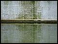
| 05/09/2004 12:10:26 PM |
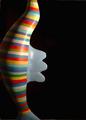
Reflectionby lilnukeeComment: This surprised me. Thumbnail didn't hint at how much I'd like this image, but it has a subtle power to draw the eye. Feels very Manet somehow. 10 |
| Photographer found comment helpful. |
Home -
Challenges -
Community -
League -
Photos -
Cameras -
Lenses -
Learn -
Help -
Terms of Use -
Privacy -
Top ^
DPChallenge, and website content and design, Copyright © 2001-2026 Challenging Technologies, LLC.
All digital photo copyrights belong to the photographers and may not be used without permission.
Current Server Time: 06/18/2026 01:11:07 PM EDT.