| Image |
Comment |
| 03/12/2007 06:43:53 PM |
|
 Photographer found comment helpful. Photographer found comment helpful. |
| 03/12/2007 01:32:21 AM |
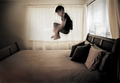
While you were outby rinacComment: I gave this a 9 as the motion blur on Max yelled FUN to me. I remember bouncing on beds as a kid, not quite jumping onto them like this but bouncing :)
Nice shot! |
| Photographer found comment helpful. |
| 03/08/2007 07:51:53 PM |
36 Palmsby jgriecoComment: Greetings from the Critique Club.
Composition: You have made some good choices in this. The lines of the pool draw our eyes from the lower left corner away to either the top right or top left. This lets us then take in the great sky and clouds and finally the trees. The only negative is that the horizon could do with being a bit more level. It's not far off so perhaps it looked ok while on the camera. Minimal Editing rules are tough!
Technicals: Well, this would score good in any of the rulesets but in Minimal this shows you got the technicals correct! Good exposure for the clouds and sunrise but still detail in the objects at the poolside.
Feeling: I didnt vote on this but if I had it would have been a good score. Lots of interest with very little "extras" in the shot to distract me. Jolly fine work!
PM me if you have any questions. |
| Photographer found comment helpful. |
| 03/08/2007 06:48:37 PM |
Heart of Goldby BakerBugComment: Greetings from the Critique Club
Composition: This is a hard one. The flower is so large in the frame that the bits of background that do show through are exagerated. When I look at the image my eye flicks from the background at the top-left to the bit at the right and back again. I think either fill the frame some more or not so tight.
Technicals: The flower is nice and sharp and the colours are bright. There is a little bit of noise/grain in the image (look at the lower left) but otherwise good.
Feelings: While this is a nice close up of a flower it lacks something to make me say "cool" or "wow". It's nice but that's it. nice seems to be a 5 on DPC and that's what the image got. A different perspective on the flower may have added some more interest for viewers.
PM me if you have any questions |
| Photographer found comment helpful. |
| 03/08/2007 01:35:14 PM |
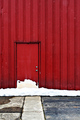
behind the red doorby posthumousComment: Greetings from the Critique Club, this will be the second of your images I've got in the one week!
Composition: I like the composition as I'm a bit of a fan of some negative space. Having the door low and left leaves a lot of the wall for us to look at. The wall holds little interest so we are forced to concentrate on the door and the great path that leads up to it. The line in the path moving directly to the door in fantastic. I can see you had a little dilema here: level the snowline or line up the vertical lines in the wall? It's hard to say without seeing it but I'm inclined (no pun intended) to say the wall lines are the stronger element so they should be the lined up ones.
Technical: Here's where I see the problem. Some of the commenters have mentioned it but the image lacks sharpness. Is it a small crop? A resize issue? The processing? Whatever the case it makes it hard to look at and find the little interesting elements as they all seems to blur together in a way. I'm sure this is worth half a point in your score.
Feeling: I love the concept of the image. I like the mass of red and the contrast with the snow. A great image to play with: how about if you had tried changing the colour of the wall but leaving the door red?
PM me if you have any questions |
| Photographer found comment helpful. |
| 03/08/2007 12:04:55 AM |
|
| Photographer found comment helpful. |
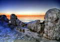
| 03/07/2007 03:14:40 AM |
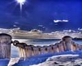
frozen water, water frozenby posthumousComment: Oh no, giving a critique on another CC member! Here goes...
The composition is ok but it took me a while to realise that not only are the icicles a main element in the image but thats actually running water below them! I think this would have been missed by many voters which would have had them doing what I first did: saying "I don't get the title in relation to the image".
The light's a tad harsh up top. B&W is ok but I wonder how a bit of a blu tint would have gone. Often ice has a blue hue to it and that may have made the image jump out at people a bit more.
I'd suggest a tighter crop to focus more on the icicles and with titles, I like to err towards hitting voters over the head rather than having to rely of them thinking too much :)
Good stop motion on the water. An image with plenty of potential.
PM me if you have any questions |
| Photographer found comment helpful. |
| 03/07/2007 12:07:05 AM |
|
| Photographer found comment helpful. |
| 03/06/2007 01:40:25 AM |
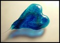
Take \"Karo\" my heartby pyritjennyComment: Greetings from the Critique Club.
Composition: The image is laid out nicely with a strong diagonal form created by the heart. In a way I don't find the shadow of the heart a string part of the image so I feel that the heart is a bit far toward the top of the image. I realise the shadow is part of the image though.
Technicals: Some of the commenters have already referred to the brightness at the top-right and the hilights it has created. The hilights themselves are not a problem but when they are placed right beside such a bright portion of the background it becomes a bit much. The background in general seems to be a dirty colour which may hurt the image as the heart itself has such nice colouring.
Feelings: I like the heart and the shapes within in. It fits the challenge nicely.
PM me if you have any questions |
| Photographer found comment helpful. |
| 03/05/2007 11:21:54 PM |
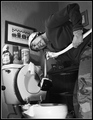
Arrgh!... I hate this!by alexjackComment: Greetings from the Critique Club.
Starting with a string idea like this you can't go too wrong and your score shows that's the case.
Composition: The composition is good and the way your wife is bending over the toilet like that helps all the lines in the image point towards the bowl. There is a "thing" poking into the frame on the left that you should have moved if it is something that can be moved.
Technical: The B&W conversion is good. The border works well. The lighting is a bit harsh, especially on the cleaning products above the loo. That's really the only major criticism I can find.
Feeling: Here's where the fun comes in. The expression on your wife's face is classic for the image. The duck, well who doesn't like a rubber duck - why he's in the loo I don't want to know! The paper is a good touch too!
PM me if you have any questions. |
| Photographer found comment helpful. |
Home -
Challenges -
Community -
League -
Photos -
Cameras -
Lenses -
Learn -
Help -
Terms of Use -
Privacy -
Top ^
DPChallenge, and website content and design, Copyright © 2001-2026 Challenging Technologies, LLC.
All digital photo copyrights belong to the photographers and may not be used without permission.
Current Server Time: 06/26/2026 06:36:55 PM EDT.