| Image |
Comment |
| 04/04/2007 02:15:40 AM |
|
 Photographer found comment helpful. Photographer found comment helpful. |
| 04/03/2007 05:17:48 AM |
Gossipingby HauxonComment: Greetings from the Critiaue Club
Fit: This image fits the challenge well, someone is using a cellphone.
Composition: Nicely composed with your girlfriend almost filling the frame without being overbearing. The cellphone in the front helps form a nice diagonal leading us towards her face.
Technical: It may be because this was a last minute entry but the increased brightness is what hurt this image I feel. There is good contrast between dark and light areas but each of these is at the extreme end of the scale. It just feels a bit bright. The DOF is nice as the cellphone in front is OOF enough not to draw too much attention but is still a key element in the image.
Feel: A fun shot that shows nice emotion in your model. I just can't get past the fact that it is a bit "in your face" with the brightness.
PM me if you have any queries. |
| 04/02/2007 03:00:13 PM |
Inocenciaby enriqueavilaComment: Greetings from the Critique Club
Composition: The composition is good. The child is not centered yet she is not pushed to the sides of the frame either. There is some interest around her in the frame yet it does not distract.
Technical: I think B&W was a good choice as the colours of the clothing would have been a distration from the child who is your central topic. The B&W conversion seems ok but feels a little flat, perhaps a bit more contrast. If you could have got the childs face into the shot I feel your score would have increased as we could have felt a connection with her.
Feel: I rated this one above the score it finally received. While the multiple light sources is not obvious it worked on a couple of levels: a straight lighting shot but also using the analogy of the child "lighting" the parents life. Being a parent I can relate to that sentiment.
If you have an comments feel free to PM me, good luck in future challenges. |
| 04/02/2007 05:21:49 AM |
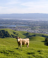
Mooooving Into Silicon Valleyby AgaerisComment: Is that the real Silicon Valley? I heard the name of course but you never seem to see pictures unless it's off some corporate headquaters.
Cows are cool :) |
| 04/02/2007 05:19:30 AM |
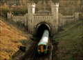
Back To The Futureby marboComment: What an interesting location, I'm keen to learn where this is and the history hedind it |
| Photographer found comment helpful. |
| 04/02/2007 05:05:51 AM |
|
| Photographer found comment helpful. |
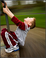
| 03/31/2007 05:05:38 PM |
The Thrill of Youth by DrAchooComment: I had this sort of idea but when I went looking it seems parks in NZ have taken most of them out on "safety" grounds. Silly if you ask me.
Nice shot, love the motion blur and the lights in the shoes!! |
| Photographer found comment helpful. |
| 03/30/2007 05:29:48 PM |
See what I'm sayin'?by freakin_hilariousComment: Greetings from the Critique Club
Composition: The composition is good but I feel you are a little close to the right side for comfort. I also wonder if the way the letters curve up to the top of the frame isn't causing an unnatural line in the image - I say this because my eye is drawn from you out to the "H", which is taking me away from the model.
Technicals: The lighting is good, maybe the backlighting could be a bit higher. The PP work is very good.
Feel: I wish the letters were a bit more "professional" looking as they seem to drop the tone of the image a bit. If I had voted I think that fact would have dropped a point and maybe a lot of other voters felt similar? Overall a pleasant image and as a portrait would work very well. Your creative streak, whcih you should continue to foster, may have in this case not added to the overall image :(
PM me if you have any querstions. |
| Photographer found comment helpful. |
| 03/26/2007 05:07:28 AM |
|
| Photographer found comment helpful. |
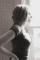
| 03/26/2007 05:02:06 AM |
Young woman in windowby doug61853Comment: Greetings from the Critique Club
I really like this shot. I didn't vote but if I had it would have scored well from me.
Composition: While the subject is in the center of the frame, her arm bending backwards pulls her into the left half of the frame. The cutoff elbow, I'm not so sure about.
Technical: The lighting from the window sure seems overblown. I think it works and it also adds a lot of depth to the image in that we start to wonder what she is looking at as it is in such a bright void. The bright light pulls our eyes to the models face and to a lesser extent, her breasts. You've added a lot of grain to the image but I guess that's what the challenge was about. I'd like to have seen a bit more contrast in the B&W conversion as your model seems to merge in with the background a bit much.
Feel: As I said, I like it. There's a sense of mystery in the image. |
| Photographer found comment helpful. |
Home -
Challenges -
Community -
League -
Photos -
Cameras -
Lenses -
Learn -
Help -
Terms of Use -
Privacy -
Top ^
DPChallenge, and website content and design, Copyright © 2001-2026 Challenging Technologies, LLC.
All digital photo copyrights belong to the photographers and may not be used without permission.
Current Server Time: 07/16/2026 11:59:07 AM EDT.