| Image |
Comment |
| 02/11/2010 03:23:34 PM |
Manhattan Amateur Classic - Championship Ballroom Dancersby cmathis430Comment: Greetings from the Critique Club.
First impressions are that the lighting is a bit harsh - on board flash?
Technically this is an ok shot but diffusing the flash would have helped a bit. The landscape crop feels out of place here are the space to their left and right adds nothing to the story - maybe portrait would have been beter?
Artistically we catch a glimpse of their faces and that's what tells the story. If we could have seem her face more it would have helped engage us. The back background also doesn't allow us to get the context of the dancers as well as if there were some detail in it (although I suspect you weren't able to achieve that given the lighting in the venue).
In summary this is a good shot but there are areas to work on. Congrats on your first DPC entry!
Feel free to PM me if you have any queries.
Gerry |
| 02/11/2010 03:18:26 PM |
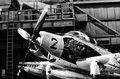
Number Twoby JacksonGarietyComment: Greetings from the Critique Club.
First impressions are that the detail here is great. The B&W has great tones.
Technically this is good. It is composed nicely and the B&W conversion is first rate. The background is a bit distracting - some blurring in PP may have softened it a little. Given this is inside I doubt you could do much about the lighting but there are some hotspots that stand out.
Artistically this is ok. This is a study of an old plane rather than an artistic shot of the plane. An airman standing in front of the plane would have made all the difference.
In summary this is a good shot that probably deserved a little more scorewise.
Feel free to PM me if you have any queries.
Gerry |
 Photographer found comment helpful. Photographer found comment helpful. |
| 02/11/2010 03:13:14 PM |
Great Blue Heronby eaglebeckComment: Greetings from the Critique Club.
First impressions are that this shot is a little small and poorly processed.
Technically it is the artifacts around the bird that stand out.  Yo_Spiff Yo_Spiff has covered that off in his comment so I won't repeat that here.
Artistically this shot does not offer DPC what it likes. The Heron is just standing in the water, not even looking at us. Birds are a tough subject at DPC and to score well they need something wow. This shot does not have that wow, even if it weren't for the technical issues.
In summary it's an ok shot but that's it.
Feel free to PM me if you have any queries.
Gerry |
| 02/09/2010 05:23:47 PM |
Winter on the moorby tembaComment: Greetings from the Critique Club.
First impressions are that there is a lot of interest but the composition feels a little off.
Technically this is good. There is good detail in the horses and given the weather the tones look good. I feel that given the wind is pushing the tree left and the rain is driving left we should have a little more frame to the left - just my feeling.
Artistically this is great. The horses being buffeted by the wind and rain but still standing their ground sends a strong message to the viewer.
In summary a good shot and the 6.x score reflects that. It just lacks the final "wow" needed in a Free Study. A good shot and result even so.
Feel free to PM me if you have any queries.
Gerry |
| Photographer found comment helpful. |
| 02/09/2010 05:09:00 PM |
Srebrna Urodaby labudsComment: Greetings from the Critique Club.
First impressions are that this is a classy shot.
Technically this is good. The composition is good although she is a bit close to the frame - as we follow her gaze we hit the frame too soon. Nice tones and exposure. The eyes stand out well and we are drawn to them.
Artistically this is very good. The way the light reflects off the jewellery makes me think this could be an add for the necklace and earring. In that context this would do well, in this challenge it draws away from the human form a bit.
In summary a great shot and it scored a solid 6 so you have to be happy.
Feel free to PM me if you have any queries.
Gerry |
| 02/09/2010 05:05:32 PM |
Moose Meadowsby PANComment: Greetings from the Critique Club.
First impressions are that the size is too small. I know it's a panorama but any "wow" is lost by the small height.
Technically this seems ok. At this size I struggle to see a lot of detail to be able to comment. It appears a bit dark overall but as it's 2am that's to be expected. Given this thought I'd expect there to be some element to focus on - there isn't.
Artistically this could be great - at the right size.
In summary it's all about size. Any drama or "wow" in this shot was lost in the small height :(
Feel free to PM me if you have any queries.
Gerry |
| 02/04/2010 09:05:00 PM |
|
| Photographer found comment helpful. |
| 02/04/2010 01:12:33 PM |
|
| Photographer found comment helpful. |
| 02/04/2010 01:24:17 AM |
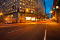
5th and Westlakeby iammatthiasComment: Greetings from the Critique Club.
First impressions are the yellow colour cast (as I noted when voting).
Technically the colour cast could be sorted in post processing to a large degree with a levels adjustment. Composition is good but it appears a hard image to get all the buildings feeling vertical - the right most one feels off. The lights are bordering on over-exposure but the star forms they make are nice.
Artistically this is ok but I don't feel much from the shot. I think there is too much going on in it - the van, the light trails, the overhead lights, and the blown out sign right in the middle.
In summary this was a good location but overall the exposure was a little too long and the PP needed to go a bit further.
Feel free to PM me if you have any queries.
Gerry |
| 02/03/2010 02:09:02 PM |
Regrowth by michelRComment: Greetings from the Critique Club.
First impressions are that this is a moody shot that contrasts a new plant with some rubbish well.
Technically this is good. The plant is nicely exposed and the composition is good to allow us to compare the two items - a little centered vertically perhaps.The DOF is very shallow and this doesn't let us see much detail in the spray can (I didn't realise that's what this was until I read your notes - I thought it was a coke can or something)
Artistically this rocks! I love these moody shots and now that I know this is a spray can this tells a great story.
In summary the inability for voters to see the link with graffiti killed the score on this shot. If you could have arranged the can so that we could read that it was a spray can then I'm sure this would have done well.
Feel free to PM me if you have any queries.
Gerry |
| Photographer found comment helpful. |
Home -
Challenges -
Community -
League -
Photos -
Cameras -
Lenses -
Learn -
Help -
Terms of Use -
Privacy -
Top ^
DPChallenge, and website content and design, Copyright © 2001-2026 Challenging Technologies, LLC.
All digital photo copyrights belong to the photographers and may not be used without permission.
Current Server Time: 06/21/2026 10:46:43 PM EDT.