| Image |
Comment |
| 02/17/2010 12:47:21 AM |
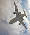
Plane of perspective by snafflesComment: Greetings from the Critique Club.
First impressions are that this is an impressive shot that makes the plane look like it is upside down!?
Technically this is good. Composed well. Exposed well - you haven't killed it with post processing. I do find the skin of the plane to look a little glossy - maybe we don't clean our planes in NZ as much as you guys ;) There seems to be some noise visible in the engines - is this from some shadow/hilight processing perhaps or a topaz filter? The crop works well for the shot. The green circle is a bit of a shame but it seems you are off to address that :)
Artistically this has a "wow" factor that DPC likes but you know this because you won the blue with it. The sky is a bit full of clouds for my liking but that's a minor nitpick.
In summary a good shot for the challenge as the voters have already told you. The funny thing is that in a Free Study I'm not sure this would score much above a 6, it's just that it fits the challenge well so in context it rocks.
Feel free to PM me if you have any queries.
Gerry Message edited by author 2010-02-17 00:48:18. |
 Photographer found comment helpful. Photographer found comment helpful. |
| 02/16/2010 02:02:20 PM |
Secrets . . by JedusiComment: Fantastic detail, I'd love to compare it to the original |
| Photographer found comment helpful. |
| 02/16/2010 12:37:30 AM |
Bedtime Storiesby MinsoPhotoComment: Greetings from the Critique Club.
First impressions are that the shot is a bit flat and soft.
Technically the editing here jumps out out you - and not in a good way. The blurred background doesn't merge with the floor in a natural way. Composition is good. As I mentioned before the shot feels a bit flat.
Artistically this rocks! The concept is great and the doll is staring right at us - very creepy indeed. Great chair, it fits the concept well.
In summary this has great potential but the technicals let it down, as you have already noted.
Feel free to PM me if you have any queries.
Gerry |
| Photographer found comment helpful. |
| 02/15/2010 09:09:01 PM |
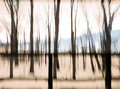
Rocking Chairby posthumousComment: Greetings from the Critique Club.
First impressions are OMG there is no chair and that's a mess!
Technically I can't really comment sorry. I just don't know much about this style. All I can say is that a crop to remove the "second horizon" and the bottom would have made me happier.
Artistically it's not bad as far as these sorts of shots go. I like the effect although I also know DPC generally hates it.
In summary no chair but it's not hard to infer the shot is from a chair. Having said that the challenge did say "Include a chair in your photograph" so you ignored the challenge - shame on you and shame on the voters for letting that go!
Feel free to PM me if you have any queries.
Gerry |
| Photographer found comment helpful. |
| 02/15/2010 02:28:42 PM |
Green Chairby dtremainComment: Greetings from the Critique Club.
First impressions are that the tones are very nice and there is alot to see in the shot.
Technically there isn't too much to find fault with in this. The tones are great, the composition well, the exposure spot on. DOF is perhaps the only thing that springs to mind - a bit of blurring of the background would have been good.
Artistically this is a bit dull. It's a picture of a chair but the chair is clearly in a shop and it comes across as being a shot of a window display rather than a chair, which is what voters will be looking for.
In summary it's a good shot technically but I suspect a lot of voters just found it a little uninspring, hence all those 5's.
Feel free to PM me if you have any queries.
Gerry |
| Photographer found comment helpful. |
| 02/15/2010 01:18:59 PM |
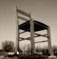
The Greatest Chair In The Worldby gadionComment: Greetings from the Critique Club.
First impressions are "wow - what a chair"!
Technically this is ok, there's not much to fault it on other than it being a bit flat.
Artistically it's good, the person a good touch to give us a sense of scale and not have us think it's a model or diorama. POV is not the best but I doubt you had a ladder tall enough to do much about that :)
In summary it's a quirky shot that meets the challenge and has an initial "wow" but after that we are left with a feeling of "it's just a big chair". It's a shame the sky wasn't cooperating with you that day.
Feel free to PM me if you have any queries.
Gerry |
| Photographer found comment helpful. |
| 02/15/2010 01:36:02 AM |
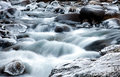
Cold riverby svavaComment: Greetings from the Critique Club.
First impressions are "not another long exposure of water" - we see so many on DPC.
Technically this is a good example however. Exposure is good, with hardly any of the ice blown out. The composition could perhaps be improved with a little less at the top so we focus more on the foreground.
Artistically a nice DPC friendly shot - the score reflects that.
In summary a good shot, not too much to do differently, a good score and fit for the challenge.
Feel free to PM me if you have any queries.
Gerry |
| Photographer found comment helpful. |
| 02/15/2010 01:33:36 AM |
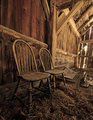
In situby snafflesComment: Greetings from the Critique Club.
First impressions are of the tones - they are great!
Technically this seems exposed well. The composition is good but everything seems on a slight lean. There are plenty of leading lines however they take us away from the chairs and off to the bright light through the boards.
Artistically there is plenty for us to look at here. I do feel that less of the surroundings and more of the cobweb covered chairs would have added to the appeal. The title is fine, don't listen to them!
In summary a good shot (it did get a 6.4) but I think it could have easily been top 10 with some work.
Feel free to PM me if you have any queries.
Gerry |
| Photographer found comment helpful. |
| 02/14/2010 08:02:35 PM |
fork in hellby bcenuComment: Greetings from the Critique Club.
First impressions are that this is quite "in your face".
Technically this is good. There is some dust(?) on the fork that is prominent and I'm unsure the composition is best. The lighting on the fork at the right is a bit dull.
Artistically this is nice and colourful but it's not obvious the fork is hot, it's just orange. I wonder if that was an issue? The blue from the gas is a good tough as it does guide us to the centre of the frame.
In summary a nice shot but it doesn't say "hot" enough.
Feel free to PM me if you have any queries.
Gerry |
| Photographer found comment helpful. |
| 02/14/2010 07:59:48 PM |
Metal workerby hemantComment: Greetings from the Critique Club.
First impressions are that this shot is a pleasure to view.
Technically it is great. Lighting is good, the light trails are perfect, composition is good.
Artistically this is also good as we see plenty of interest in what the man is doing.
In summary a good solid shot that didn't score as high as I'd have thought but it does lack a little of the required excitement that DPC needs.
Feel free to PM me if you have any queries.
Gerry |
| Photographer found comment helpful. |
Home -
Challenges -
Community -
League -
Photos -
Cameras -
Lenses -
Learn -
Help -
Terms of Use -
Privacy -
Top ^
DPChallenge, and website content and design, Copyright © 2001-2026 Challenging Technologies, LLC.
All digital photo copyrights belong to the photographers and may not be used without permission.
Current Server Time: 06/21/2026 10:46:59 PM EDT.