| Image |
Comment |
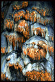
| 06/07/2007 05:52:32 AM |
Nature's Muralby shutterflyComment: very cool abstract image. love the colors. wondering what this is and how the paiting of light was used here as it isn't a prominent part of the image (or at least not recognizable if you don't know what the subject is and how it looked prior to the light painting). Give me the feeling of sloshy melting away. |
 Photographer found comment helpful. Photographer found comment helpful. |
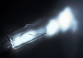
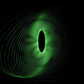
| 06/07/2007 05:51:14 AM |
Fraction of Lightby ocelotComment: seems really out of focus. i don't really understand the title, why fraction? Did you mean fracture, if not to me that seems more fitting. The quality of the light is really poor and lacking in form. |
| Photographer found comment helpful. |
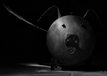
| 06/07/2007 05:49:52 AM |
~O~by jenesisComment: cute! took me a second to recognise the little piggy. nice textures. really interesting subject. at first I thought it was a large machine of some sort and now realizing what it is and guessing it's size based on the floor tiles I still can't shake that first impression! makes it very surreal. could have done with a little more contrast but then again maybe not if it changed the integrity of the shadows. |
| Photographer found comment helpful. |
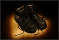
| 06/07/2007 05:47:54 AM |
End of a Long Dayby Evil-ChihuahuaComment: really noisy image especially on the red ring. Think the boots could be arranged more authentically to convey the feeling of the "long day" like they were just kicked off. the circle is much to artificual and I think this could have done better with angular like on one boot casting shadows on to the other. |
| Photographer found comment helpful. |
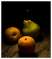
| 06/07/2007 05:46:21 AM |
old wood and fruitby tcmartinComment: Nice orange tones and lovely glow. i feel like this image might have been nice if there was a little less of the total blackness behind the pear and if you could see the stem. although the almost 50/50 distribution of the light on the table is interesting in a way. |
| Photographer found comment helpful. |
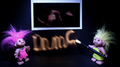
| 06/07/2007 05:44:33 AM |
DNMC trollsby SheryllComment: interesting... don't really understand the signifigance of the small photo... bitterness over a past entry or just a random addition to the scene? The light isn't very well done and barely legible. |
| Photographer found comment helpful. |
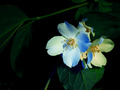
| 06/07/2007 05:43:26 AM |
Subtle Shades of Bloomby colorcarnivalComment: Love the blue tones here. I find the back branch a bit distracting but without it a definite change in composition would be in order to account for the negative space. This may have looked nice with a square crop. |
| Photographer found comment helpful. |
| 06/07/2007 05:41:44 AM |
Swanby ChikaZAWaComment: The surface the swan is sitting on gives this a nice surreal effect which is the biggest plus. I think the red spot by the head is where you lose some points. It is the one area with substantial noise and it really stands out and clashes with the rest of the image and the soft cool tones. I think the light could be more purposeful, meaning more controled and with an intent of some sort. Why does this swan have random light around it. I think some spirals would have aided the surreal effect. |
| Photographer found comment helpful. |
| 06/07/2007 05:36:27 AM |
GE - Imagination at Workby freakin_hilariousComment: cool affect but it leaves feeling like... what's the point? To be more stunning graphically I think I'd prefer less of the outside space, perhaps even none at all to give it a continuous feel, that way you have the effect of feeling like it goes on forever. |
| Photographer found comment helpful. |
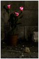
| 06/07/2007 05:32:44 AM |
Life Amongst the Rubbleby shalrathComment: Nice change on the flower in a studio shots. Could be my monitor but the red looks too harsh. I like the concept though it took me a while to realise where the use of light was. I find it kind of strange that your subject is placed so far back in the image with a heavy foreground. Kind of interesting. |
| Photographer found comment helpful. |
Home -
Challenges -
Community -
League -
Photos -
Cameras -
Lenses -
Learn -
Help -
Terms of Use -
Privacy -
Top ^
DPChallenge, and website content and design, Copyright © 2001-2026 Challenging Technologies, LLC.
All digital photo copyrights belong to the photographers and may not be used without permission.
Current Server Time: 07/19/2026 03:57:11 PM EDT.