| Image |
Comment |
| 01/26/2003 09:41:41 PM |
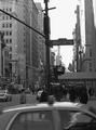
New Yorkby rll07Comment: Should have cropped the car off the bottom of the photo. In my opinion, I would have cropped it just below the "Don't Walk" sign. It would have helped in several ways - lighting could have been adjusted better, for one. Also subject would have been easier to identify. Is this "THE 34th street" of Christmas movie fame? Lighting too dark on bottom right side. |
| 01/26/2003 09:35:21 PM |
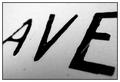
Avenueby mciComment: This does not appear to be a road sign. It does not have good focus or lighting either. The background appears very dirty. Has no personal appeal or validity. |
| 01/26/2003 09:32:27 PM |
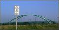
No Cars Allowedby GeneralEComment: I see your "road sign" but not the path. The metal arc appears to be the subject of the photo and I can not tell what it is. It almost appears to be chains hanging down from the metal frame, but there are no seats in site. It's a nice photo I just can't figure it out too well. Hope you explain it to us. |
| 01/26/2003 09:28:24 PM |
|
 Photographer found comment helpful. Photographer found comment helpful. |
| 01/26/2003 09:25:27 PM |
Duck Crossingby Wheeler1992Comment: The top of the photo is washed out til the sky is white and there appears to be a haze. Even the "sign" is washed out. As for the "duck" clearly in the crossing area, that's cute but not enough to make up for the washed out section.. Decent photo otherwise. |
| Photographer found comment helpful. |
| 01/26/2003 09:18:56 PM |
Head Gamesby jitamsComment: Love it. Right on. Would have liked a little differentiaion between the background ant eh head since the sign with the head is your subject. But still a good shot. |
| Photographer found comment helpful. |
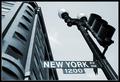
| 01/26/2003 09:16:09 PM |
Start Spreadin' the News by magnetic9999Comment: This is not exactly a black and white, more like light grey and dark grey, but I really like it. With the angle you shot the "road sign" I believe it speaks volumnes about New York: tall buildings and street light. All the techs are right in my opinion. This is a very well done composition with really good execution. Worhy of a 9. |
| Photographer found comment helpful. |
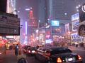
| 01/26/2003 09:12:37 PM |
Signs of Times Squareby evmariedogsComment: Top 2/3 of photo appears washed out. White spots everywhere are very distracting. May cleaning your lens would help. Technically I see one "road sign" and it is behind a lamp post and barely visible and a small street sign and "one way" sign across the street. They are to hidden or lost in the photo to be your subject. Since "road signs" is the challenge in my opinion you have not met the challenge. Yes, there are lots of "signs" that are not "road signs". |
| 01/26/2003 09:06:50 PM |
Red Rock, Red Stopby YomiComment: There doesn't appear to be a sign post on this sign. I like the rock formation bery much and the coloring is fantastic. But something's not right here. Nice photo but can't figure it out. |
| Photographer found comment helpful. |
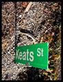
| 01/26/2003 09:03:51 PM |
Keats St.by jimmythefishComment: Sorry, but I don't get anything out of this one. It is great focus and all but I can tell nothing. Can't even tell if it is on a post or lying on the ground or standing up. I do hope you explain it to us. |
Home -
Challenges -
Community -
League -
Photos -
Cameras -
Lenses -
Learn -
Help -
Terms of Use -
Privacy -
Top ^
DPChallenge, and website content and design, Copyright © 2001-2026 Challenging Technologies, LLC.
All digital photo copyrights belong to the photographers and may not be used without permission.
Current Server Time: 07/23/2026 05:48:20 AM EDT.