| Image |
Comment |
| 05/02/2003 12:19:45 AM |
|
 Photographer found comment helpful. Photographer found comment helpful. |
| 05/02/2003 12:17:54 AM |
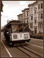
the Elby brentpaughComment: Nice city shot! Should have waited for the train to be right in the middle of the shot however. |
| Photographer found comment helpful. |
| 05/02/2003 12:15:45 AM |
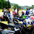
Coffee breakby pikytoComment: I like the extreme tweaking effect it has on this. The helmet in the foreground is nice also. |
| 05/02/2003 12:14:06 AM |
|
| Photographer found comment helpful. |
| 05/02/2003 12:04:05 AM |
DPChallenge Colorby OneSweetSinComment: I like this one but... although the pictures are good (nice and \"well-rounded\"), the one on the right (a barn?) is really bad. You can\'t even tell what it is. You should have used a Train or Boat instead. Should have made the ribbon bluer. I really like the structure of this one and the background also. This could be a winner with a few \"tweaks\". Also, make the URL stick out more (color, whatever) and left-justify it with the "a digital.." logo. Good job! |
| Photographer found comment helpful. |
| 05/01/2003 11:56:22 PM |
Untitledby PHOTOCHlXComment: Hmm.. well I'm back to this one.. I really like it more and more. Two things: 1) Make the Ribbon a little bigger, bluer, slightly 3D looking (more texture), and finally, locate it higher and behind the "dpchallenge" at the top. 2) Make the URL bigger or stand out more some how. This one could also be the winner. :) Good job!! |
| Photographer found comment helpful. |
| 05/01/2003 11:53:06 PM |
DPC: Universally The Best.by BigSmilesComment: LOL, the logo isn't very good. It's hard to tell what this sticker is for. Could be a gun club since there's no other indication other then a tiny hint from the word "shoot". |
| Photographer found comment helpful. |
| 05/01/2003 11:44:42 PM |
A Great Stickerby NicNic101Comment: You can barely read the URL. The text isn't very good probably because you stretched it too much. |
| 05/01/2003 11:43:44 PM |
1 week, 1 camera, 1 desire... WIN!by kosmikkreeperComment: Pretty good idea.... should have put the "WIN!" on the same line with "1 desire..." so it reads: "1 desire.... TO WIN!" Would be much better. Should also make the ribbon a little bluer. Good job not over doing it with too many colors. A lot of text + a lot of colors isn't very good. |
| Photographer found comment helpful. |
| 05/01/2003 11:40:43 PM |
|
| Photographer found comment helpful. |
Home -
Challenges -
Community -
League -
Photos -
Cameras -
Lenses -
Learn -
Help -
Terms of Use -
Privacy -
Top ^
DPChallenge, and website content and design, Copyright © 2001-2026 Challenging Technologies, LLC.
All digital photo copyrights belong to the photographers and may not be used without permission.
Current Server Time: 07/28/2026 02:39:51 AM EDT.