| Image |
Comment |
| 10/05/2005 04:40:07 PM |
Children in Sapaby letuananhComment: This has a great photojpurnalistic quality to it, but it doesn't represent complementary colors. |
 Photographer found comment helpful. Photographer found comment helpful. |
| 10/05/2005 04:39:55 PM |
|
| Photographer found comment helpful. |
| 10/05/2005 04:39:46 PM |
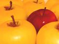
At The Orchardby popdeepopComment: There are too many colors equally proportioned to see a strong complementary color theme. |
| Photographer found comment helpful. |
| 10/05/2005 04:39:12 PM |
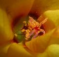
Dusting of Pollen (yellow and red)by dphillipsComment: Beautiful macro, but the complementary colors are too subtle. Green/Red. I do see a tiny bit of green towards the petals join in the center of the flower, and I do see the red. It just doesn't complement enough to draw interest away from the yellow. |
| 10/05/2005 04:38:34 PM |
|
| Photographer found comment helpful. |
| 10/05/2005 04:38:23 PM |
Pensive reflectionby dmmontyComment: I can't see any complementary colors in this, and I am having a difficult time understanding what I am looking at. If abstract is what you are going for, you have succeeded. I do like the shades of red, orange, and yellow. This would make a great fine art print. |
| 10/05/2005 04:37:41 PM |
|
| 10/05/2005 04:37:27 PM |
take your pickby mimsydotesComment: This doesn't show complementary colors. You should have used green apples. Such a great comp. |
| 10/05/2005 04:36:53 PM |
Barnby russbbrinkComment: This interpretation of complementary colors is a bit too lose for my taste. I can see a little orange tone in the wood to complement to blue, but it doesn't stand out enough. This is a beautiful shot thoug. The angel and perspective really move the compositon. The image is very clear and sharp, and the detail is great. It just doesn't display strong complementary colors. |
| 10/05/2005 04:36:34 PM |
|
| Photographer found comment helpful. |
Home -
Challenges -
Community -
League -
Photos -
Cameras -
Lenses -
Learn -
Help -
Terms of Use -
Privacy -
Top ^
DPChallenge, and website content and design, Copyright © 2001-2026 Challenging Technologies, LLC.
All digital photo copyrights belong to the photographers and may not be used without permission.
Current Server Time: 07/17/2026 10:48:15 PM EDT.