| Image |
Comment |
| 12/12/2005 12:16:33 PM |
White Christmasby garlicComment: An interesting minimalistic approach that is for the most part sleek and clean in color and presentation. However, upon looking upon the image I have to wonder why one candle wick is shown unlit, one candle wick is lit and shown with a flame, and the other two are shown as burned out (or are they actually lit upon closer inspection?). I am at a loss of how that plays into what imagery/mood/idea you wanted to convey in this image. How does that add to the composition? The white background while it helps with the imagery of a "white christmas' it makes it all the more challenging for the photographer to capture a distictly visible flame that is perceptable to the eye. I can see that one candle is lit but the flame is "washed" out against that white background - perhaps some burning and dodging would have improved visibility or a change to an ivory background that is not as stark white to take away visual impact of the candle flame. |
 Photographer found comment helpful. Photographer found comment helpful. |
| 12/12/2005 11:59:02 AM |
John Winston Lennonby pawdrixComment: A photojournalistic shot that also satisfies the candlelight requirements to create or show a mood. Colors, composition, lighting all come together to create a visually compelling image that ignites and fuels our imagination of "what might of been" if "Imagine" had made the "world one". What might "Imagine" be if John Lennon had lived. I think that this is a really good photo. My only critique for the shot is a small one. And that is that you could have changed the angle slightly so that the full word "Imagine" is visible in the photo - as it stands here the "e" is not visible in the frame. |
| Photographer found comment helpful. |
| 12/12/2005 11:53:05 AM |
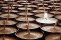
One is enoughby ArnarHComment: A simple yet elegently executed photo. One solitary candle stands alone in a sea of candles. It can symbolize a great many things. It states the the light of hope, the light of truth, etc. starts/begins with just one single light being lit. From that one many others will soon follow that shining example. Very well done. I cannot find any flaw or really recommend to do anything different for this photo other than wonder what it would look like in B&W or color instead of the sepia tone. |
| Photographer found comment helpful. |
| 12/12/2005 11:47:37 AM |
Santa's Apprenticeby mpetersComment: I really like the idea behind the composition but there are many elements that need improvement for this image to reach it's potential. First, I would have had the background be a solid black - so that the main subjects pop out more and visually attract the eye. The yellow/amber/white wall in the background does nothing to add strength to the seen. In fact, it detracts. Next, I would have liked the overall image to be sharper in all main objects present in the scene. Parts of the globe are slightly fuzzy including the man and the santa hat he wears. Greater sharper detail would improve this image. Including the candle in the shot would have been nice especially if it was one of the those festive holiday decorated candles or one that looks like a candy cane with the stripes for it would strengthen the connection to Santa imagery as well as the holiday spirit. Lastly, it would have been great if the viewer could see more of the red hue in the Santa hat - again it would further strengthen the ties to the Santa imagery. I know that the lumens drops off sharply the further away the subject is from the candle and placement, but by simply placing another candle behind the model and out of the picture frame would have illuminated the red of the Santa hat rather nicely. As I said, you have a great idea here compositionwise it is just the execution and details of the set-up that need improvement. |
| Photographer found comment helpful. |
| 12/12/2005 11:26:50 AM |
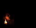
Nyctophobiaby smykComment: I guessed from the imagery what the title meant...hey you not only get challenged at DPC but you learn from it too:-) Onto the image. I like the set-up and composition of the piece. From just the single candle that this girl holds we see that she is screaming in fear. She appears to be looking over her shoulder at something in the dark. Two thirds of the image is just plain darkness. Because the girl is looking over her shoulder and screaming the viewer has to wonder what exists in that darkness that she sees that we do not? Some frightful creature hides in those deep shadows waiting for that single candlelight to go out. Very creative, spooky and well done. |
| Photographer found comment helpful. |
| 12/12/2005 08:18:46 AM |
A moth to the flame.by banditComment: I really like the take of visually capturing the imagery of "a moth to a flame". The moth is very well light such that we can make out details on it's wings, body and even attenae. I think the visual impact of the image would be strengthened if the flame were more detailed in the shot. As it appears here it is overexposed and an undefined blob of light. Another area that could go a long ways to strengthening the wow factor would have been to illuminate the latern that holds the candle - seeing the details in that object too would add some more visual interest to hold the eye's attention. Still, this is a well done shot. |
| Photographer found comment helpful. |
| 12/12/2005 08:11:50 AM |
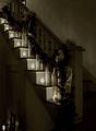
Stairway to Heavenby SJCarterComment: Love the angle of the composition. The eye naturally follows the trail of lights as they line the stairs. The slight sepia tone here gives it a feel of a time gone past - a good memory. As much as the sepia tone adds to the mood - I still wonder what the color version would have looked like. My only critique on this photo is that there appears to be another source of light or candle on the bottom left of the image. This not only distracts attention away from the main focus but also serves to break the visual linear trail of the candles lining the steps. |
| Photographer found comment helpful. |
| 12/12/2005 08:00:50 AM |
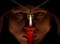
Necromancyby labudsComment: Composition, set-up, and lighting are all in fine tune to invoke the imagery presented here. The flame on the candle is in perfect focus and with it's position in center of the frame it immediately captures the eye's attention. The choice of the candle with red & black burned wax running down the sides was excellent in creating the mood and further strengthening the connection to necromancy and/or satanic practices. The imagery is further strengthened by coupling the symbol of the stereotypical five pointed satanic symbol hovering behind and just above the flame from the candle. In the background we notice the hooded figure whose intense stare is leveled on the symbol and the flame. |
| 12/12/2005 07:51:31 AM |
Extinguishing by soupComment: A very minimilistic approach that works wonderfully. The main focus is the wick and the flame that appear to be adrift in a sea of blue with the darkness (the dark area in the upper 1/2 of the left hand side) threatening to extingush it. Lighting, composition, and subject are well captured. |
| Photographer found comment helpful. |
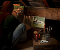
| 12/12/2005 01:31:25 AM |
Garretby graphicfunkComment: This is a great shot for the composition, lighting, and mood it creates. The set-up of the composition gives us the feel and impression of a painter who is very poor - the artists who suffers for their art. The candles, the open can of salmon, the winter clothing he has all play into that. Even thought on closer inspection I find some things that could have made the imagery stronger I will give this a higher than average score. Now the things that could have been included in the composition to strengthen the imagery of the starving artists. The candles could have given us a sense of time and a lot of usage if they had loads of burned candle wax running down the sides and dripped onto their holders. As they appear here they are neat and clean. Second, the jeans are dirty which helps with the idea of 'starving artist' but a hole in the knee would have strengthened the imagery better. The tubes of paint look barely used - another element that goes to show they have not been utilized very much with weakens the the thought of this artist's supporting himself solely on his art. If they gave the appearance that they had been heavily employed for the painting being painted here they would be half rolled up, some of the caps would be off, some paint would be visible on the wooden box. The choice of canned food could have played more strongly into the stereotype of the starving artist too. Beans and/or rice are the stereotypical choice portrayed by those having very little money to afford anything else. |
| Photographer found comment helpful. |
Home -
Challenges -
Community -
League -
Photos -
Cameras -
Lenses -
Learn -
Help -
Terms of Use -
Privacy -
Top ^
DPChallenge, and website content and design, Copyright © 2001-2026 Challenging Technologies, LLC.
All digital photo copyrights belong to the photographers and may not be used without permission.
Current Server Time: 06/10/2026 11:40:43 PM EDT.