| Image |
Comment |
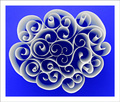
| 08/21/2006 12:56:48 AM |
Paper Patterns by timfythetooComment: Love the shapes of the paper curls. They swirl and curl and not only captures the eye's attention with shape, but coupled with that beatiful blue hue the mind becomes enchanted. This image is very visually appealing. Upon viewing the photo the viewer is easily entranced and can enter a daydream state very simular to laying on a grassy hillside and gazing up at the white clouds that drift by. |
 Photographer found comment helpful. Photographer found comment helpful. |
| 08/21/2006 12:46:22 AM |
Blowin' Smokeby cislanderComment: I love the attention to details in the composition - all the titles in the sheet music match the mood and title of these piece. |
| Photographer found comment helpful. |
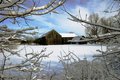
| 08/18/2006 11:07:06 PM |
Barn@Davis Road (Small).jpgby RayEthierComment: I love the colors in this photo. And what makes it especially beautiful to gaze upon is the snow draped tree branches that make a natural frame around the wooden barn centered in the composition. Very lovely. I just found a hidden jem to add to my favorites. |
| Photographer found comment helpful. |
| 08/18/2006 09:09:31 PM |
sailing_test1by AgaricusComment: Love the colors on this peaceful and serene waterscape. The sailboat catchs our attention and holds it as we sail away unto a pastel blue and pink sky. |
| Photographer found comment helpful. |
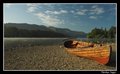
| 08/18/2006 11:22:28 AM |
Beside Derwentby taljComment: I love the composition of this shot. I like the colors of boat and how the angle/perspective makes it appear that it is approaching the viewer by 'sailing' out of the shot. The mood of the photo is one of a peaceful solitude. I agree with others that this is a great shot, it has all the right elements that make it appealing but if you do a little PS with upping the saturation, a bit of curves and some contrast adjustments it will move from the great category into the outstanding cateory. |
| Photographer found comment helpful. |
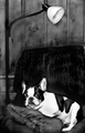
| 06/05/2006 09:13:49 PM |
What makes you think you’re something special when you smile? - Hey Bulldogby notesinstonesComment: Simple B&W presentation really makes the focal point of your photo pop off the page. The white tones of the doggie really pop off of the dark hues in his surrounding environment. And that expression!!! That wonderfully smug happy 'smile' on the dog's face is just great! As I look at it I do indeed hear the lines "What makes you think you're something special when you smile?" Hey Bulldog, I give you an 8. |
| Photographer found comment helpful. |
| 06/05/2006 09:09:24 PM |
The fool on the hillby birkinComment: Love the deep rich tones of the oranges and yellows in the sky. These warm tones are very appealing. Attention to detail is good. The subject is wearing a fool's hat and his arms are thrown wide in joyful abandon. The subject and the ground plane are in deep silhouette which is good because it really pops off the warm tones of the sky - not to mention that if any other colors showed it would clash for the eye's attention and 'clutter' the scene. My only critique is that I wish 'the fool' was holding a can and not an umbrella for it just doesn't seem to fit all to well with the time period represented with the fool's hat. Then again, this is representing the Beatles whose songs were sometimes whimsical, silly or avant garde. 10 |
| Photographer found comment helpful. |
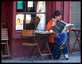
| 06/05/2006 08:59:47 PM |
"I read the news today, oh boy!" from "A Day in the LIfe" - Sergeant Pepperby RiponladyComment: This photo is a good shot, but there are a few things you could do to move it out from the good category and into the extraordinary category. First off, there are too many elements in the shot that clutters it and diminishes a focal point. A tighter crop chopping out the folded table on the left & the table against the metal backdrop on the right would center/ground the focus on the man sitting at the two seater table. Next, the glare on the cafe window is distracting - a simple polorizer filter to illiminate glare would take care of that - flash would not be good because most times it will just bounce off the glass and create a bigger problem of glare. An alternate would be to have been there at a different time of the day as that the sun's position will greatly affect the glare/reflections cast or not cast - but that may have meant you would not have had captured this candid shot of this man reading the paper (assuming that this is not a posed shot). Lastly, show us what the headlines are - if this is a posed shot then their indeed might have been a frontpage headline that catches one by surprise and makes us sing "I read the news today, oh boy!" And even if it was a candid, showing the headline might just by luck relate to the emotion/title/or challenge you are trying to tackle. |
| Photographer found comment helpful. |
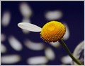
| 06/05/2006 08:47:42 PM |
She Loves You by MayaMComment: Already scored this a 10 and I am now coming back to comment. Simple, clean and beautifully presented. The single petal and the remaining portion of the daisy are in crystal sharp focus. In the background we can see the blurred picked petals. They fade into the background not just physically but also symbolically. Those flower petals do not hold the answer to the question "Does she love me". The one that tells us "She Loves You" is the last remaining one on the daisy that dominates the forefront. Simply brilliant. |
| Photographer found comment helpful. |
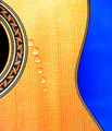
| 06/05/2006 01:33:03 AM |
While My Guitar Gently Weepsby PurpleFireComment: Minimilistic and simply stated - the photo grabs the eyes attention and holds it with the bold colors (the brilliant blue backdrop and the rich yellow hue of the guitar) and the shaped curves. The only critiques I have on the piece as it relates to the challenge is that those brilliant bold colors project a "happy" mood which is a direct contrast to the tone & mood of the Beatles song you are capturing (which is sad and heavy-hearted). The water drops do their best to project the idea of the guitar weeping, but I feel it can be improved if each drop was not uniform in shape. Perhaps if they (and this would be challenging I know but it would be worth it) were more in the classic teardrop shape. Water droplets in that shape would create a much stronger impact and connection to the guitar weeping. |
| Photographer found comment helpful. |
Home -
Challenges -
Community -
League -
Photos -
Cameras -
Lenses -
Learn -
Help -
Terms of Use -
Privacy -
Top ^
DPChallenge, and website content and design, Copyright © 2001-2026 Challenging Technologies, LLC.
All digital photo copyrights belong to the photographers and may not be used without permission.
Current Server Time: 06/11/2026 08:07:14 PM EDT.