| Image |
Comment |
| 09/01/2006 12:09:39 PM |
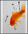
Ever Feel the Odds Are Against You?by DrAchooComment: Great title and creativity!!!! Love the set-up of the elements that make up this humorous photo. While the lighting on the fish and creativity are excellent the composition and execution of the shot needs improvement. I really think you could pull back and show us the glass so that it creates a greater impact to the title. It will show just another way that the odds are stacked against you. Next the water in the glass and the background could be clearer and brighter. The background white could be whiter and that can be accomplished through selective editing to bump up the contrast. Hmmm, maybe even play with the Brightness/Contrast tools to see if you could get the whites looking whiter rather than dingy and dull. I think just one fishing hook perfectly poised so that you can see the curve of the hook would be much better than the numerous ones you have in the composition. The reason? Simplicity sometimes is the best presentation. In my honest opinion, too many hooks is overkill on presenting your idea.
I really hope that you go back and reshoot or touch up this one for it really is a great concept. |
 Photographer found comment helpful. Photographer found comment helpful. |
| 09/01/2006 12:02:04 PM |
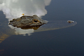
Beauty and the Beastby yakatmeComment: Took me some time to find 'Beauty' as that she is small relation to the composition as a whole. Great capture, but you need to draw us in more. A closer crop would compell us to linger longer and look at your photo. If you have a good zoom lens I would use it to get closer to the gator (don't do it physically just let your camera do it with the zoom function) I think a tight square crop just showing the portion of his head [not his snout]above water will give us all the details of the gator and the dragonfly not to mention the detail of textures both these creatures have. You want to keep the attention focused on your main subject and that is these two creatures - not the water or the negative space they are swimming in. Next, there needs to be sharper details on the skin of the gator and the dragonfly. That can be accomplished by using a smaller aperature setting (an 8 - 16 range) to get more detail and depth of field. Maybe the original has that and sometimes due to resizing some sharpness is lost - simply using sharpen or unsharp mask will take care of that. Lastly, the reflection of the cloud in the water is greatly distracting and it takes away focus from your main subjects. Changing the angle in which you shoot (low angle or high angle) or moving a few degrees to the right or left of the subject tends to get rid of unslightly elements that contribute nothing to the overall composition. |
| Photographer found comment helpful. |
| 09/01/2006 11:27:18 AM |
R E Dby gaurawaComment: Wonderful study of a red rose. The colors are deep, vibrant, and rich. Not only does the color captivate but the folds of the petals & curves of the flower draw you in. The thin white border was a good choice for it really makes the image 'pop' off the page. |
| Photographer found comment helpful. |
| 09/01/2006 11:22:37 AM |
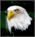
Determinationby bvoiComment: Wow! What a wonderful side profile of this magnificient bird. And the composition really allows the viewer to get "up close & personal" with this bald eagle. One really gets a good look at that commanding stare and that sharp beak. I love all the details you can see in this one from the feathers to the textures on it's beak. Well done. |
| Photographer found comment helpful. |
| 09/01/2006 11:18:44 AM |
Concentration.by QikiComment: What a great action shot! Love the look of concentration on the boys face as he focuses on the soccer ball. It is great how you caught the action of him running and his other leg is poised for the kick. The colors are bold and vibrant. They provide an extra 'kick' that makes the photo 'pop' off the page. The only critique is that there is the mild distraction of the standing people off in the top left corner. But I don't really see how you could have avoided this because you get what you get in action shots and the angle from which you snapped this photo is esentiall to showing the action taking place. |
| Photographer found comment helpful. |
| 09/01/2006 11:11:33 AM |
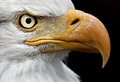
Freedomby charliebakerComment: Very stunning close-up of the bald eagle. Colors are bold and vibrant. Composition is excellent...love how one can see all the details in the feathers. Excellent capture. |
| Photographer found comment helpful. |
| 09/01/2006 11:08:00 AM |
A Day at the Racesby ShermyComment: As I gaze upon this photo I cannot help but think of the film American Graffiti . The somewhat muted colors give it a nostalgic feel - which helps because the composition has some old style classic cars in it. The title of this piece is A Day at the Races and unfortunately the composition of the elements just doesn't carry it off. You don't show us much of the cars in this shot - all we are given is the top portion. Showing us more of this racer leaning against the car with the front portion, the hood, the wheels visible. We see the racer but showing more of his car will give us a better sense of who he is and what action is about to take place. Next shooting at a lower angle and a different angle (perhaps to the side of the car where the grille and headlight are seen at a diagonal) would remove all the unsightly elements that detract from the main focus of your image ( the other cars, that guy strolling by in the background, the billboard, and possiblity the telephone poles & wires). |
| Photographer found comment helpful. |
| 09/01/2006 10:45:01 AM |
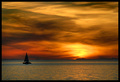
Arctic sunsetby eirasiComment: Simple, clean and elegent presentation of this sunset. The sailboat is a wonderful touch to the composition. The colors and hues and wonderful. Only two critques on this photo. There seems to be too much of a yellow tone to the hue of the water such that the majority of the water is a aqua-gold color rather than the normally accepted color we think of what water should be. Most of that is due to the stunning colors of the sunset reflecting on the water but I wonder if hue of the water is is due to playing with the color levels to bring out the sky. It worked beautifully for the sky but it just doesn't look right for the water. If levels were not adjusted then mayhap playing with aperature and shutter speed would get a different color result where the water is a deeper hue. Second critique is that having the sun evident in the shot would move it out of the good category and into the excellent category. That may not have been possible, for mother nature does not always grace us with what we want for our shots but I wonder if the sun was visible before or after this shot that it could have been incorporated for it. |
| Photographer found comment helpful. |
| 09/01/2006 10:33:23 AM |
HOOPS by Breeee123Comment: Beautiful and stunning capture! Love how it all comes down to the shapes of the silhouettes that compliment all the elements and the lovely warm tones of golds, reds, and oranges. Love the action of the two men shooting hoops. I see so many curves in this composition the curve of the basketball hoop, the curve of the ball, and even the curve of the setting sun. The composition is wonderfully composed with the action of the two men jumping to get the ball and the sun (another sphere) resting right between them. Simple, beautifull and elegent in it's presentation I think this will easily be in the top 20 if not the top 5. Good work. |
| Photographer found comment helpful. |
| 09/01/2006 10:18:00 AM |
The Captainby FalcComment: Oh my! It is those arresting eyes and the lines on the face that just expresses volumes on the life of a fisherman. Gazing upon this portrait, I look upon the chiseled features that speak of life out at sea and I see a man/a captain who has sailed out on the fickle & sometimes harsh waters and returned. Wonderful capture, I sit here and I can almost think I can turn the page to read the National Geographic story that goes with this picture:-) |
| Photographer found comment helpful. |
Home -
Challenges -
Community -
League -
Photos -
Cameras -
Lenses -
Learn -
Help -
Terms of Use -
Privacy -
Top ^
DPChallenge, and website content and design, Copyright © 2001-2026 Challenging Technologies, LLC.
All digital photo copyrights belong to the photographers and may not be used without permission.
Current Server Time: 06/11/2026 08:06:47 PM EDT.